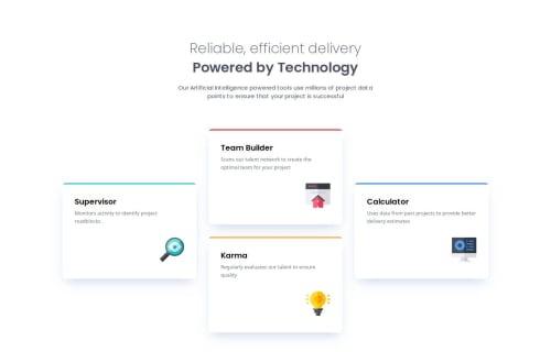
Four Card Feature in React, Next.js, tailwindcss, and TypeScript.

Solution retrospective
When I initially looked at solving this it initially occurred to me to use a grid, although I wanted to see if I could get it right with flex box. It ended up being pretty simple to set up breakpoints to change only a few properties in order to get the layout to work in all 3 screen sizes.
What challenges did you encounter, and how did you overcome them?I was hard time realizing that the tailwind classes for adjusting position in a container, switch the direction they work with depending on the main axis of the flex box. Some of them work with the main axis and some with the perpendicular axis.
I ended up finding some helpful info in the tailwind docs.
What specific areas of your project would you like help with?I'd like recommendations on how to improve the semantic html elements used throughout the page and components.
Please log in to post a comment
Log in with GitHubCommunity feedback
No feedback yet. Be the first to give feedback on Erik S. Carlsten's solution.
Join our Discord community
Join thousands of Frontend Mentor community members taking the challenges, sharing resources, helping each other, and chatting about all things front-end!
Join our Discord