Skip to content
  • Unlock Pro
  • Log in with GitHub
Profile
OverviewSolutions
14
Comments
11
P

Erik S. Carlsten

@ecarlsteDenver, CO290 points

I’m a mysterious individual who has yet to fill out my bio. One thing’s for certain: I love writing front-end code!

I’m currently learning...

I'm currently focusing on building front end apps using React, Next.js, shadcn/ui, and tailwindcss. I'm also focused on learning more about front end testing since I've been primarily a backend engineer for most of my career.

Latest solutions

  • Responsive Time Tracking Dashboard w/ NextJS/TailwindCSS/TypeScript

    #next#react#tailwind-css#zustand#typescript

    P
    Erik S. Carlsten•290
    Submitted 3 months ago

    Semantic HTML usage is what I primarily need advice on here. And potentially project source organization, when it comes to the component structure I ended up using. I could potentially break up some of the larger components into sub-components.


    1 comment
  • Responsive Newsletter Sign Up w/ NextJS/tailwind/zod/react-hook-form

    #next#react-hook-form#tailwind-css#typescript#zod

    P
    Erik S. Carlsten•290
    Submitted 3 months ago

    I'd like feedback on my use of Semantic HTML more than anything.


    1 comment
  • Responsive Article Preview Component w/ Next.js/React/Tailwind

    #next#react#typescript#tailwind-css

    P
    Erik S. Carlsten•290
    Submitted 3 months ago

    I think the biggest thing for me is still wanting to get advice about how to organize the component using semantic HTML.


    1 comment
  • Meet Landing Page w/ React, Next.js, tailwindcss, and TypeScript.

    #next#react#tailwind-css#typescript

    P
    Erik S. Carlsten•290
    Submitted 5 months ago

    I'd like some advice on alternative ways to solve the top hero section, especially if there are cleaner ways to organize the elements of that section to get it to be responsive.


    1 comment
  • Four Card Feature in React, Next.js, tailwindcss, and TypeScript.


    P
    Erik S. Carlsten•290
    Submitted 5 months ago

    I'd like recommendations on how to improve the semantic html elements used throughout the page and components.


    2 comments
  • Responsive product preview card w/ React, Next.js, and tailwindcss.

    #next#react#tailwind-css#typescript

    P
    Erik S. Carlsten•290
    Submitted 5 months ago

    I'd like advice on any semantic html elements that I should be using which I'm not, or any different ones that are recommended.


    1 comment
View more solutions

Latest comments

  • Stefano Lezzi•350
    @Steno-95
    Submitted 3 months ago
    What challenges did you encounter, and how did you overcome them?

    On the cards for each activity i wasn't able to hide the colors from the element under the display, if anyone can give me a tip on it, i would be thankful!

    What specific areas of your project would you like help with?

    Except the specific mentioned before anything that i could improve!

    Time tracking dashboard, responsive using React and Tailwindcss

    #react#tailwind-css
    1
    P
    Erik S. Carlsten•290
    @ecarlste
    Posted 3 months ago

    I actually ran into the exact same problem you mentioned when working on this challenge using tailwind.

    In order to fix the issue, I had to set rounded-b-[<value>] and rounded-t-[<value>] rather than simply using rounded-[<value>] for the div that has the changing background color. To get the background of the div in the back not to show, I simply set the rounded corner radius on the bottom only to be something higher than the dark blue div that holds all of the data.

    Don't make the radius full or it will look wrong, but something that's a higher value than your data containing div should get the sliver of color to hide.

  • Grecco Oliva, Franco•310
    @GreccoOliva-Franco
    Submitted 4 months ago
    What are you most proud of, and what would you do differently next time?
    • All form handling
    • Faster resolution. Getting used to UI composition and CSS in general. Yet, CSS is still difficult in some cases and pixel perfect designs
    • Achieving solution avoiding help
    What challenges did you encounter, and how did you overcome them?
    • CSS

    Overcome: Fail, Try again, Try harder, Fail

    What specific areas of your project would you like help with?

    I would LOVE to see a Senior Developer to get in his mind and understand their way of tackling the problems

    NextJs - Tailwind CSS

    #next#tailwind-css#zod
    1
    P
    Erik S. Carlsten•290
    @ecarlste
    Posted 3 months ago

    While looking through your code I noticed you are using a very helpful util function that became very popular from shadcn/ui I think. Very nicely done!

    Nice job using variants to allow tailwind to style differently depending on the media breakpoints.

    I do think that the mobile layout could use a little tweaking, especially the horizontal sizing and alignment of the hero image in relation to the form content with mobile screen sizes.

    Overall, very nicely done!

  • Terence Zhang•660
    @TerenceCLZhang
    Submitted 4 months ago

    Article preview component built with React

    #accessibility#react
    1
    P
    Erik S. Carlsten•290
    @ecarlste
    Posted 3 months ago

    The desktop and mobile designs look to be very close to the solution and work great. I especially liked the hover effect that you added to the social link icons. I think it would be nice to see a similar type of hover effect with the share button so that a user might know they can't click it.

    I did notice that when transitioning from a small screen to medium, and also when going from large to medium, the interrim tablet size stretches the entire size of the screen and doesn't look right as it becomes much wider than the desktop version. It also seems to move the article image above the details in a flex column, which it should not do until it reaches the small breakpoint for mobile.

    All in all, it looks great! Nice job!

    Marked as helpful
  • P
    V.S Karthik Tirumalasetty•130
    @VSKarthikT
    Submitted 10 months ago
    What are you most proud of, and what would you do differently next time?

    I've just started learning Tailwind CSS for this project and am excited to have implemented a responsive page! Responsiveness has always been a bit tricky for me, especially dealing with overlapping elements when using absolute positioning, but I feel like I've finally got it figured out

    What challenges did you encounter, and how did you overcome them?

    At first, I found Tailwind’s syntax a bit challenging, but the website’s documentation was super helpful, and now I’m much more comfortable with it. Positioning hero images was a bit tricky too—I wanted them to overflow the parent container and touch the viewport edges. I figured it out by using negative margins, and it’s looking just right now!

    What specific areas of your project would you like help with?

    I’d like some guidance on effectively using mixins or reusable styles in Tailwind, similar to how CSS handles mixins. I’m curious if there’s an efficient way to apply repeated styling patterns across multiple components without adding redundant code.

    Additionally, I’ve noticed my HTML tags are getting cluttered with a lot of classes, making them look a bit unwieldy. Are there any strategies or best practices in Tailwind for keeping my code cleaner, especially when it comes to managing lengthy class lists? Any tips on optimizing readability would be great!

    Responsive meet page using tailwind CSS

    #tailwind-css
    1
    P
    Erik S. Carlsten•290
    @ecarlste
    Posted 5 months ago

    Nice job getting your responsive UI to work the way you wanted it to in tailwind.

    It looks like the paragraph text in the first two sections is expanding farther than the design. The top hero section text should be the same width as the heading above it. The second heading and that section's paragraph text are also expanding farther than the design looks to intend.

    The footer section looks to be laid out in a column rather than a row, so you might want to take a look at getting it to flex as a row rather than a column for large screens.

  • P
    Mirko Zlatunic•250
    @mirkozlatunic
    Submitted 5 months ago
    What are you most proud of, and what would you do differently next time?

    Trying to keep the code lines as small as possible to customize the grid system and keep it responsive

    What challenges did you encounter, and how did you overcome them?

    to rearrange the cards based on the challenge.

    What specific areas of your project would you like help with?

    N/A

    Responsive Testimonial Grid Cards

    #tailwind-css#vite
    1
    P
    Erik S. Carlsten•290
    @ecarlste
    Posted 5 months ago

    Looks great, nice job!

    I did notice that when I resize the screen from desktop down to tablet and mobile sizes, the double quote character in the background of the purple div seems to get out of alignment. It might be worth checking different screen sizes if you have a chance.

    I didn't notice much usage of semantic html in your code, I it might help with accessibility to look at places you could use a <main>, <section, and <article> tag in this challenge.

    You did a good job splitting up the code into parts that are easy to understand. One thing you might consider is splitting out the testimonial card itself out into its own component that can be reused, so the code inside the map would be a bit simpler to follow.

  • Diamond202•400
    @maria202costa
    Submitted 5 months ago

    A responsive project desktop/mobile using Flexbox and CSS grid.

    1
    P
    Erik S. Carlsten•290
    @ecarlste
    Posted 5 months ago

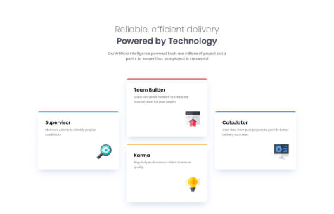
    The top padding in your desktop size looks to be using the same value as the smaller layouts want, rather than the largest of the three padding values included in the Figma design. I believe it should be at 102 pixels.

    Also, nice job using semantic HTML, here's an alternative use of it that might be helpful:

      <body>
        <header class="intro-card">
          <p class="intro-pg">Reliable, efficient delivery</p>
          <h1 class="title">Powered by Technology</h1>
          <p class="description-pg">
            Our Artificial Intelligence powered tools use millions of projects data
            points to ensure that your project is successful
          </p>
        </header>
        <main>
          <article class="supervisor">
            <h2>Supervisor</h2>
            <p>Monitors activity to identify project roadblocks</p>
            <img src="./Imgs/icon-supervisor.svg" alt="Supervisor icon" />
          </article>
    
          <section class="double-card-section">
            <article class="team-builder">
              <h2>Team Builder</h2>
              <p>Scans our talent network to create the optimal team for your project</p>
              <img src="./Imgs/icon-team-builder.svg" alt="Team Builder icon" />
            </article>
    
            <article class="karma">
              <h2>Karma</h2>
              <p>Regularly evaluates our talent to ensure quality</p>
              <img src="./Imgs/icon-karma.svg" alt="Karma icon" />
            </article>
          </section>
    
          <article class="calculator">
            <h2>Calculator</h2>
            <p>Uses data from past projects to provide better delivery estimates</p>
            <img src="./Imgs/icon-calculator.svg" alt="Calculator icon" />
          </article>
        </main>
      </body>
    
    Marked as helpful
View more comments

Stay up to datewith new challenges, featured solutions, selected articles, and our latest news

Frontend Mentor

  • Unlock Pro
  • Contact us
  • FAQs
  • Become a partner

Explore

  • Learning paths
  • Challenges
  • Solutions
  • Articles

Community

  • Discord
  • Guidelines

For companies

  • Hire developers
  • Train developers
© Frontend Mentor 2019 - 2025
  • Terms
  • Cookie Policy
  • Privacy Policy
  • License

Oops! 😬

You need to be logged in before you can do that.

Log in with GitHub

Oops! 😬

You need to be logged in before you can do that.

Log in with GitHub

Oops! 😬

You need to be logged in before you can do that.

Log in with GitHub

Oops! 😬

You need to be logged in before you can do that.

Log in with GitHub

Oops! 😬

You need to be logged in before you can do that.

Log in with GitHub

Oops! 😬

You need to be logged in before you can do that.

Log in with GitHub

Oops! 😬

You need to be logged in before you can do that.

Log in with GitHub

Oops! 😬

You need to be logged in before you can do that.

Log in with GitHub

Oops! 😬

You need to be logged in before you can do that.

Log in with GitHub

Oops! 😬

You need to be logged in before you can do that.

Log in with GitHub

Oops! 😬

You need to be logged in before you can do that.

Log in with GitHub

Oops! 😬

You need to be logged in before you can do that.

Log in with GitHub

Oops! 😬

You need to be logged in before you can do that.

Log in with GitHub

Oops! 😬

You need to be logged in before you can do that.

Log in with GitHub

Oops! 😬

You need to be logged in before you can do that.

Log in with GitHub

Oops! 😬

You need to be logged in before you can do that.

Log in with GitHub

Oops! 😬

You need to be logged in before you can do that.

Log in with GitHub

Oops! 😬

You need to be logged in before you can do that.

Log in with GitHub

Oops! 😬

You need to be logged in before you can do that.

Log in with GitHub

Oops! 😬

You need to be logged in before you can do that.

Log in with GitHub

Oops! 😬

You need to be logged in before you can do that.

Log in with GitHub

Oops! 😬

You need to be logged in before you can do that.

Log in with GitHub

Oops! 😬

You need to be logged in before you can do that.

Log in with GitHub

Oops! 😬

You need to be logged in before you can do that.

Log in with GitHub

Oops! 😬

You need to be logged in before you can do that.

Log in with GitHub

Oops! 😬

You need to be logged in before you can do that.

Log in with GitHub

Oops! 😬

You need to be logged in before you can do that.

Log in with GitHub

Oops! 😬

You need to be logged in before you can do that.

Log in with GitHub

Oops! 😬

You need to be logged in before you can do that.

Log in with GitHub

Oops! 😬

You need to be logged in before you can do that.

Log in with GitHub

Oops! 😬

You need to be logged in before you can do that.

Log in with GitHub