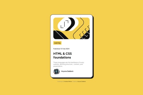
Not Found
Not Found
Not Found
Not Found
Not Found
Not Found
Not Found
Not Found
Not Found
Not Found
Not Found
Not Found
Not Found
Not Found
Not Found
Not Found
Not Found
Not Found
Not Found
Not Found

Submitted

Blog Preview Card

#accessibility#lighthouse

@zacc-anyona

Desktop design screenshot for the Blog preview card coding challenge

This is a solution for...

  • HTML
  • CSS
1newbie
View challenge

Design comparison


SolutionDesign

Solution retrospective


What are you most proud of, and what would you do differently next time?

What I am proud of in this project

  • I am proud that I managed to build a fully responsive web page using flex-box. I love flexing my muscles in this area.
  • Proud of the fact I managed to overcome some of the challenges I encountered and went to ahead to complete the challenge.

What I would do different next time

  • I reduce the number of media queries I have in my CSS by employing mobile-first workflow.

What challenges did you encounter, and how did you overcome them?

Challenges I encountered in this challenge

  • Making the site responsive by the use of media queries.

What specific areas of your project would you like help with?

I need help in the following areas;

  • Responsiveness
  • How to come up with descriptive class names.

Community feedback

P
tediko 6,580

@tediko

Posted

Hello @zacc-anyona!

Good job on this challenge! There is a few things that you can improve in your code and learn a thing or two alongside!

  • You shouldn't define font-size in your body element in pixels. You don't have to do it at all. By default, browsers set the HTML font size to 16px. A lot of people change their base text size in browser to make it more accessible for them. Defining your body element font-size in pixels will not respect the user's font-size preferences. Remove font-size from body to use default browser size.
  • Learn about landmarks because you're using them wrong. Landmarks are semantic elements that can be used to define different parts of a web page to make your website accessible to users using assistive technologies. Landmakrs help screen reader users navigate your website. The <main> element represents the dominant content of a document. That's why you need to wrap your .content div with <main> element. If you want your .content element can be an <article> but it isn't necessary. Change your main element within .content to div. <header> is element that represents a container for introductory content or a set of navigational links. In your example either of these conditions are met so change <header> to normal <div> element.
  • Read about figure element since you misuse it within your header element. The <figure> element represents self-contained content, and <figure-caption> provides the accessible description to that element. Replace it with div element. As for using this figure for the avatar, I think it is a more reasonable choice, but still don't know if I'd use it for that.
  • Instead of setting width: 30% on your .content component, you could use max-width property to set the maximum width of an element.
0
Daniel 🛸 37,290

@danielmrz-dev

Posted

Hello @zacc-anyona!

Your solution looks excellent!

I have just one suggestion:

  • Use <main> to wrap the whole main content instead of just the text. The <main> tag is meant for main content, including images, videos or any other elements that are part of it.

This tag change does not impact your project visually and makes your HTML code more semantic, improving SEO optimization as well as the accessibility of your project.

I hope it helps!

Other than that, great job!

0

Please log in to post a comment

Log in with GitHub
Discord logo

Join our Discord community

Join thousands of Frontend Mentor community members taking the challenges, sharing resources, helping each other, and chatting about all things front-end!

Join our Discord