Skip to content
  • Unlock Pro
  • Log in with GitHub
Solution
Submitted 5 months ago

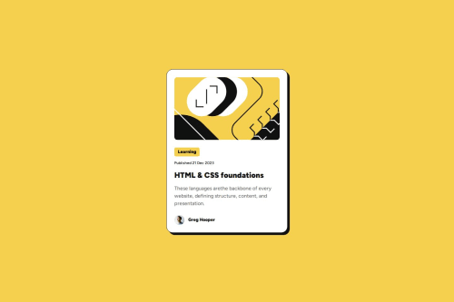
Blog preview card using flexbox

Aiden•20
@sorcerycss
A solution to the Blog preview card challenge
View live sitePreview (opens in new tab)View codeCode (opens in new tab)

Solution retrospective


What are you most proud of, and what would you do differently next time?

I'm very proud that I was able to implement flexbox features and finally understood how positioning works on a bit deeper level. For the upcoming challenges I plan to experiment with both flexbox and grid to see what looks best.

What challenges did you encounter, and how did you overcome them?

The fact that margin property works differently with flexbox made me really confused at first, as I thought it's the same thing. Turns out align-items, align-self have some limitations compared to the margin being inside the flexbox. I was able to overcome my confusing by putting it to the practice with this awesome challenge.

What specific areas of your project would you like help with?

I find it very complicated to set up the right width for my image based on the figma design file. Perhaps, I used incorrect width elements or was wrong with the sizing that I have set on the image itself, not sure. I'm still in the process of improving the solution, refactoring in other words, to make it look much cleaner.

Code
Select a file

Please log in to post a comment

Log in with GitHub

Community feedback

  • P
    Huy Phan•3,430
    @huyphan2210
    Posted 5 months ago

    Hi @sorcerycss,

    I've reviewed your solution and wanted to share my thoughts:

    margin is not exclusive to Flexbox. It can be applied to almost any element. align-items is typically used on the Flexbox or Grid container, while align-self is used on their child elements. However, with recent CSS updates, align-self can now be used on elements outside of a Flexbox or Grid.

    Regarding the image: You're setting min-width: 279px and max-width: 100% on the <img> without defining a width. I'd recommend using min-width and max-width with absolute values while setting width with a relative value. For example:

    img {
      min-width: 279px;
      max-width: 300px;
      width: 100%;
    }
    

    This ensures the image scales with its parent while maintaining defined constraints.

    Beyond these points, consider improving your HTML semantics for better structure. You're using multiple <p> elements, but many of them don't represent actual paragraphs. Depending on the content, you might want to replace them with elements like <span>, <blockquote>, <address>, <time>, etc. where appropriate. Additionally, replacing <div> with elements like <main>, <article>, or <footer> can enhance readability and accessibility.

    Hope this helps! 😊

  • Luiz Fernando Barreto•20
    @LuizFernandoBarreto
    Posted 5 months ago

    Eu aprendi a usar o @media que ajuda a manter o padrão entre design e o que sera entregue.

Join our Discord community

Join thousands of Frontend Mentor community members taking the challenges, sharing resources, helping each other, and chatting about all things front-end!

Join our Discord
Frontend Mentor logo

Stay up to datewith new challenges, featured solutions, selected articles, and our latest news

Frontend Mentor

  • Unlock Pro
  • Contact us
  • FAQs
  • Become a partner

Explore

  • Learning paths
  • Challenges
  • Solutions
  • Articles

Community

  • Discord
  • Guidelines

For companies

  • Hire developers
  • Train developers
© Frontend Mentor 2019 - 2025
  • Terms
  • Cookie Policy
  • Privacy Policy
  • License

Oops! 😬

You need to be logged in before you can do that.

Log in with GitHub

Oops! 😬

You need to be logged in before you can do that.

Log in with GitHub

How does the accessibility report work?

When a solution is submitted, we use axe-core to run an automated audit of your code.

This picks out common accessibility issues like not using semantic HTML and not having proper heading hierarchies, among others.

This automated audit is fairly surface level, so we encourage to you review the project and code in more detail with accessibility best practices in mind.

How does the CSS report work?

When a solution is submitted, we use stylelint to run an automated check on the CSS code.

We've added some of our own linting rules based on recommended best practices. These rules are prefixed with frontend-mentor/ which you'll see at the top of each issue in the report.

The report will audit all CSS, SCSS and Less files in your repository.

How does the HTML validation report work?

When a solution is submitted, we use html-validate to run an automated check on the HTML code.

The report picks out common HTML issues such as not using headings within section elements and incorrect nesting of elements, among others.

Note that the report can pick up “invalid” attributes, which some frameworks automatically add to the HTML. These attributes are crucial for how the frameworks function, although they’re technically not valid HTML. As such, some projects can show up with many HTML validation errors, which are benign and are a necessary part of the framework.

How does the JavaScript validation report work?

When a solution is submitted, we use eslint to run an automated check on the JavaScript code.

The report picks out common JavaScript issues such as not using semicolons and using var instead of let or const, among others.

The report will audit all JS and JSX files in your repository. We currently do not support Typescript or other frontend frameworks.

Oops! 😬

You need to be logged in before you can do that.

Log in with GitHub

Oops! 😬

You need to be logged in before you can do that.

Log in with GitHub