Skip to content
  • Unlock Pro
  • Log in with GitHub
Solution
Submitted 6 months ago

Blog preview component

pruwt•20
@pruwt
A solution to the Blog preview card challenge
View live sitePreview (opens in new tab)View codeCode (opens in new tab)

Solution retrospective


What are you most proud of, and what would you do differently next time?

This challenge was much more seamless compared to the previous QR component. Approaching responsiveness by using simple fundamental principles, like not using px for elements except images, for instance, helped. I'm proud of improving on the responsiveness. It was much easier, which I guess is a sign of improvement.

What challenges did you encounter, and how did you overcome them?

For challenges faced, even though there was an improvement with my approach to responsiveness, I think there's still much more work to do. For instance, units such as em and rem, even though I understand them, I must say it's a bit confusing. Additionally, thinking critically on when to use max width is something that's starting to make sense.

What specific areas of your project would you like help with?

I think trying to match the design as closely as possible is still in the works. I need help on the best way to handle the margins (mostly top and bottom) in this case (I didn't use auto in this case). That's pretty much it

Code
Select a file

Please log in to post a comment

Log in with GitHub

Community feedback

  • P
    Huy Phan•3,430
    @huyphan2210
    Posted 6 months ago

    Hi, @pruwt

    From what I see, the card (.blog-component) should be centered in the viewport. The viewport refers to the visible area of a webpage on the screen, which changes depending on the device or window size.

    Right now, the card isn’t centered yet. You’ve already applied Flexbox to the body, but the body itself doesn’t fill the entire viewport. To fix this, set:

    body {
      min-height: 100vh;
    }
    

    The min-height: 100vh ensures the body covers the full height of the viewport, allowing Flexbox to work as expected for centering.

    Regarding the margin, I don’t think margin-top: 30px on .component-wrapper adds to the design. Consider removing it entirely. If you intend to use margin, apply it purposefully to create consistent spacing.

    Hope this helps!

    Marked as helpful
  • Charles7458•80
    @Charles7458
    Posted 6 months ago

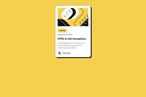
    Your project looks exactly the same as the design, but the card is not centered.

    I used this to center the card:

    body{min-height: 100vh;}

    But overall, good job.

  • P
    MukhammadBobur•370
    @Bobstyle23
    Posted 6 months ago

    Good!

Join our Discord community

Join thousands of Frontend Mentor community members taking the challenges, sharing resources, helping each other, and chatting about all things front-end!

Join our Discord
Frontend Mentor logo

Stay up to datewith new challenges, featured solutions, selected articles, and our latest news

Frontend Mentor

  • Unlock Pro
  • Contact us
  • FAQs
  • Become a partner

Explore

  • Learning paths
  • Challenges
  • Solutions
  • Articles

Community

  • Discord
  • Guidelines

For companies

  • Hire developers
  • Train developers
© Frontend Mentor 2019 - 2025
  • Terms
  • Cookie Policy
  • Privacy Policy
  • License

Oops! 😬

You need to be logged in before you can do that.

Log in with GitHub

Oops! 😬

You need to be logged in before you can do that.

Log in with GitHub

How does the accessibility report work?

When a solution is submitted, we use axe-core to run an automated audit of your code.

This picks out common accessibility issues like not using semantic HTML and not having proper heading hierarchies, among others.

This automated audit is fairly surface level, so we encourage to you review the project and code in more detail with accessibility best practices in mind.

How does the CSS report work?

When a solution is submitted, we use stylelint to run an automated check on the CSS code.

We've added some of our own linting rules based on recommended best practices. These rules are prefixed with frontend-mentor/ which you'll see at the top of each issue in the report.

The report will audit all CSS, SCSS and Less files in your repository.

How does the HTML validation report work?

When a solution is submitted, we use html-validate to run an automated check on the HTML code.

The report picks out common HTML issues such as not using headings within section elements and incorrect nesting of elements, among others.

Note that the report can pick up “invalid” attributes, which some frameworks automatically add to the HTML. These attributes are crucial for how the frameworks function, although they’re technically not valid HTML. As such, some projects can show up with many HTML validation errors, which are benign and are a necessary part of the framework.

How does the JavaScript validation report work?

When a solution is submitted, we use eslint to run an automated check on the JavaScript code.

The report picks out common JavaScript issues such as not using semicolons and using var instead of let or const, among others.

The report will audit all JS and JSX files in your repository. We currently do not support Typescript or other frontend frameworks.

Oops! 😬

You need to be logged in before you can do that.

Log in with GitHub

Oops! 😬

You need to be logged in before you can do that.

Log in with GitHub

Oops! 😬

You need to be logged in before you can do that.

Log in with GitHub