Bookmark Landing Page Project

Solution retrospective
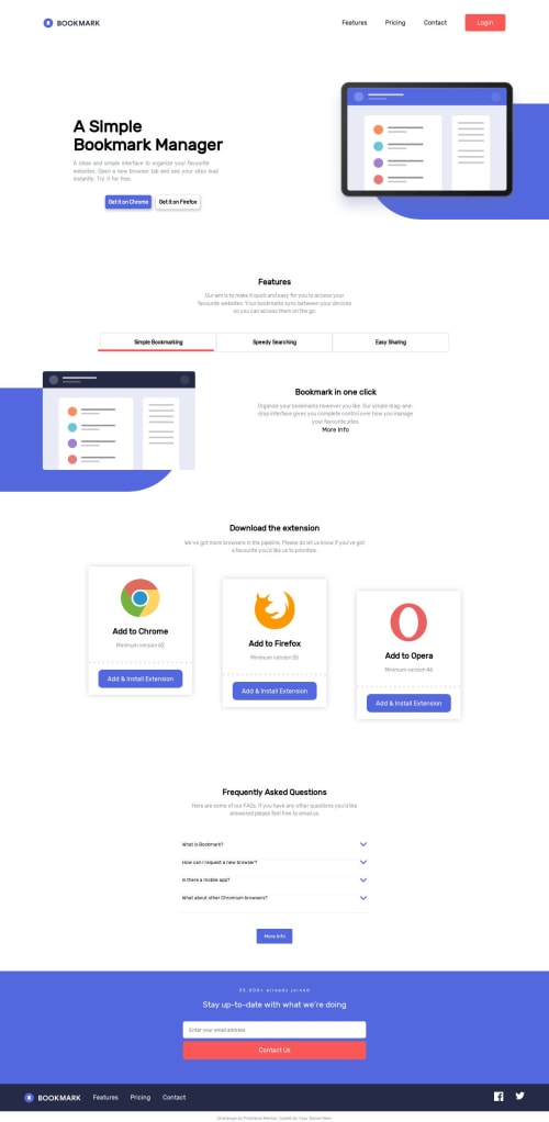
Overall easy project, the one thing that gave me any trouble was the background element behind the images that I had to create via changing the shape of an empty div and styling it. Doing so was easy but getting it's dimensions anywhere close to right was a bit messy and I am still not fully happy with it or the amount of white space in that part of the page.
What specific areas of your project would you like help with?Pretty much every project for FEM I have had the same three issues that would appreciate help on.
-
Image size/scaling and how it can mess up layout, while if force image size generally just makes it look stretched and/or squashed.
-
The scale on the page being far off on the submission snapshot, and between the chrome dev tools and what see normally in the browsers I test in. I must be missing something obvious since most of my peers do not seem to be having the same issue, at least going by their snapshots.
-
And using semantic HTML correctly. Header, Main, Section, h1-6, and Footer is obvious but always feel like I overuse section and should at least use article in there somewhere. Related to that I also likely need to study proper aria use much more, as is I just avoid it.
Please log in to post a comment
Log in with GitHubCommunity feedback
No feedback yet. Be the first to give feedback on Crystalis89's solution.
Join our Discord community
Join thousands of Frontend Mentor community members taking the challenges, sharing resources, helping each other, and chatting about all things front-end!
Join our Discord