P
@JairRaid
Pretty much every project for FEM I have had the same three issues that would appreciate help on.
Image size/scaling and how it can mess up layout, while if force image size generally just makes it look stretched and/or squashed.
The scale on the page being far off on the submission snapshot, and between the chrome dev tools and what see normally in the browsers I test in. I must be missing something obvious since most of my peers do not seem to be having the same issue, at least going by their snapshots.
And using semantic HTML correctly. Header, Main, Section, h1-6, and Footer is obvious but always feel like I overuse section and should at least use article in there somewhere. Related to that I also likely need to study proper aria use much more, as is I just avoid it.
Pretty much every project for FEM I have had the same three issues.
Image size/scaling and how it can mess up layout, while if force image size generally just makes it look stretched and/or squashed.
The scale on the page being far off on the submission snapshot, and between the chrome dev tools and what see normally.
And using semantic HTML correctly. Header, Main, Section, h1-6, and Footer is obvious but always feel like I overuse section and should at least use article in there somewhere. Related to that I also likely need to study proper aria use much more, as is I just avoid it.
Two problems that I keep having with all of the projects is that my scales are always a bit off, even if look perfect to me the screenshot after submission is not right.
I think the issue may be partly related to Chrome dev tools as things can look perfect in it for me at all sizes from 320px up to the 1440 target in style guide but when close devtools there will be at least a few things very wrong that don't look similar til zoom in 150% despite my screen not being big.
I would need to add another breakpoint to make it overlap correctly on my screen even if works perfectly 1440px and below
An area that keeps giving me issue is responsive layouts, usually from something shrinking changing the way it is positioned next to other elements.
In the case of this project the image for the "founding" blurb stays in same spot and resizes fine, but the text changes shape thus making it overlap less as the screen shrinks or move apart if grows to much even if I put in max values or 0 grow/shrink. And just the fact images react differently to changing size than text.
Having responsive elements maintain same shape and relative layout to surrounding elements is probably my weakest CSS skill right now that unlike everything else does not feel like I am improving much on no matter how much practice or read.
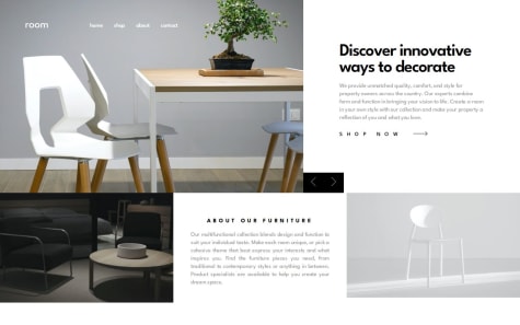
Only thing that gave me issue is proportions trying to make it match the image, while every other part seems about quite close it seems like the card itself just ends up to small to match the image like the content is not enough to fill it if I expand it to match with the other elements properly sized.
Although I suspect that may be an issue of perspective in that I try to have it fill same space as in the image and if the image is zoomed or cropped that would be pointless and inaccurate but it only thing I got to work off of.
There was one thing I could not figure out what doing wrong no matter what tried, and that is the way "Fall Limited Edition Sneakers" wraps to next line after "Limited" even if there more than enough space for the whole thing. For whatever reason it seems like Edition and Sneakers are stuck together as if they one word.
Visually looks about right so great job there and you used semantic HTML well which is something alot of our peers seem to miss, nice touch on the animations on the hovers.
The only major lack I am seeing on a cursory look is seems you didn't include the custom validation message and svg for the email error in favor of using the built in validation.
Your HTML is fine aside from possibly needing some more semantic HTML to make it easier to read than nested divs, also important for making it work better for those using a screenreader. Your JS is nicely done.
On desktop your scaling matches a bit closer than mine and looks right at the 1440px at least in the snapshot. Unfortunately the layout seems to break at anything more than 360px and less than 1440px, primarily from the lack of image scaling, the button positioning, and hardcoding a bit to much.
The ideal for responsive, and much easier to maintain, is to have it able to smoothly scale between the smallest and largest common sizes with minimal code changes rather than hardcoding everything to only look right at specific size.
Commonly recommended to design for small mobile (like 320px) then scale up til something breaks, fix it, eventually get large enough to transition to desktop size with minimal changes needed. Someone much more skilled than me could possibly do it without any breakpoints for a simple layout like this.
Not much to say, yours is good bit closer than mine and unlike most of the ones I have reviewed actually used Semantic HTML. I haven't used Tailwind personally so cannot say how that factors in.
Good Job.
So only thing I can add is an alternative way to do the sidebar open/close is instead of class manipulation can change the styling of the elements directly:
menu.style.display = 'grid'
and to hide it
menu.style.display = 'none'
And maybe move your CSS Reset into it's own file that you can just easily copy between projects rather than being in the main CSS. But that more preference, I just find it "cleaner".
Any suggestions are welcome.
Slightly closer match than mine so great job there, although the SVG is slightly off center as my only criticism.
Looks like we had similar idea for the overlay just executed differently.
An alternative way to do the overlay, that I used, was have it be an absolute div with it color transparent that the image covers. That also made is easy to center the SVG as the only element inside of it. Then swap between with a hover to change the image's z-index followed by the overlays to higher as long as hovered.
I noticed it looks like you included a small "reset" in your CSS. You could put that inside a separate CSS file you can just copy between so it easier to recycle. Not sure if that is "best practices" or not but personally I find it cleaner to keep it on it's own, but I also use a much larger one.
Looks quite close, better than mine in some areas.
Although would suggest add a touch of transition animation to the mobile menu open/close, it just "feels" better than the instant pop out and is a common thing to do.
For the JS side should have the main image being the trigger for the lightbox, having it tied to the image selection thumbnails is just annoying and makes the image selection inside of the lightbox itself not work.
While it doesn't show it I also included that lightbox closes if click anywhere not an image, which is fairly standard. And you can easily change cursor to zoom in or out style to show that with the CSS "cursor: zoom-in;" and cursor: zoom-out;"
Aside from those few issues you did a great job.
have more structure in my css
What challenges did you encounter, and how did you overcome them?the sidebar, had chatgpt do it, but i tried to understand it so i can implement it on my own next time.
Looks pretty close aside from size in screenshot being off, which is a common issue myself included. Although you did forget to include hover for the bottom set of 3 articles.
For the mobile nav menu part of page you forgot the opaque overlay to block the rest of the page the menu is not covering. That just takes having the menu inside a container covering the screen that has the background color and opacity you want.
Also might want to add the alt text to the open and close menu buttons since a screenreader won't know what they are for.
And finally advice I give nearly every one I have been presented for feedback is get more practice with the Semantic HTML. It more useful for the dev by making the page structure much more clear than nested divs while also being better for SEO and Accessibility.
You could probably replace most of them with a simple set of <ul> and <li> which seems to be fairly common way to structure and aid navigation of any part of a page that is a group (list) of related items, for example articles.