Skip to content
  • Unlock Pro
  • Log in with GitHub
Profile
OverviewSolutions
25
Comments
25
P

Habeeb Kareem

@olaide-hokLagos, Nigeria690 points

A fullstack web developer.

Latest solutions

  • Bookmark landing page

    #tailwind-css

    P
    Habeeb Kareem•690
    Submitted 2 months ago

    1 comment
  • Room homepage


    P
    Habeeb Kareem•690
    Submitted 2 months ago

    1 comment
  • Loopstudios landing page


    P
    Habeeb Kareem•690
    Submitted 2 months ago

    1 comment
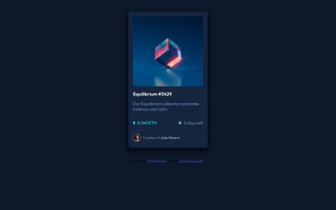
  • NFT preview card component


    P
    Habeeb Kareem•690
    Submitted 2 months ago

    1 comment
  • Tic Tac Toe game


    P
    Habeeb Kareem•690
    Submitted 2 months ago

    1 comment
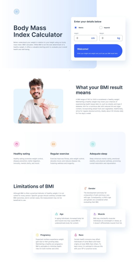
  • Body Mass Index calculator


    P
    Habeeb Kareem•690
    Submitted 3 months ago

    1 comment
View more solutions

Latest comments

  • P
    Nishanth Venkatesan•1,030
    @nishanth1596
    Submitted 2 months ago
    What are you most proud of, and what would you do differently next time?

    This was my first time using Framer Motion, and I implemented it to add a smooth sliding transition to the accordion component.

    Recently, I learned about the compound components pattern, but I initially struggled to understand it. Since the best way to learn is by doing, I decided to apply it in this project. Although I faced challenges at first, I was able to complete it—and now, I feel like I have a solid understanding of the pattern, which I'm proud of.

    What specific areas of your project would you like help with?

    I need help with adding the background image and text decoration (underline).

    Currently, the width of the underline remains constant instead of adjusting dynamically based on the content. I’d appreciate any help in resolving these two issues.


    Responsive bookmark landing page

    #framer-motion#react#react-hook-form#typescript#tailwind-css
    1
    P
    Habeeb Kareem•690
    @olaide-hok
    Posted 2 months ago

    Hi there,

    Great work here!

    Well done.

    Regarding the width of the underline remaining constant instead of adjusting dynamically based on the content. An approach would be to style using ::after pseudo css selector. The width will then be in percentage instead of a fixed value.

    For the background image, two approaches

    • add it using the ::before css pseudo selector.
    • add it by adding and styling a div as a sibling element of the image. With the parent div position relatively and target div absolutely. The width and height would have percentage values in other to be responsive.

    For example

    function HeroSection() {
      return (
        <section className="mx-8 mt-20 lg:mx-12 lg:mt-[6.75rem] lg:grid lg:grid-cols-2 xl:mx-0 xl:gap-16">
    <div class="relative">
          <img
            className="mx-auto lg:order-2"
            src={heroImg}
            alt="Illustration of a browser tab showing a list of bookmarks with colored indicators"
          />
    <div class="pos right-0 bottom-0 -z-1 bg-[#5267D} w-[75%] h-[75%] rounded-l-[999px]"></div>
    </div>
    
    // Article section goes here
        </section>
      );
    }
    

    Or styling the pseudo

    function HeroSection() {
      return (
        <section className="mx-8 mt-20 lg:mx-12 lg:mt-[6.75rem] lg:grid lg:grid-cols-2 xl:mx-0 xl:gap-16">
    <div class="hero-img-wrapper relative">
          <img
            className="mx-auto lg:order-2"
            src={heroImg}
            alt="Illustration of a browser tab showing a list of bookmarks with colored indicators"
          />
    </div>
    
    // Article section goes here
        </section>
      );
    }
    
    .hero-img-wrapper::before{
        content: "",
        background: #5267DF;
        position: absolute;
        width: 75%;
        height: 75%;
    }


    NB all tailwind utility classes and css rules provided have to be edited to suite specific needs.

    The Feature Section component could be update to

    
    function HeroSection() {
      return (
        <section className="mx-8 mt-20 lg:mx-12 lg:mt-[6.75rem] lg:grid lg:grid-cols-2 xl:mx-0 xl:gap-16">
        <article>
               <nav className="mt-8" aria-label="Download options">
              <ul className="flex items-center justify-left gap-3.5">
                // li tags goes here
              </ul>
            </nav>
          </article>
        </section>
      );
    }
    

    Well done and happy coding.

  • P
    toshirokubota•1,200
    @toshirokubota
    Submitted 2 months ago
    What challenges did you encounter, and how did you overcome them?

    It was tricky to align the arrows for the two screen sizes. I was able to do it with subgrid. This was my first attempt to implement a carousel, and I struggled at first. It should be easier the next time around.

    What specific areas of your project would you like help with?

    Any sort of feedbacks are highly appreciated! If you could do the layout in a simpler way, I would like to learn about it.

    room-homepage

    1
    P
    Habeeb Kareem•690
    @olaide-hok
    Posted 2 months ago

    Great work here!

    Your JS contained

    ✅ Readable Code

    • The code is well-structured with meaningful variable names (carousel_pics, carousel_txts, etc.).
    • The use of function encapsulation (e.g., updateCarousel(), carouselNext(), showMenu()) improves clarity.

    ✅ Accessibility Considerations

    • The use of tabIndex, aria-hidden, and keydown event listeners for keyboard navigation enhances usability for screen readers.

    ✅ Separation of Concerns

    • The carousel logic and navigation logic are separated into different sections, making the code easier to manage.

    Some areas for Improvement includes

    🔹 1. Issue with captions.forEach(e => { e.shop_now = e.querySelector('.shop-now'); });

    Problem:

    • shop_now is being assigned as a new property to e (a DOM element), which is not a standard practice and could lead to unexpected behavior.

    Suggested Fix:
    Use a Map or a dataset attribute instead of modifying the DOM object:

    const shopNowButtons = new Map();
    captions.forEach(e => {
        shopNowButtons.set(e, e.querySelector('.shop-now'));
    });
    

    Then, access it like this:

    shopNowButtons.get(txt).tabIndex = 0;
    

    🔹 2. Inefficient updateCarousel() Function

    Problem:

    • The function recalculates img_width and caption_width every time it runs, which is unnecessary.

    • Instead of looping through all images and captions every time, we can optimize how we update styles.

    Suggested Fix: Cache widths once and reuse them like below:

    const imgWidth = pictures[0].clientWidth;
    const captionWidth = captions[0].clientWidth;
    
    const updateCarousel = (count) => {
        carousel_pics.style.transform = `translateX(-${count * imgWidth}px)`;
        carousel_txts.style.transform = `translateX(-${count * captionWidth}px)`;
    
        pictures.forEach((pic, i) => {
            const txt = captions[i];
            const isActive = i === count;
            pic.setAttribute('aria-hidden', !isActive);
            txt.setAttribute('aria-hidden', !isActive);
            shopNowButtons.get(txt).tabIndex = isActive ? 0 : -1;
        });
    };
    
    • This reduces unnecessary calculations and improves performance.

    🔹 3. Event Listeners Could Be More Efficient

    Problem:

    • Multiple click and keydown event listeners for each button could be refactored into a single handler.

    • Using e.key === "Enter" is preferred over e.code == 'Enter' for better compatibility.

    Suggested Fix: Use a single function for event handling:

    const handleKeyEvent = (event, action) => {
        if (event.type === "click" || event.key === "Enter") {
            action();
        }
    };
    
    left_arrow.addEventListener("click", carouselPrev);
    left_arrow.addEventListener("keydown", (e) => handleKeyEvent(e, carouselPrev));
    right_arrow.addEventListener("click", carouselNext);
    right_arrow.addEventListener("keydown", (e) => handleKeyEvent(e, carouselNext));


    On the CSS side,

    1. In desktop viewport you can apply a width: 1440px to the main tag. This would keep the content in place for viewport greater than 1440px.
    2. You can still refactor the section tag with about class to a grid-template-column: repeat(3, 1fr); for desktop viewport and grid-template-column: 1fr; for mobile. The padding could be adjusted for mobile and desktop also.

    Overall, well done. Happy coding!

    Marked as helpful
  • P
    toshirokubota•1,200
    @toshirokubota
    Submitted 3 months ago
    What challenges did you encounter, and how did you overcome them?

    This is my first attempt with SCSS/SASS and I found it fairly straightforward. Since it makes it easier to write the stylesheet, I feel that I might have become less mindful on clarity, organization, and simplicity on the design. I wanted to use BEM on this project but I am still new to BEM and was not patient enough to stick through the naming convention. Hopefully, on the next project, I will be able to stick through with it.

    What specific areas of your project would you like help with?

    This is my first use of SCSS/SASS. It makes it easier to write the style sheet, but I may be making more verbose and less concise because of that. Any advices/comments/suggestions on my use of SCSS/SASS are highly appreciated.

    loopstudios-landing-page

    1
    P
    Habeeb Kareem•690
    @olaide-hok
    Posted 2 months ago

    Great job here.

    Your SASS did show consistent variables, typography mixin, responsive design, BEM-like structure, and accessibility.

    Some areas to improve on would be to consider

    1. Typography Mixin Overuse: The mixin is used for small, one-off styles (e.g., font-size: 14px), which adds unnecessary complexity. You can reserve the mixin for repeated typography patterns (e.g., headings) and use direct properties for one-offs. For example
      font-size: 14px;  // Direct property
      @include typography(14px, 'Alata', 400, 14px, 5px);  // Only if reused
    }
    
    1. Nesting Depth and Specificity: Over-nesting (e.g., header nav .menu) can lead to high specificity and hard-to-maintain code. You can limit nesting to 3 levels and use BEM-like classes for scalability for this particular project. For example:
    .header {
      &__nav {
        padding: 0 1rem;
      }
      &__menu {
        background: $color-black;
      }
    }
    
    1. For the hover and focus state on links, you can consider using the ::after pseudo selector and then style it to meet the design. This would give you room to adjust the width dynamically without affecting the text.
    Marked as helpful
  • Leonardo Sauberman•50
    @leosauberman
    Submitted 2 months ago

    NFT Preview Card

    1
    P
    Habeeb Kareem•690
    @olaide-hok
    Posted 2 months ago

    Great job here!

    A change you can consider is changing the cursor to pointer on hovering over the image.

    .card .image-view:hover .overlay {
      opacity: 1;
      pointer-events: auto;
      cursor: pointer;
    
    }
    

    Happy coding!

  • P
    Jair•700
    @JairRaid
    Submitted 3 months ago

    tic tac toe react

    2
    P
    Habeeb Kareem•690
    @olaide-hok
    Posted 2 months ago

    Great work on the UI.

    Considering the coming soon banner you added, I'm assuming you are still working on the project.

    Happy coding!

    Marked as helpful
  • P
    Jair•700
    @JairRaid
    Submitted 3 months ago

    body mass index calculator

    1
    P
    Habeeb Kareem•690
    @olaide-hok
    Posted 3 months ago

    Great work here!

    Some areas for improvements would be:

    1. Readability: Some variable and function names are not descriptive enough (e.g., mVal, value in setBMIResultDOM). You can use more descriptive names to improve readability. Examples would be renaming mVal to heightInMeters, value in setBMIResultDOM to isEmpty.

    2. Reusability: The code is tightly coupled to the DOM structure, making it less reusable. An approach would be to decouple the logic from the DOM by passing elements as parameters or using dependency injection. For example

    function calculateBMI(unitSystem, height, weight, heightInches = 0, weightLbs = 0) {
      // BMI calculation logic
    }
    
    1. Duplicate Code: Some logic is repeated (e.g., setBMIResultDOM is called in multiple places). You can consolidate repeated logic into reusable functions. For example
    function updateResultUI(bmi, classification) {
      this.setBMIResultDOM(false);
      this.bmiScore.textContent = bmi.toFixed(1);
      this.updateBMITextResult(classification);
    }
    
    1. Imperial Unit Support: The code only calculates BMI for metric units. Imperial unit support is incomplete. You can add functions to calculate BMI for imperial units. Example:
    function calculateImperialBMI(ft, inches, st, lbs) {
      const heightInInches = ft * 12 + inches;
      const heightInMeters = heightInInches * 0.0254;
      const weightInKg = (st * 14 + lbs) * 0.453592;
      return weightInKg / (heightInMeters * heightInMeters);
    }
    
    1. Performance: The keyup event listener recalculates BMI on every keystroke, which can be inefficient. Consider using the debouncing approach to limit the number of calculations.

    Example:

    function debounce(func, delay) {
      let timeout;
      return function () {
        clearTimeout(timeout);
        timeout = setTimeout(() => func.apply(this, arguments), delay);
      };
    }
    
    inputsContainer.addEventListener("keyup", debounce(() => {
      if (units === "metric") {
        if (canCalculateMetricBMI()) {
          updateResultUI();
        }
      }
    }, 300));
    

    Overall, well done. Happy coding!

View more comments
Frontend Mentor logo

Stay up to datewith new challenges, featured solutions, selected articles, and our latest news

Frontend Mentor

  • Unlock Pro
  • Contact us
  • FAQs
  • Become a partner

Explore

  • Learning paths
  • Challenges
  • Solutions
  • Articles

Community

  • Discord
  • Guidelines

For companies

  • Hire developers
  • Train developers
© Frontend Mentor 2019 - 2025
  • Terms
  • Cookie Policy
  • Privacy Policy
  • License

Oops! 😬

You need to be logged in before you can do that.

Log in with GitHub

Oops! 😬

You need to be logged in before you can do that.

Log in with GitHub

Oops! 😬

You need to be logged in before you can do that.

Log in with GitHub

Oops! 😬

You need to be logged in before you can do that.

Log in with GitHub

Oops! 😬

You need to be logged in before you can do that.

Log in with GitHub

Oops! 😬

You need to be logged in before you can do that.

Log in with GitHub

Oops! 😬

You need to be logged in before you can do that.

Log in with GitHub

Oops! 😬

You need to be logged in before you can do that.

Log in with GitHub

Oops! 😬

You need to be logged in before you can do that.

Log in with GitHub

Oops! 😬

You need to be logged in before you can do that.

Log in with GitHub

Oops! 😬

You need to be logged in before you can do that.

Log in with GitHub

Oops! 😬

You need to be logged in before you can do that.

Log in with GitHub

Oops! 😬

You need to be logged in before you can do that.

Log in with GitHub

Oops! 😬

You need to be logged in before you can do that.

Log in with GitHub

Oops! 😬

You need to be logged in before you can do that.

Log in with GitHub

Oops! 😬

You need to be logged in before you can do that.

Log in with GitHub

Oops! 😬

You need to be logged in before you can do that.

Log in with GitHub

Oops! 😬

You need to be logged in before you can do that.

Log in with GitHub

Oops! 😬

You need to be logged in before you can do that.

Log in with GitHub

Oops! 😬

You need to be logged in before you can do that.

Log in with GitHub

Oops! 😬

You need to be logged in before you can do that.

Log in with GitHub

Oops! 😬

You need to be logged in before you can do that.

Log in with GitHub

Oops! 😬

You need to be logged in before you can do that.

Log in with GitHub

Oops! 😬

You need to be logged in before you can do that.

Log in with GitHub

Oops! 😬

You need to be logged in before you can do that.

Log in with GitHub

Oops! 😬

You need to be logged in before you can do that.

Log in with GitHub

Oops! 😬

You need to be logged in before you can do that.

Log in with GitHub

Oops! 😬

You need to be logged in before you can do that.

Log in with GitHub

Oops! 😬

You need to be logged in before you can do that.

Log in with GitHub

Oops! 😬

You need to be logged in before you can do that.

Log in with GitHub

Oops! 😬

You need to be logged in before you can do that.

Log in with GitHub