


@elingwange
Aspiring MERN Stack Developer currently mastering React and building dynamic, user-friendly web experiences. Actively learning Node.js, Express, and MongoDB to transition into a Full Stack Developer role.
I’m currently learning...Node js, Express Js, Mongodb and mongoose
Latest solutions
Responsive Dictionary app
#axios#react#tailwind-css#typescriptPSubmitted 2 months agoI was unable to style select element, if I create it using divs, I can but I want keep the code semantic Any help in here is much appreciated.
Responsive Audiophile ecommerce website
#react#react-hook-form#react-router#redux-toolkit#tanstack-queryPSubmitted 2 months agoResponsive product-list-with-cart
#react#redux-toolkit#tanstack-query#typescript#pure-cssPSubmitted 3 months agoThe alignment of the "Add to Cart" button is incorrect, and I’m not sure why it’s getting wrapped. However, if I remove left: 50%, the issue is resolved. It seems to be related to positioning—since there isn’t enough space, the button is wrapping to the next line.
I've never encountered this issue before, so I’m unsure how to fix it. Any help would be greatly appreciated.
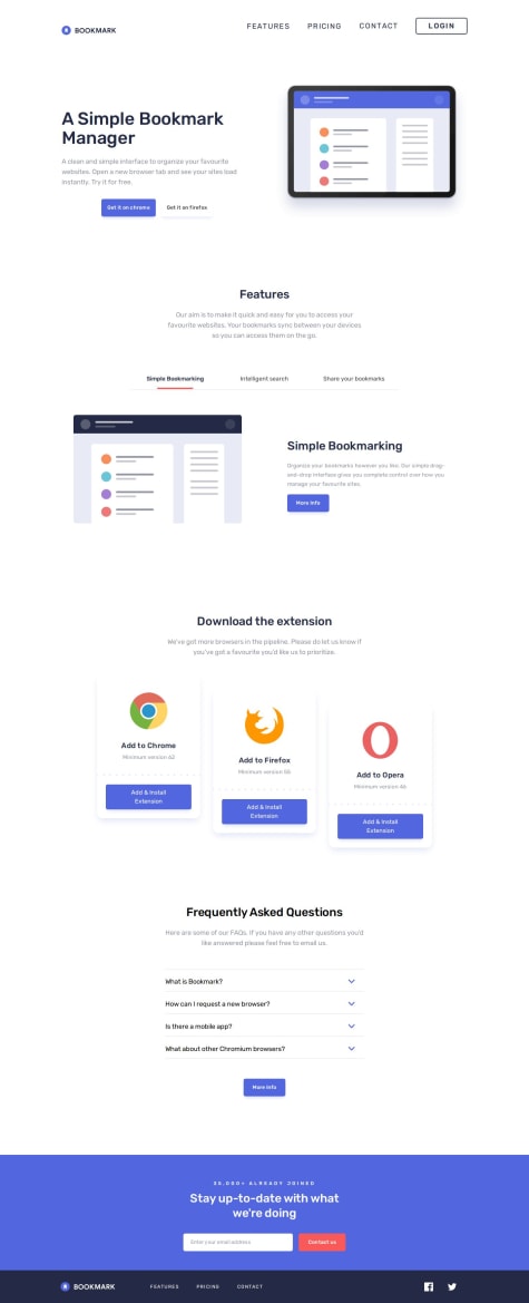
Responsive bookmark landing page
#framer-motion#react#react-hook-form#typescript#tailwind-cssPSubmitted 3 months agoI need help with adding the background image and text decoration (underline).
Currently, the width of the underline remains constant instead of adjusting dynamically based on the content. I’d appreciate any help in resolving these two issues.
Room homepage
#react#tailwind-css#typescriptPSubmitted 3 months agoI need help in making this page responsive for the screens between 768px and 1024px
Latest comments
- P@nishanth1596
Hi @elingwange, Great work on this! I really enjoyed going through your project. Here are a few suggestions that might help take it even further:
-
Consider using external CSS: You've used internal CSS, which works fine for smaller projects. However, switching to an external stylesheet can improve separation of concerns, make your code more maintainable, and speed up loading times as your project grows.
-
Avoid inline CSS where possible: Inline styles are best used for dynamic or one-off cases. Moving styles into an external file gives you better flexibility and consistency across the site.
-
Use more semantic HTML tags: Tags like <header>, <main>, <section>, and <article> improve accessibility, SEO, and the overall structure of your HTML. For example:
<header> <h1>Simple Omelette Recipe</h1> <p>An easy and quick dish, perfect for any meal. This classic omelette combines beaten eggs cooked to perfection, optionally filled with your choice of cheese, vegetables, or meats.</p> </header> <main> <!-- all content here --> </main> <footer> Challenge by Frontend Mentor. Coded by Evan Fang. </footer>- Update your README.md: It might seem like an extra step, but a clear README can really make your project stand out. It shows professionalism and helps others understand your work quickly.
Keep up the awesome work, you're doing great!
Marked as helpful -
- @bhuvi819381P@nishanth1596
Hi @bhuvi819381, You're doing a fantastic job, really impressive work so far! I had a few small suggestions that might make the experience even better:
- The card hover transition feels a bit slow, slightly increasing the speed could make it feel smoother and more responsive.
- It looks like the cursor: pointer might be missing on the buttons. Adding it would improve the UX subtly but noticeably.
- You could consider adding a reducer to remove an item from the cart when its quantity drops below one. This would add a nice real-life touch to the cart functionality.
- Adding a small notification (like using react-hot-toast library) when items are added, updated, or removed from the cart could enhance the user experience even more and it's quick to implement!
- Also, there seems to be some inconsistency in the styling of the "Delete" button for cart items, a bit of padding and visual alignment would make it look more consistent and polished.
Overall, really solid work, just a few refinements and it’ll feel even more polished. Keep it up!
Marked as helpful - @DyaC-703What are you most proud of, and what would you do differently next time?
I improved my understanding of box-sizing: border-box for consistent layouts and practiced using object-fit: cover to handle responsive images without distortion.
What challenges did you encounter, and how did you overcome them?Maintaining the aspect ratio of images inside containers was tricky at first, but using object-fit: cover solved this issue effectively.
What specific areas of your project would you like help with?I’d appreciate suggestions on optimizing my CSS for better maintainability and performance.
P@nishanth1596Hi @DyaC-703, Great job, the design is clean, semantic, and well-organized!
A few small suggestions to make it even better:
- Simplify the layout if possible: If you're not styling the image wrapper specifically, you can simplify the structure like this:
   <main class="container">
     <img src="./images/image-product-desktop.jpg" alt="Perfume Bottle" class="product-image" />
     <div class="product-info">...</div>
   </main>


.container {
  display: flex;
}
But if you need more control over image sizing or layout ratios, wrapping the image in a .card-image div is still a good idea.
-
Avoid redundant class names: If .container and .product-card are applied to the same element and not reused separately, you can consolidate them into one class to keep things simpler.
-
Make price info more semantic: You could wrap the pricing section in a <p> or semantic container for better structure:
<p class="price"> <span class="discount-price">$149.99</span> <span class="original-price">$169.99</span> </p>- Consider mobile-first development: It’s generally easier to start with a simple mobile layout and scale up using min-width media queries. This also leads to more maintainable CSS as the project grows.
Overall, great work! Just a few tweaks here and there to make it even more awesome. Keep building
Marked as helpful - P@gkuzivamWhat are you most proud of, and what would you do differently next time?
Learning state management using Signals
What challenges did you encounter, and how did you overcome them?Understanding Signals, I overcame this by doing tutorials.
What specific areas of your project would you like help with?Coming up with a mobile version as an improvement.
P@nishanth1596Hi @gkuzivam Great work on the implementation, your effort really shows! 👏 I’d love to share a few suggestions that might help improve the project further:
-
Tagging: I noticed the project is built using Angular, but it’s tagged as React. Since I'm reviewing this as part of my learning path (which includes React projects), it showed up on my list. This can be a bit misleading for reviewers and learners following a specific stack. Correct tagging will help others find and evaluate your project more effectively.
-
Responsiveness: I'd recommend adopting a mobile-first development approach. It's generally simpler to build for smaller screens first and scale up. For example:
- Start with grid-template-columns: 1fr for mobile.
- Adjust to grid-template-columns: repeat(3, 1fr) for tablets.
- Scale further for desktop as per your layout needs. This way, responsiveness becomes more structured and easier to manage.
- Transitions: Most of the transitions in your project feel very fast and linear. Adding a slight transition duration, something like
transition: all 0.3s ease-in-out;can make interactions feel smoother. Whether it's a color change or icon shift, this subtle improvement enhances the user experience noticeably.
- Cursor Pointer: For interactive elements like the increase/decrease buttons in the cart, consider adding cursor: pointer;. This small detail improves UX by visually indicating clickable elements.
Overall, it’s a solid foundation, with a few tweaks, it’ll feel much more polished. Keep up the great work! Let me know if you’d like help with the CSS structure if it were React, I’d be happy to walk through it!
-
- @okhaled11P@nishanth1596
Hi @okhaled11, You've done a great job implementing the tip calculator using HTML, CSS, and JavaScript, it looks clean and functional. I really appreciate the effort you’ve put in. Here are a few friendly suggestions that could help polish the project further and bring it closer to a professional standard:
-
Tagging: Since this project is built using plain HTML, CSS, and JS, tagging it as a React project might be a bit misleading. Updating the tags accordingly could help others find it more accurately.
-
Documentation: Adding a short README or usage guide, even if minimal, makes a big difference. It signals that you care about code clarity and makes it easier for others to understand and test your work.
-
Reset Button Behavior: Currently, the reset button calculates the result. Typically, a reset button is expected to clear all input fields and set values back to default. You might consider renaming it or adjusting the logic to match the label.
-
Active Tip Highlight: There’s no visual indication of which tip percentage is selected, which can slightly impact the user experience. Adding an active class for the selected tip can help users better understand their selection at a glance.
-
Semantic HTML: Using semantic tags like <header>, <main>, <section>, etc., instead of generic <div> elements, improves accessibility and SEO. For example:
<header class="header">
  <span>SPLI</span>
  <span>TTER</span>
</header>
This gives better structure and meaning to your layout.
Again, great work overall, you’re definitely on the right path. Keep coding and refining, and your projects will keep getting stronger!
-
- @bccpadgeWhat are you most proud of, and what would you do differently next time?
The only thing I would do differently, is use React and Tailwind CSS.
What challenges did you encounter, and how did you overcome them?N/A
What specific areas of your project would you like help with?All feedback is welcome and greatly appreciated.
P@nishanth1596Hi Rebecca! Excellent work on this challenge! 🎉 It’s really impressive how semantic and accessible your HTML is! The transitions and animations look super smooth, Im definitely going to steal a few of these ideas for my next challenge 😉
My few suggestions are; 1.Decorative Image Optimization Since the illustration is decorative, you can simplify the markup by removing the <figcaption> and aria-hidden="true". An empty alt attribute (alt="") is enough to hide it from screen readers
  <figure class="productive__banner">
          <img class="intro__img" src="./assets/images/illustration-2.svg" alt="" aria-hidden="true">
          <figcaption class="visually-hidden">Image doesn't need a caption</figcaption>
        </figure>


<figure class="productive__banner">
          <img class="intro__img" src="./assets/images/illustration-2.svg" alt="" >
</figure>
2.Improving Tablet Layout UX For tablet screens, consider adding more horizontal padding and constraining the width of the input and button fields. Centering them would improve the overall visual balance. This is also where using React (or any component-based UI library) could shine, you only need to update the button/input styles once, and it would reflect everywhere!
Again, great job! Keep up the amazing work and keep pushing yourself with more advanced setups like React, you’re clearly ready for it! 🚀
Marked as helpful


