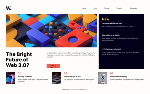
Responsive Full News Page project

Solution retrospective
That completed the first project that was a full page not just a single element. Only part that took a bit of research was how to make the sidebar nav properly slide in and out smoothly due to it not being able to animate switching in and out of display:none so needing to add a few extra lines to make it work.
What challenges did you encounter, and how did you overcome them?Only part I was not sure about was there not being anything that seemed like could single it out to be THE h1, I settled with making one for the Headline section and have it visually hidden to function as a Landmark for Screenreaders.
Also feel like may have made a mistake on the mobile layout due to the nav not being visible til press the button which seems like bad design for those using a screenreader, even if said button says so in the image alt text.
I originally tried having the sidebar active at all times but hidden visually til click to act as the nav for both layouts for screenreader usage with the header nav being hidden from SR but that runs into issue of invisible tab navigation targets so eventually changed it.
Please log in to post a comment
Log in with GitHubCommunity feedback
- P@TranDanh1122
that good, but you have some problem
- spacing need improve
- padding need improve
- need to set max-width to you content, not body (that trick like .container in bootstrap), makesure body always 100% height and width
- refactor code if you have time, i feel hard a bit when try to understand your css file
- overlay of sidebar in mobile no need to move, it need position fixed and 100% width and height
- you can review my solution, maybe it helpful
Marked as helpful
Join our Discord community
Join thousands of Frontend Mentor community members taking the challenges, sharing resources, helping each other, and chatting about all things front-end!
Join our Discord