Not Found
Not Found
Not Found
Not Found
Not Found
Not Found
Not Found
Not Found
Not Found
Not Found
Not Found
Not Found
Not Found
Not Found
Not Found
Not Found
Not Found
Not Found
Not Found
Not Found

Submitted

bootstrap 5 and javascript for responsive page landing

#bootstrap#jquery
Eji Cyril Arinze• 220

@Cyril-Arinze

Desktop design screenshot for the Intro section with dropdown navigation coding challenge

This is a solution for...

  • HTML
  • CSS
  • JS
2junior
View challenge

Design comparison


SolutionDesign

Solution retrospective


First, I would like to start by saying this is a really great challenge. I am a beginner who just started learning web development(html and css) a few months ago. i still have alot to learn as this challenge which appeared easy at first took me to long to complete esp the responsive part which i think is a flaw on this project of mine. generally i am happy about the outcome and will practice to improve.

Community feedback

Mohamed Ehab• 350

@Programming-School-Pro-Coding

Posted

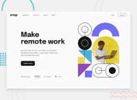
Very Amazing Work Sir

Congrats on finishing this project

I have some suggestions:

  1. make the padding of the buttons are equal Because the button may be not cool
  2. remove the style closing tag
  3. the the outer section tag a outer main tag
  4. make all alt attributes have a content for the readers

Do you understand ?

I may help you with my suggestions

Marked as helpful

1
P
Chamu• 12,970

@ChamuMutezva

Posted

Frontend Mentor challenges are arranged from Newbies which are the easier ones to Guru which are more complex. For people new to coding i encourage to start with the newbie challenges and work your way up after getting feedback from the slack channel and/or this site.

  • interactive elements such as buttons and anchor elements should have readable text, that is for the benefit of assistive technology users - they need to know the purpose/functions of the interactive element.
  • the first heading element of a site should be an h1 element and for best practice a site should have only one h1 heading element with heading elements in sequential order without skipping headings.
  • duplication of code especially in your html where you have content for mobile and another for desktop is not the best practice for Responsive web design - view your code with the css commented to see the structure of your html.
  • while bootstrap is an awesome library, it is something that you need to use when you are really comfortable with the basic css
  • in general the site is responsive

Marked as helpful

1

Eji Cyril Arinze• 220

@Cyril-Arinze

Posted

@ChamuMutezva Thank you for your feedback. i really appreciate and i promise to improve.

0

Please log in to post a comment

Log in with GitHub
Discord logo

Join our Discord community

Join thousands of Frontend Mentor community members taking the challenges, sharing resources, helping each other, and chatting about all things front-end!

Join our Discord