


@shubhamthedev
Posted
Hi, the design looks great in my opinion specially the way you nailed responsiveness is great even i wasn't able to do that on this project. Some suggestions that i would make:
-
The font sizes seem to be a little to small specially on bigger screens.
-
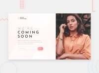
The hero image looks a tad bit thin in the final design.
-
The mobile version of the site has a blank space on the top for some reason and I'm not sure if it's my browsers fault or not, since i read the code and couldn't figure out where that space is coming from.
-
You should color font inside the input element to pink.
-
Lastly you should fix the accessibility issues which i wouldn't say much about because i make those mistakes myself.
Those were some of my suggestions. Keep working hard and Happy Coding 👨💻.

