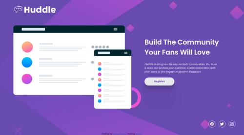
Submitted about 3 years agoA solution to the Huddle landing page with a single introductory section challenge
Build with SCSS and flex, media queries for mobile design
sass/scss

@RadeQu
Solution retrospective
Any advices is welcome :)
Code
Please log in to post a comment
Log in with GitHubCommunity feedback
- Account deleted
I see some minor mistakes when I compare the original design from your work.
- The brand's logo is too large in the desktop view and maybe add some more margin on top
- The text should'nt be italic.
- Button text should be lighter and should be increased a bit.
- The social icons' lose its padding in mobile view. I think it should be a fixed value.
- I think the original design is wrapped inside a container because the text and social icons are aligned.
Hope this helps
Join our Discord community
Join thousands of Frontend Mentor community members taking the challenges, sharing resources, helping each other, and chatting about all things front-end!
Join our Discord