Not Found
Not Found
Not Found
Not Found
Not Found
Not Found
Not Found
Not Found
Not Found
Not Found
Not Found
Not Found
Not Found
Not Found
Not Found
Not Found
Not Found
Not Found
Not Found
Not Found

Submitted

Built with React + Redux + Styled Components
@AgataLiberska

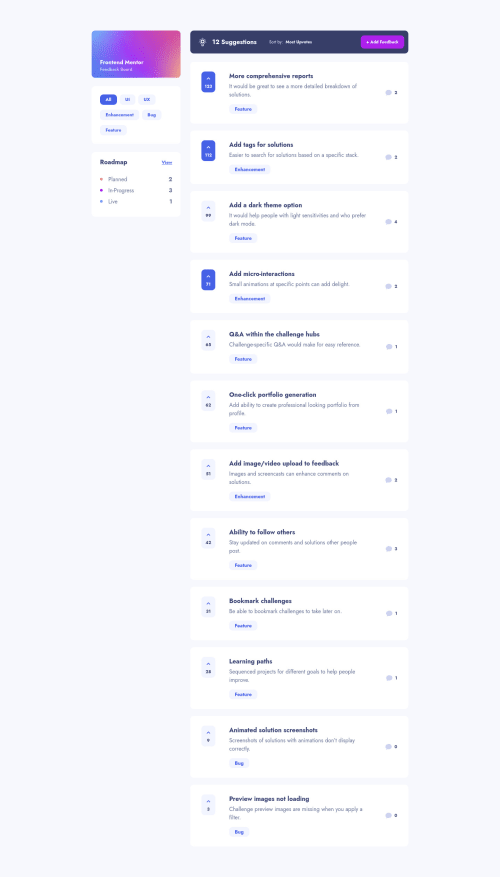
Desktop design screenshot for the Product feedback app coding challenge

This is a solution for...

  • HTML
  • CSS
  • JS
5guru
View challenge

Design comparison


SolutionDesign

Solution retrospective


I wanted to use this project to practise Redux with React. I feel like my file organisation isn't great (I went through a Udemy course and the Redux tutorial and kind of ended up with a mix of the two suggested systems which I'm not sure is the optimal way). The project was very challenging at some parts but I think I learnt quite a lot, and I'm planning to do another take of this challenge, this time with async operations. And of course, I am yet to write up a nice readme, please don't hate me for it. Anyway, any comments on functionalities, or the code are welcome. Thank you!

Community feedback

Jay 695

@Junjiequan

Posted

Hello, Agata.

I am currently also working on this challenge and I have to say this one is tough. You did really nice work on this solution.

Here are some issues I have found:

  • Sort by button is slightly shifting on click

  • Scroll prevented?. not able to scroll content.

  • Textarea horizontal resizing breaks out

  • The feedback title in product detail page or to say product commenting page should be unable to click or the link functionality should be prevented. Click the title multiple times causes Go Back button not working properly (have to click multiple times back to make it work).

Hope you find this feedback helpful.

I took some time to check your solution as you were the first person who gave me feedback on my early solution and I am always grateful for that :)

Marked as helpful

3

@AgataLiberska

Posted

@a331998513 Hi Jay! Thank you!

I've corrected the scroll issue - it was an accident from when I was on a long journey to fix horizontal scroll caused by the mobile nav :D

Thanks for pointing out the textarea issue - you totally blew my mind, I had no idea resizing it was a thing!

I've added a conditional wrapper to that link now as well, so it will not be a link on the details page, thanks for pointing it out :)

I'll correct the focus styles now as well - I added the border when working on the form and took care of that size shift there, so that sorting button was a total overlook on my part! Also I definitely have used box shadow for focus styles before, no idea why I didn't think of it now - I think I was too focused on React stuff :)

Anyway, very happy to hear I could help you out before, and thank you for taking the time to look through my solution and leave feedback, I really appreciate it! :)

1
P

@emestabillo

Posted

Hey Agata, congrats on this project! Looking good and functions well. I’m viewing everything on mobile and the menu appears behind the comment cards. I’m also seeing a horizontal scroll, I’m not sure where it’s coming from since I’m ios only right now. Planning to take a look at the codebase tonight as I’m also eyeing this project and could take a few pointers from you lol. Great job!

Marked as helpful

1

@AgataLiberska

Posted

@emestabillo yeah someone pointed the same thing to me on Twitter, I'm trying to fix it now and I am literally screaming :D

1
P

@emestabillo

Posted

@AgataLiberska Lol! Seems like overflow: hidden on body should do it 😊

1

@AgataLiberska

Posted

@emestabillo yeah I thought so but it doesn't seem to be working... I've positioned the body, too - someone somewhere suggested that may be causing the issue. I'm thinking I should just animate from display none to display block at 1%, and then move it in from the side - but that would add a scrollbar for a second as well I think.

1
P

@emestabillo

Posted

@AgataLiberska Odd, checked on desktop and I tried the overflow trick. Seemed to work against the horizontal scroll. I’d like to see if you’ve pushed changes. I’m really curious now lol.

1

@AgataLiberska

Posted

@emestabillo weird, it doesn't work for me at all. I've pushed the changes now if you want to look, I've been trying different things in different places, but I think finally the only changes I pushed were adding z-index to the hidden menu and overflow and position on the body

0
P

@emestabillo

Posted

@AgataLiberska Took a closer look at the menu. Have you tried:

  • hide the overflow on body only when the menu is open, otherwise, default to auto. Jay is correct that we can't scroll down on the index page.
  • change the menu to fixed instead of absolute

If that doesn't work, I would even try to change the width from 0 to 17 rem when the menu is open.

1

@AgataLiberska

Posted

@emestabillo Yeah I've noticed the no scroll the next time I sat down to it, already changed it to overflow-x but that didn't do much (other than allowing scrolling). I've managed to animate it in nicely, but on closure it just disappears (I know why it does that, just can't figure out an alternative that doesn't cause horizontal scroll).

Thank you for suggesting position fixed though, I was really struggling with how to set the body to not scroll when the nav is open - this kind of helps, for now at least.

I feel it's good enough for now, just going to look at the suggestions that Jay posted below and correct those and leave it for a bit and do something else, and then come back and maybe try to use context to fix that menu, I don't know :D

Anyway thank you so much for all of your suggestions above, they really helped me!

1
Jay 695

@Junjiequan

Posted

@AgataLiberska The reason overflow-x doesn't work is because you didn't set position:relative to parent element.

In your case you set position:absolute to your mobile navigation bar but it didn't attached to any parent element with position:relative. So if you want the overflow-x work for your nav menu you have to set it on html{ overflow-x:hidden} or { position:relative; overflow-x:hidden } to right above parent element

  • Solution1 : GlobalStyle add :root { overflow-x:hidden}
  • Solution2 : add position:relative to HomePageContainer
1

@AgataLiberska

Posted

@a331998513 Thanks Jay, I'll try that :)

0

@AgataLiberska

Posted

@a331998513 Okay so now I have a question, how does it work lol :D I know I didn't have a position:relative to start with, and the position of the menu was then relative to the root. But when I started removing overflow from the body, I did position it relative and it literally made no difference. Does it need to be a more direct / closer parent?

Either way thank you so much, it worked like a charm! :)

0
Jay 695

@Junjiequan

Posted

@AgataLiberska

What I can think of is because body didn't have explicit width. So, I assume overflow-x:hidden is actually applied, but you can't tell as there's no specific width attached to it.

That's just my guess :D and happy to help :))

1

@AgataLiberska

Posted

@a331998513 ohh yes that makes sense! Thank you!

0

Please log in to post a comment

Log in with GitHub
Discord logo

Join our Discord community

Join thousands of Frontend Mentor community members taking the challenges, sharing resources, helping each other, and chatting about all things front-end!

Join our Discord