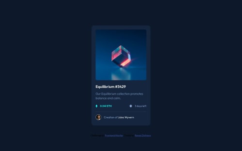
Skip to content
  • Unlock Pro
  • Log in with GitHub
Solution
Submitted about 2 years ago

Card NFT responsive using Flexbox and the method Mobile-first

Renzo Dichiara•50
@rendichiara5
A solution to the NFT preview card component challenge
View live sitePreview (opens in new tab)View codeCode (opens in new tab)

Solution retrospective


ENGLISH I would be very grateful for any kind of correction and any advice, I am new in the world of programming. I was able to make this design with guides that I was finding on the internet. I would appreciate your support, thank you.

SPANSIH Agradecería mucho cualquier tipo de correción y cualquier consejo, soy nuevo en el mundo de la programación. A éste diseño lo pude hacer con guías que iba encontrando en internet. Agradecería mucho tu apoyo, gracias.

Code
Select a file

Please log in to post a comment

Log in with GitHub

Community feedback

  • Fer•3,970
    @fernandolapaz
    Posted about 2 years ago

    Hi 👋🏻, some of this may interest you for future projects:

    • Skipping heading levels can be confusing and should be avoided whenever possible (start from <h1>, followed by <h2> and so on).
    • The icons are decorative and therefore need an empty alt attribute to be ignored by screen readers.
    • When there is a hover state over an element it means that it is interactive, so there must be an interactive element around it (like a link or a button). So, the image should be wrapped with <a> or <button> (depending on what happened when clicking on it), and also 'Equilibrium #3429' and 'Jules Wyvern' should be wrapped with the <a> tag.
    • You could also use flexbox to center the content of the page:
    body {
    min-height: 100vh;
    display: flex;
    flex-direction: column;
    justify-content: center;
    align-items: center;
    }
    

    And removing the margin from the 'main-container'.

    • Think about using relative units since they are better for scalable layouts. Something simple to start with would be to convert to rem (1 rem equals 16px by default), consider this suggestion especially for the font-size.

    I hope it’s useful : )

    Saludos,

    Marked as helpful
  • Aimal Khan•2,260
    @Aimal-125
    Posted about 2 years ago

    Bro use flex box and don't use absolute units on your main container. Use % units. And horizontal scroll is appearing on my laptop device. To remove x and y scrolls use % units.

    Hermano, use la caja flexible y no use unidades absolutas en su contenedor principal. Utilice unidades de porcentaje. Y el desplazamiento horizontal aparece en mi dispositivo portátil. Para eliminar los desplazamientos x e y, use unidades de %.

    Marked as helpful

Join our Discord community

Join thousands of Frontend Mentor community members taking the challenges, sharing resources, helping each other, and chatting about all things front-end!

Join our Discord
Frontend Mentor logo

Stay up to datewith new challenges, featured solutions, selected articles, and our latest news

Frontend Mentor

  • Unlock Pro
  • Contact us
  • FAQs
  • Become a partner

Explore

  • Learning paths
  • Challenges
  • Solutions
  • Articles

Community

  • Discord
  • Guidelines

For companies

  • Hire developers
  • Train developers
© Frontend Mentor 2019 - 2025
  • Terms
  • Cookie Policy
  • Privacy Policy
  • License

Oops! 😬

You need to be logged in before you can do that.

Log in with GitHub

Oops! 😬

You need to be logged in before you can do that.

Log in with GitHub

How does the accessibility report work?

When a solution is submitted, we use axe-core to run an automated audit of your code.

This picks out common accessibility issues like not using semantic HTML and not having proper heading hierarchies, among others.

This automated audit is fairly surface level, so we encourage to you review the project and code in more detail with accessibility best practices in mind.

How does the CSS report work?

When a solution is submitted, we use stylelint to run an automated check on the CSS code.

We've added some of our own linting rules based on recommended best practices. These rules are prefixed with frontend-mentor/ which you'll see at the top of each issue in the report.

The report will audit all CSS, SCSS and Less files in your repository.

How does the HTML validation report work?

When a solution is submitted, we use html-validate to run an automated check on the HTML code.

The report picks out common HTML issues such as not using headings within section elements and incorrect nesting of elements, among others.

Note that the report can pick up “invalid” attributes, which some frameworks automatically add to the HTML. These attributes are crucial for how the frameworks function, although they’re technically not valid HTML. As such, some projects can show up with many HTML validation errors, which are benign and are a necessary part of the framework.

How does the JavaScript validation report work?

When a solution is submitted, we use eslint to run an automated check on the JavaScript code.

The report picks out common JavaScript issues such as not using semicolons and using var instead of let or const, among others.

The report will audit all JS and JSX files in your repository. We currently do not support Typescript or other frontend frameworks.

Oops! 😬

You need to be logged in before you can do that.

Log in with GitHub

Oops! 😬

You need to be logged in before you can do that.

Log in with GitHub