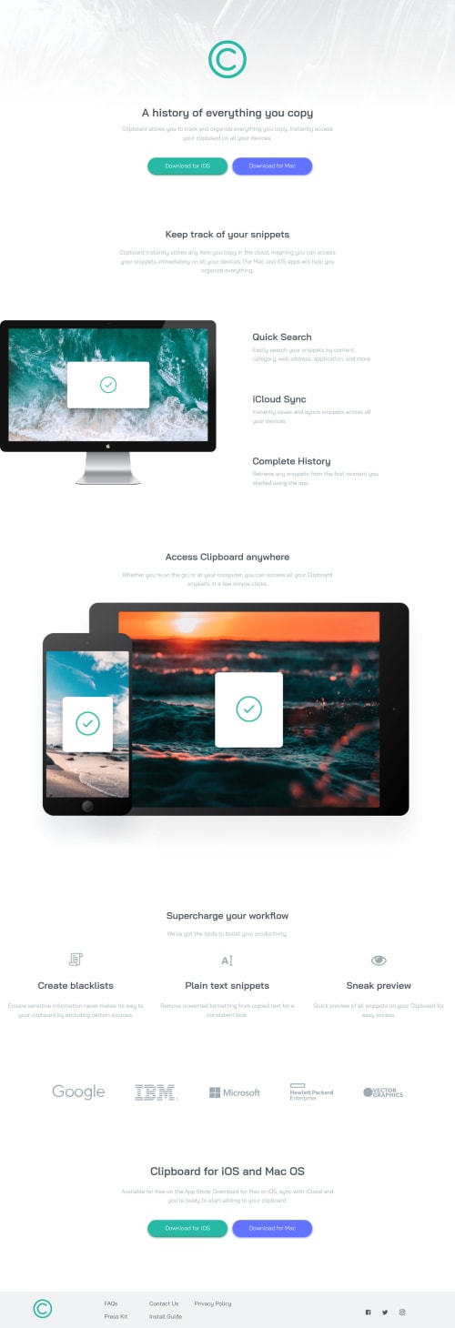
Clipboard landing page with scss, flexbox and grid

Solution retrospective
Hi, here with other challenge of this plataform.
In general i want that someone give me tips for improve my sass code.
I do my best trying to make it the closer as possible with the design, i used sass, if someone can show that and say me how i can improve the sass code will be great, and in general best practices also be great.
Any other feedback always is helpful, have a nice day guys <3
Please log in to post a comment
Log in with GitHubCommunity feedback
- @RocTanweer
This is what codercoder at YouTube taught me. Hope this confirms that my help is relevant 🤠
$breakPoints : ( 'small' : 24rem, 'medium' : 40rem, 'large' : 64rem ); @mixin responsive($size) { $breakPoint : map-get($breakPoints, $size); @media(max-width : $breakPoint) { @content }; };Hope it helps(happy coding..!)
- @RocTanweer
Ah yes about sass....I love it Lol Watch Sass tutorial of 2 hours with a project to understand basics of sass on freecodecamp YouTube channel
You can also read documentation...it's pretty simple
Hope it helps
- @RocTanweer
There are some minor issues but overall great 👌 work really @Ippotech
Keep coding and happy coding 😉
- @chrisbailey85
I'm only just getting started sass myself but I think as a best practice you shouldn't use capital letters on your class names, it makes it a bit more difficult to read. I also just learnt about something called BEM, which is a set of rules for when writing classes, it looks like you were using it in places but I did only learn about it today so I wasn't 100% sure.


Join our Discord community
Join thousands of Frontend Mentor community members taking the challenges, sharing resources, helping each other, and chatting about all things front-end!
Join our Discord