Clipboard Landing Page with Vanilla CSS

Solution retrospective
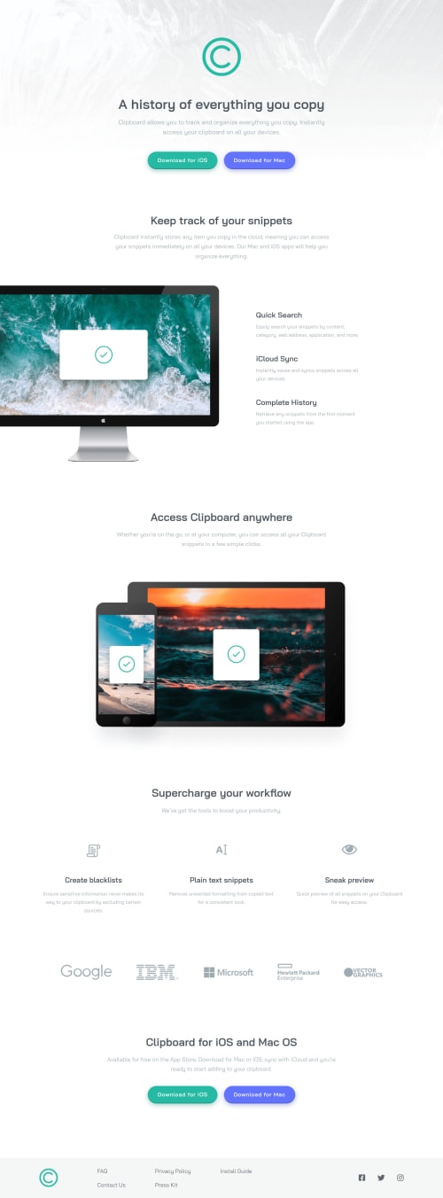
This is my first Junior challenge completed! ^^ I'm more or less satisfied with the final result but I had a hard time coming up with a nice-looking layout for medium screen sizes and I feel like I had to use one or two small "hacks" to make things look like how I wanted. I sometimes felt a bit frustrated and confused about the length of this design, as so far I only did smaller components, but I'm sure this is something I'll get used to ^^
Pretty please give me your honest feedbacks about it, I'm sure there's plenty to improve on my html, how I organised my code and on these small "hacks". One of these hacks was how I aligned the feature divs in the workflow section. The images are not the same width and height, which made the text look all over the place. The only solution I could came up with is to set a fixed height for the image holder divs, but I'm sure there's a more elegant way to do this (probably it's just my lack of knowledge of flexbox).
I'd appreciate it if you take time to look at my work. Have a lovely day everyone! :)
edit: After looking at the report, I'd like to ask, do I need to provide an alt for all images even if I set aria-hidden for them?
Please log in to post a comment
Log in with GitHubCommunity feedback
- @ChamuMutezva
aria-hiddencan be applied to any other elements while the alt is intended for images - @hafizanadli
What a nice solution, it survive at all screen size.
You just forgot to add alt attribute in img tag.
Great job!
- @Azkanorouzi
it looks pretty nice , good job 🥳


Join our Discord community
Join thousands of Frontend Mentor community members taking the challenges, sharing resources, helping each other, and chatting about all things front-end!
Join our Discord