


@pikapikamart
Posted
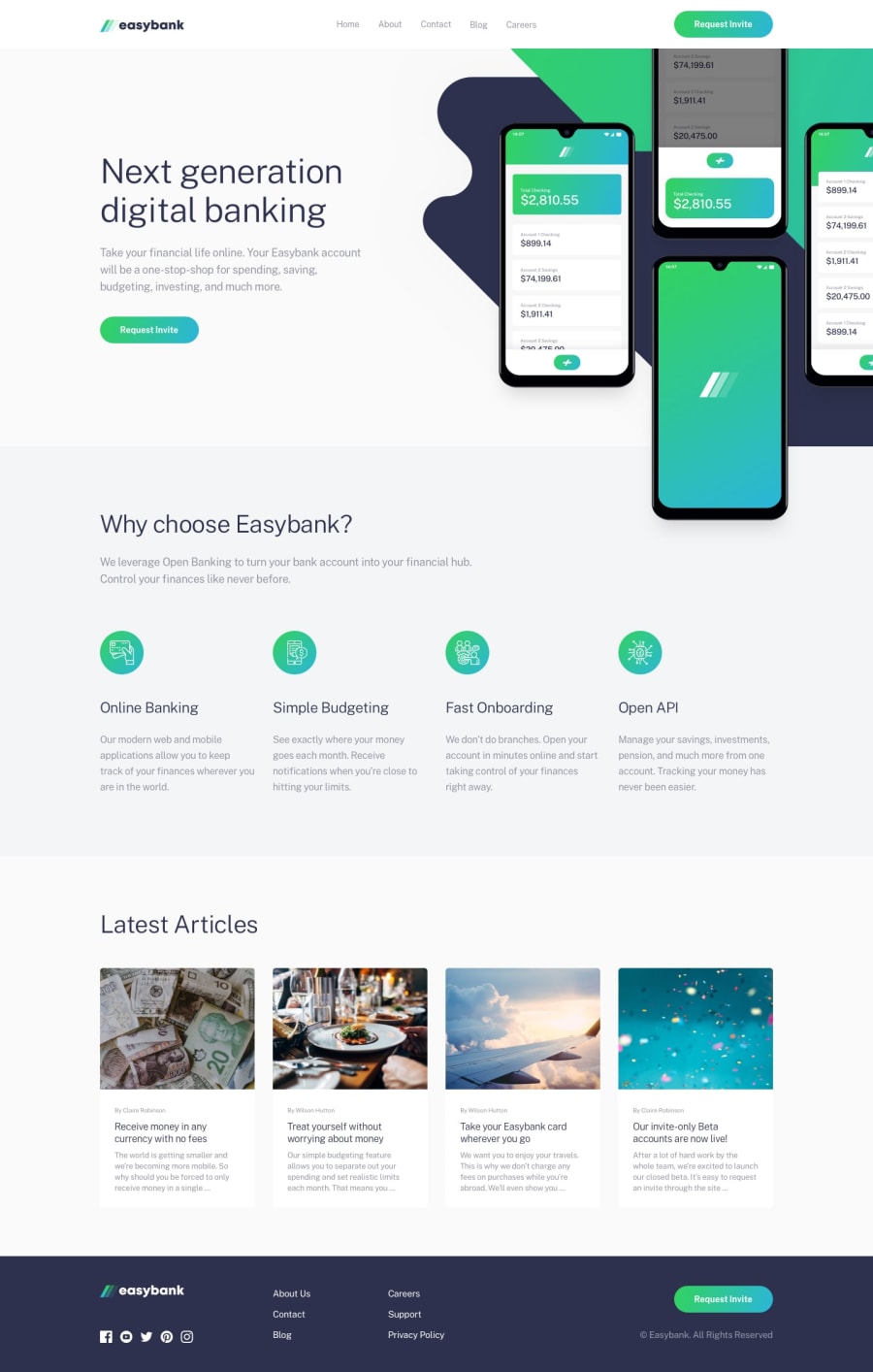
Hey, great work on this one. I like that animation on the hero section. Okay, for the desktop layout it is good, resizes fine although the hero-image gets hidden. The mobile layout is good.
Some suggestions would be:
- The website logo in the
header, theatag should usearia-label="homepage" so that when users navigate in that link, assistive tech will anounce the phrasehomepage link`, this will inform the user that this is a homepage link. - The website logo, the
imgshould usealt="easybank"as the attribute. Avoid adding words that relates to "graphic" like "logo, image, icon.." as a value onalt. - Navbar links is not showing.
- The hero background is not appearing, change the
::beforebackgroundvalue with thisbackground: url(../img/bg-intro-desktop.svg) no-repeat;. - Adding
alton the hero image is nice, but I thinkphonealone is not descriptive, maybealt="easybank phone app". alton the icons in thewhy choose easybanksection could be left empty since those are just decoration.- On the article section, since you are adding like a
cursor: pointerto thearticleitself and treating it as an interactive element, what would make it better is to wrap the wholearticleinsideatag. This way, the interaction that you add makes more sense. Because if you add an animation interaction to an element that doesn't do anything, what good would it add, right? But I like the hover effect:> - On the
articlethe title of the article should be a heading tag, if thearticleis wrapped in theatag. - On the
footer, website logoatag should usearia-label="homepage"as well. - The
svgof the website logo in thefootershould have atitleelement inside it with a text:
<title> easybank </title>
This is like a alt but for svg's.
-
The six links in the
footershould be wrapped inside anavsince those are navigation links like the ones on theheaderelement. -
On mobile layout, the hamburger menu should use
buttoninstead ofdiv, this will make it accessible. Also include aaria-label="hamburger dropdown toggler"on it. Also add aaria-expandedattribute with it, you should use javascript to toggle thearia-expandedattribute to eithertrueorfalse. This will inform a user that a dropdown has been expanded.
Aside from those, really great work.
Marked as helpful
@zaraag92
Posted
@pikamart thanks so much your feedback.
I fixed all the problems and going to update them. Really appreciate your time and all the suggestions, it really helped me.

