


@eTyradelli
Posted
Hi @nawfelsekrafi,
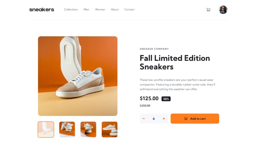
Very well done! The cart functionality works as it should and the layout looks great on all screens.
Now the neat-picking part. Here's a couple of things that I think can take it up a noch:
-
On smaller screen-sizes where the mobile menu kicks-in, it seems like the default state of the menu is to be open. So when the page loads on small screens, or when I resize the screen, the menu is open and hides everything.
-
While on the mobile menu subject, instead of display:none to hide it, try transform: translateX(-100%) or something like that. That way you can add a transition effect, plus it takes less power for the browser to load it, so the transition will be smoother. Here's an informative video on which properties to animate for better performance: https://www.youtube.com/watch?v=N5EW4HnF6FU
-
Expanding on no2, a few CSS animations and/or transitions here and there would make the design really shine. For example, on the mobile menu as it opens and closes, on the cart modal as it opens and closes, on the img slider, or even on the hover state of the Add to cart button.
Overall, great work!
Cheers!
Marked as helpful
@nawfelsekrafi
Posted
Thanks Eleana, this is very helpful & organized comment ❤, for transition I am a little bit wanned to just submit the solution as fast as possible after two days 😅, It would be nicer if I add animations.
@eTyradelli
Posted
@nawfelsekrafi I know the feeling! :D

@tkressma
Posted
@eTyradelli I'd just like to thank you for sharing that youtube video! That is a super useful resource.
Also, @nawfelsekrafi, great solution! This one is a bit tricky - I'm still working on it myself!

@ahmedzrig
Posted
very good . well done . @nawfelsekrafi
@nawfelsekrafi
Posted
thanks @ahmedzrig

