


@EmmanuelOloke
Posted
Hello @WilberkLedezma, great work on this challenge, you've got the mobile view implementation absolutely spot on.
Just some observations I made and will like to bring to your notice:
-
When I view the solution on a widescreen monitor, the whole page content is aligned to the left of the screen. I think central alignment on the page will look much better.
-
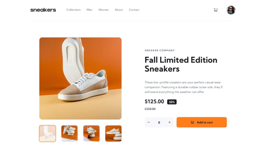
On the Lightbox thumbnails styling, according to the design files, there should be some opacity on the thumbnail image as well as an orange border/outline when a particular thumbnail is clicked. With you solution, the opacity and border show only onClick and disappears afterwards.
-
When I increase the item quantity and click on the Add To Cart button, the cart icon badge in the navbar only changes to 1 instead of the quantity selected. I think using State Hooks and ContextAPI in ReactJS can help solve this issue.
Overall, awesome job with the challenge. Thanks.
Marked as helpful
