Equalizer Landing Page (Vanilla CSS and Custom Hover States)

Solution retrospective
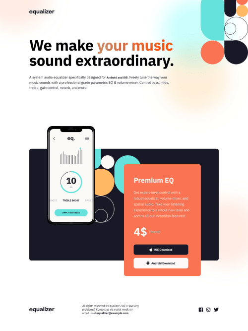
👾 Hello, Frontend Mentor coding community. This is my solution for the Equalizer Landing Page.
I added some features:
- 👻 h1 span: spinning color animation;
- 👾 Phone image on hover;
- 🥰 2 more breaking points;
Feel free to leave any feedback about my design chances and help me improve my solution or make the code clean!
Please log in to post a comment
Log in with GitHubCommunity feedback
- @AdrianoEscarabote
Falaa lucas! tudo bem?
Cara ficou tudo ótimo!
Estava olhando o seu css e está tudo muito bom, gostei bastante dos comentários ajuda bastante na hora de interpretar o código, esse efeito de hover no celular eu não faço ideia de como você fez auahhauh
A única coisa que faltou foi usar aquele min.css bolado, pro código ficar pequeninin ahuahuha
Mas o resto está insano, inclusive me deu algumas ideias para usar no meu próximo projeto!
Tamo junto man! 👍
Marked as helpful - P@tarasis
Congrats on another tweaked solution Lucas 🎊
Couple of little things, I'd suggest breaking at 1280px for Desktop so the "sic" of music doesn't overlap the top right image. Particularly because the cycling colour matches that image.
The <br> should be after "All rights reserved © Equalizer 2021"
Mixed feelings about the changing the colours on the phone image. Nice touch but I find it distracting. It becomes a "wait what did I miss", and the pink looks between cyan and orange looks odd. Similar with the equalizer logo at the page top.
The product box does some odd shifts between about 730px & 450px. It compresses and expands, compresses and expands. It gets really thin about 490px. Honesly having so many media queries makes is working against you and gives you more to check/test. (Not that I can comment, I did my middle section incorrectly, so my responsiveness between tablet and desktop sizes is awful. Its always easier to critique others 🤪 )
Would the aria label
aria-label="equalizer app pricing"not be before on the div just before the $4?Particularly given the h & p before the price are to do with pricing.For the social links / images. Should the links not have an aria label on them describing what they are? And the icons not have
aria-hidden=true?This was interesting, not come across
text-decoration-skip-inkbefore./* A elements that don't have a class get default styles */ a:not([class]) { text-decoration-skip-ink: auto; }Given you are using transitions, you should provide a version for those that have
prefers-reduced-motionset.Wishing you all the best 👨💻💜
Marked as helpful - @nonoza
Hi @correlucas.
You will always inspire me to be a better developer. I love the website that you built here. I see on a footer, on an email (equalizer@example.com), you missed an anchor element to make it clickable using a deadlink or you just left it like that?
Thanks, Pretty
Marked as helpful - @Senkuu-Midoriya
Hey Lucas, I love you solution and I can see that you have put a lot of effort into the solution. I love how you tried making it the same as the design, which is would say you have.
I have a few pieces of advice: 1). try adding the same font to the description, because it seems like you haven't changed it there 2). if you add more of a transition to the elements that can be hovered on like the icon links, them we can see how it changes from pink to orange.
Amazing solution as always, aDev👌
Marked as helpful - @denielden
Hi Lucas, congratulations on completing the challenge, great job 😁
Always add a touch of originality to the challenges and you are a great inspiration!
Some little tips for optimizing your code:
- use
maintag to wrap only the main content of the page and to improve the Accessibility...header and footergo from it. For thecontaineryou can use adivinside all tags - instead of using
pxuse relative units of measurement likeremalso for the image size and fonts
Hope this help! Happy coding 😉
- use


Join our Discord community
Join thousands of Frontend Mentor community members taking the challenges, sharing resources, helping each other, and chatting about all things front-end!
Join our Discord