P
@ania221B
Hey ania, I love the solution and how you went about adding the JS and logic.
If I may I have a few pieces of advice, 1). in the responsive mode with the hamburger menu I think you have positioned the items in the hamburger menu at the top right, whereas it is supposed to be in the middle 2). the active animation on the hamburger items is not working perhaps because you used the wrong selector
The overall webpage is superb, and the effort you put into making it can be seen.
Thank you for sharing you webpage with us and allowing us to learn from it, aDev
Hey Lucas, I love you solution and I can see that you have put a lot of effort into the solution. I love how you tried making it the same as the design, which is would say you have.
I have a few pieces of advice: 1). try adding the same font to the description, because it seems like you haven't changed it there 2). if you add more of a transition to the elements that can be hovered on like the icon links, them we can see how it changes from pink to orange.
Amazing solution as always, aDev👌
Hi @Hissue556, I love the little touches that you have added to your website to make it look even better and more like what the design of the website was going for. Don't worry if you are not going on the right path, everyone has a different pace of learning and different things they find difficult, the longer you stick at it the more you will learn, and can teach people. As for the responsive design I would suggest you watch Kevin Powell's take on it, to learn how to properly make responsive designs.
If I may I have 2 key pieces of advice for you, 1). instead of putting a border radius on an image if you put it on the entire components and say an overflow of hidden it will give you the same affect without making the image have a border radius on all sides which would make it look more like the design. 2). I would suggest that you do a lot less gradients on you webpage to make it look cleaner and simpler, which would make it look better overall, without making it look a but less refined, a linear gradients here and there is fine, and I love what you used it for, but for things like the button most of the time, flat color are fine unless you are trying to do it for a specific animation or to make it pop with the flat colors from the rest of the page.
Overall, I think the webpage is amazing and I can't believe that you are still just starting out, the webpage look amazing and you have a real eye for making the designs look even better.
Thank you for sharing you website with us, and I can't wait to see even more of the websites you make and continue to put your own touch on.
Thanks, aDev
Hi @HatimHJ, a wonderful webpage you have got here which look very good. I especially like the logo components next to the actual bar which look almost exactly like the design.
If I may, I have a few pieces of advice: 1). there is a button with go and reset and an input, I am not sure why this is, but I could see how you could implement it into the design, perhaps make it so that the user could use it to say how much storage they have used. 2). add a bit more styling such as a border radius and custom padding, widths, heights, etc. to make the UI a but more good looking, such as on the upload button and the file button where you can add a border radius which would help the design look even better, a bit more styling here and there with better placed out components can make you webpage look even better! 3). add a cursor pointer to the buttons, to make the user know that they can click on it. 4). if you make the size of the icons smaller or make the buttons bigger the design will look much more refined. 5). add the bar with the gradient to the progress bar, this can be done with making the dark blue bar with a div, and inside of that adding the gradient progress bar, and for the circle you add an an after element with a border radius of 50% to make the circle.
I hope this advice helps you, and I can't wait to see more webpages like this with you touch added to it to make it even more usable and functional.
Thanks for sharing you webpage with us and allowing us to learn from it as well, aDev
Hi @agustrinaldokurniawan, amazing solution you have got here, it really does look like the design, and the webpage itself look wonderful. I especially like how you have made the webpage look like the design exactly, which is very hard to do correctly, and my begin a newbie still struggle with that sometimes, I can see all the hard work you have put into the page and it really shows, with the quality of the webpage.
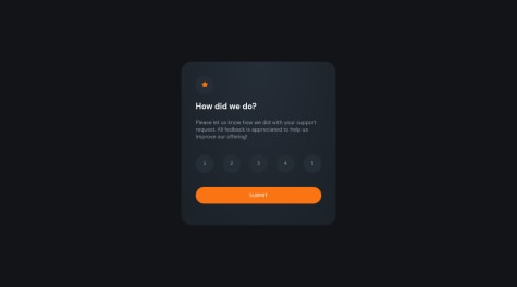
If I may, I have a few little critiques, 1). make the width of the component a bit greater so that it look more even which will make it look slightly better. 2). I am not sure if you have used the correct font family( if you have than it is my mistake, I guess look at code and webpages for too long have made my brain a bit numb :) ), else if you haven't if you do so, it would look more like the design. 3). for the desc below "How did we do" if you adjust the line height of that description, it will make it look more spaced out and a bit more refined, however this is a very small thing, and the website still looks amazing. 4). for the thank you page of the project, if you adjuist the width of where it says you selected __ of 5, it will look more like the design, and a bit more spaced out and overall a bit better. All of these are very little critiques and the website look amazing and almost exactly like the design, which is shown by how little the errors are.
This webpage is amazing and look very wonderful, I can't wait to see more of your amazing creations, and webpages.
Thanks for sharing you webpage with us and allowing us to learn from it, aDev
Hey @nazifbara, amazing website you have got here, I am still working on my rendition of this webpage but what you got here is amazing, and is almost exactly like a design, this shows a lot of skill and hard work that you must have put in to make the webpage, and it has really payed off. I especially love how you have done the box shadows, it really brings out the white just like the design. If I may, I have a few pieces of advice for you: 1). you might want to use different fonts weights as given in the style guide to make the links look better. 2). if you add a transition to the elements of you webpage that have a effect like hover on them it will be a much nicer looking transition to the hover state, etc. 3). if you add a margin or padding to the text or image where it says "A Simple Bookmark Manager" the image will overflow of the screen which is the affect that it has on the design, and if you apply an overflow hidden on the entire body the x-axis scroll bar will go away this can also apply to the other images on the webpage which also require the same type of styling as per the design. 4). on the button for the tabs such as simple bookmarking, if you apply an outline of none, when it is clicked on there will not be an outline which will make the user experience better. 5). on the accordion if you use a ui library like material ui or use some more JS you can make it so that only one accordion can be open at a time so that the user won't have to scroll or open an close the accordion bar manually. 6). for the contact us component if you add a width of 100% the entire width of the webpage should be taken up by that element like in the design.
I loved how you were able to make the accordion and dropdown almost exactly like the design as I am struggling with that, I would appreciate it a lot if you would mind taking the time to explain how you made those two elements, as you seemed to be an experienced developer, and my begin a newbie, the advice that you give would be invaluable to me, and my web dev journey.
Thank you for taking the time to show us your wonderful webpage and helping us learn from it, any advice from an experience dev like you would be appreciated.
Amazing website, aDev