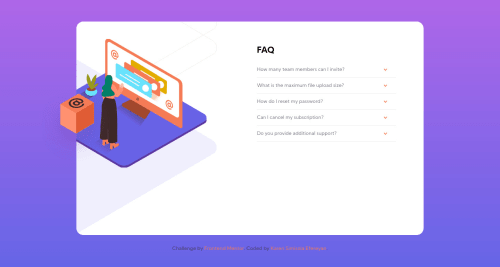
FAQ ACCORDION CARD WITH HTML | CSS | JAVASCRIPT

Solution retrospective
Hey everyone. I've been stuck on this challenge for almost two days now.
I decided to just post how far I've gone and ask for help. Here are my main challenges or things I struggled with:
-
There was a lot of positioning necessary to get the mobile pattern background, the woman and the box in place. I use ::after and ::before in several places and I think I understand it. It was a lot easier to design for desktop first. Making it responsive on mobile gave me the major headache.
-
I'm not sure why, but for a linear gradient background, it didn't fit the entire width of the screen until i made the height a 100vh. Is that a normal phenomenon with linear gradient backgrounds?
-
I would love feedback on what I could have done to make this code more efficient. Also, kindly refer me to any links, books, videos that helped you understand positioning. Thanks
Please log in to post a comment
Log in with GitHubCommunity feedback
- @AgataLiberska
Hi @karenefereyan! I think this challenge is a lot more difficult than it initially looks, so well done for sticking to it!
I'm surprised to hear that going from desktop to mobile was easier for you as most people (myself included) find the opposite to be true - for me it's easier to do the mobile version and then move elements around on larger viewports. But hey whatever works for you :)
Hope this helps, happy coding!
I think this video does a good job of explaining the position property. And of course, trial and error helps a lot too!
I noticed a few visual issues: first, with the container height set to 80% I get a lot of empty white space on the bottom of the card. May be a good idea to look at that. You could also look at your media query breakpoints - on tablet size, elements are getting cut off a little bit. And on wider mobiles, the image of the woman is not quite centered on top of the card. A great way to center an element positioned absolutely is to offset it from one side by 50% - so here it could be
left: 50%;. This will put the left edge of the element in the very middle of the parent (the one with position other than static). Then to move it back to where it's actually centered, settransform: translateX(-50%);- you move it back by half of its own width.And last but not least - the main issue here really is accessibility. I can't toggle the accordions with keyboard and in general it would be good to make the clicking target a bit bigger than just the arrow. Check out this article about accessible accordions, it helped me quite a lot
- @karenefereyan
This detailed feedback is so helpful. Thanks Agata. I always felt comfortable designing for mobile screens too.
I think I'll have to take another shot at this going step by step. I've watched that video from webdev simplified when I started this challenge but I'll have to do that again.
Could you please explain what you mean by you couldn't toggle using your keyboard? I'm still trying to make my solutions as accessible as possible

Join our Discord community
Join thousands of Frontend Mentor community members taking the challenges, sharing resources, helping each other, and chatting about all things front-end!
Join our Discord