Submitted over 4 years agoA solution to the Four card feature section challenge
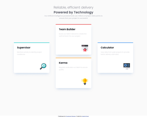
Four Card Feature Section

@thexeromin
Solution retrospective
Hello Everyone, can anyone give me some feedback about my work.
Code
Couldn’t fetch repository
Please log in to post a comment
Log in with GitHubCommunity feedback
- @ameyadeokule
This design looks very impressive, keep up the good work!! I can see that you have considered using multiple breakpoints to enhance the design but I saw that the cards overlapped in 1024px width which is a standard screen size so some work is needed. Apart from that, I would love to see the spacing between the images and the words reduces since it would resemble the design more closely. GOOD JOB!!
- P@palgramming
You might want to try using grid template areas for your card layout when at full size


Join our Discord community
Join thousands of Frontend Mentor community members taking the challenges, sharing resources, helping each other, and chatting about all things front-end!
Join our Discord