Four-card-feature-section

Solution retrospective
I think that I managed to implement the grid positioning system quite well. More planning ahead of time in terms of working out the size of typography for each view would have helped as I spent a lot of time tweaking things.
What challenges did you encounter, and how did you overcome them?Working out how to split the grid up horizontally and vertically was challenging. It took a lot of experimentation and trial and error to work out the best way to do it.
What specific areas of your project would you like help with?Moving from mobile view to tablet view, how things should look in tablet view.
Please log in to post a comment
Log in with GitHubCommunity feedback
- @FaridDanilo
Feedback sobre tu solución
A continuación, te comparto algunos puntos de mejora que pueden ayudarte a perfeccionar aún más tu código:
HTML
-
Error semántico en la estructura principal
- Detecté que estás combinando dos etiquetas en una sola línea:
<main section class="main-container"> - Corrección: Solo deberías usar una etiqueta en ese lugar. Lo correcto sería:
<main class="main-container">
- Detecté que estás combinando dos etiquetas en una sola línea:
-
Jerarquía de títulos
- Actualmente tienes dos etiquetas
<h1>: una para el título y otra para el subtítulo. Recuerda que solo debe haber un<h1>por página para mantener una estructura semántica adecuada. - Sugerencia de corrección:
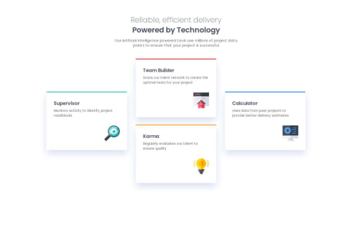
<h1 class="title-normal">Reliable, efficient delivery</h1>
<h2 class="title-bolder">Powered by Technology</h2>
- Actualmente tienes dos etiquetas
-
Encabezados en las tarjetas
- En cada tarjeta usas
<h2>para el título. Para mantener la jerarquía, te recomiendo emplear<h3>, ya que ya tienes<h1>y<h2>para el título principal y subtítulo. - Corrección:
<h3 class="s-title">Supervisor</h3>
- En cada tarjeta usas
-
Nombres de clases CSS
- Estás utilizando nombres como
s-title,tb-info, etc. Si bien funcionan para este proyecto, pueden dificultar la reutilización y escalabilidad del código en proyectos más grandes. - Recomendación: Utiliza nombres de clases más genéricos y descriptivos, por ejemplo:
card-title,card-info,card-image, etc.
- Estás utilizando nombres como
CSS
-
Uso de
font-familyen el selector universal- Actualmente tienes:
* { box-sizing: border-box; margin: 0; padding: 0; font-family: "Poppins"; } - Es mejor aplicar la fuente en el selector
bodyen vez del universal (*), para evitar posibles conflictos en el futuro. - Sugerencia:
body {
  font-family: "Poppins", sans-serif;
}
- Actualmente tienes:
-
Variables CSS
- Observé que usas variables como
--Grey-500. Es recomendable emplear minúsculas y guiones para mantener la coherencia y facilitar la escalabilidad:--grey-500 - La consistencia en la nomenclatura hace que el código sea más fácil de mantener y escalar.
- Observé que usas variables como
Espero que estos comentarios te sean útiles :)
Marked as helpful -

Join our Discord community
Join thousands of Frontend Mentor community members taking the challenges, sharing resources, helping each other, and chatting about all things front-end!
Join our Discord