


P
@CoderAlchemy24
I would like help learning and improving Flexbox, as it's quite important these days, and it would be great to master it to create web pages that stand out with this mechanic.
I would like more help and support in learning and improving with CSS Grid, as it is something new for me and something new to learn and strengthen in my daily life.
I would like help accommodating and improving further the ability to create fluid pages that adapt well to devices (especially mobile devices) without losing that sophisticated and attractive design that draws attention.
This time I don't have any specific area at the moment that requires guidance or help, but I know that I still need to improve and I know that I could further improve the design and the versatility and reduction of code for a more optimal page for everyone. Anything you have to tell me to change or correct, I know that it will be of great help to continue growing and advancing even more.
I would like guidance on how to improve my ability to properly align the divs and HTML tags on my web page, especially to position them where I want them on the page.
I would like some help or guidance to improve my CSS skills, especially with alignment properties. I've encountered some challenges when changing and modifying the position of divs so they align correctly. I'd like to learn more about how to use CSS to achieve better layout and alignment in my projects.
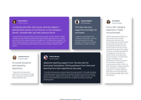
Hi, great work on the design. Here I'll highlight some semantic points for you to keep in mind:
<div> for the main structure.Problem:
You're using div class="container"> for the card group. For semantic reasons, it's better to use <main> or <section>.
Recommended correction:
<main class="container"> or <section class="container">
Problem:
Each card uses <h2 class="card_name">. If this grid is the main content, it would be ideal to have a general <h1> for the page and then <h2> for the names.
Recommended correction:
Add a general title before the grid if you don't have one (example: <h1>Testimonials</h1>).
<article class="card ..."> instead of <div class="card ..."> to give them semantic meaning and help screen readers.<div class="quote_sign" ></div>Issues:
Using names like --color-White and --color-Black in PascalCase is inconsistent with CSS recommendations (use kebab-case: --color-white).
Variables like --font-family-preset-1 are poorly defined. You are using family names that don't exist (e.g., 'Barlow Semi Condensed Semibold' is not a registered font; it should be 'Barlow Semi Condensed' with font-weight: 600).
--font-weight-preset-1 variables contain size values, not weight values.
Variables like --letter-spacing-preset-1: 0%; don't make sense; they should be 0 or normal.
Fixed:
:root {
--color-white: #fff;
--color-black: #000;
--color-dark-blue: #19202D;
--color-gray-100: #E7EAEE;
--color-gray-200: #CFCFCF;
--color-gray-400: #676D7E;
--color-gray-500: #48556A;
--color-purple-50: #EDE4FF;
--color-purple-300: #A775F1;
--color-purple-500: #733FC8;

--font-size-p: 13px;
--font-family-base: 'Barlow Semi Condensed', sans-serif;

--font-weight-bold: 600;
--font-weight-medium: 500;

/* Spacing */
--spacing-500: 40px;
--spacing-400: 32px;
--spacing-300: 24px;
--spacing-200: 16px;
--spacing-100: 8px;
--spacing-50: 4px;
}
* {
margin: self;
...
}
This sets margin: auto to everything (including elements like <p>, <h2>, <img>, etc.). This breaks the layout.
margin: 0; for reset, and apply margin: auto; only where needed.height: calc(max-content + var(--spacing-500)*6);
The max-content cannot be used like this.
min-height: 100vh; to ensure full height.max-height: calc(max-content + var(--spacing-500)*4);
This is invalid.
max-content in math operations..card.
Using position: absolute; in .container can break the flow on mobile.
Values like height: calc(fit-content + ...) are invalid in CSS.margin: 0; in universal reset.calc().position: absolute; unnecessarily.@font-face and control the weight.I think that I managed to implement the grid positioning system quite well. More planning ahead of time in terms of working out the size of typography for each view would have helped as I spent a lot of time tweaking things.
What challenges did you encounter, and how did you overcome them?Working out how to split the grid up horizontally and vertically was challenging. It took a lot of experimentation and trial and error to work out the best way to do it.
What specific areas of your project would you like help with?Moving from mobile view to tablet view, how things should look in tablet view.
A continuación, te comparto algunos puntos de mejora que pueden ayudarte a perfeccionar aún más tu código:
Error semántico en la estructura principal
<main section class="main-container">
<main class="main-container">
Jerarquía de títulos
<h1>: una para el título y otra para el subtítulo. Recuerda que solo debe haber un <h1> por página para mantener una estructura semántica adecuada.<h1 class="title-normal">Reliable, efficient delivery</h1> <h2 class="title-bolder">Powered by Technology</h2>
Encabezados en las tarjetas
<h2> para el título. Para mantener la jerarquía, te recomiendo emplear <h3>, ya que ya tienes <h1> y <h2> para el título principal y subtítulo.<h3 class="s-title">Supervisor</h3>
Nombres de clases CSS
s-title, tb-info, etc. Si bien funcionan para este proyecto, pueden dificultar la reutilización y escalabilidad del código en proyectos más grandes.card-title, card-info, card-image, etc.Uso de font-family en el selector universal
* {
  box-sizing: border-box;
  margin: 0;
  padding: 0;
  font-family: "Poppins";
}
body en vez del universal (*), para evitar posibles conflictos en el futuro.body { font-family: "Poppins", sans-serif; }
Variables CSS
--Grey-500. Es recomendable emplear minúsculas y guiones para mantener la coherencia y facilitar la escalabilidad:
--grey-500
Espero que estos comentarios te sean útiles :)
Hello KKen007,
I indicate the parts that should be improved or changed in your HTML:
This is not necessary and This may affect performance, so please only maintain one version.
Styles.css:
Improvements and fixes:
body { /* 4. Add accessible line-height / line-height: 1.5; / 5. Improve text rendering */ -webkit-font-smoothing: antialiased; }
body { background-color: var(--Cream); padding: 2rem 1rem; color: var(--Grey); font-family: var(--ff-base); font-weight: var(--fw-base); height: 100vh; }
Although CSS allows multiple definitions of the same selector, it's best to unify everything into a single body declaration to avoid:
Unnecessary duplication.
Cognitive overhead.
Maintenance difficulty.
Unified Version:
body { /* Typography */ font-family: var(--ff-base); font-weight: var(--fw-base); color: var(--Grey); line-height: 1.5;
/* Rendering */ -webkit-font-smoothing: antialiased;
/* Background and dimensions */ background-color: var(--Cream); height: 100vh;
/* Spacing */ padding: 2rem 1rem; }
I see in your HTML structure that you have several spelling errors:
(You must correct these words):
An esy and quick dish → An easy and quick dish
perfect fir any meal → perfect for any meal
Tis classis omelette → This classic omelette
cheese → cheese
begetables → vegetables
Approximately 10 minutes → Approximately 10 minutes
Beat the eggs → Beat the eggs
teblespoon of water → tablespoon of water
fluffy texture → fluffy texture
bubbing → bubbling
Cook the omlette → Cook the omelette
sprinklel ypur chosen filling → sprinkle your chosen filling
another minute → another minute
Repeated use of the "<h1>" tag:
<h1>Simple Omelette Recipe</h1> <h1>Preparation time</h1>Use only one "<h1>" tag per page; the second should be "<h2>".
Incorrect use of "<div id="table">" as a nutrition table:
You did it like this:
<div id="table"> Calories 277kcal <hr> Carbs 0g <hr> Protein 20g <hr> Fat 22g </div>It should be structured like a real table, so use the "<table>" tag, which helps achieve the expected result, like this:
<table> <tbody> <tr> <td>Calories</td> <td>277 kcal</td> </tr> <tr> <td>Carbs</td> <td>0g</td> </tr> <tr> <td>Protein</td> <td>20g</td> </tr> <tr> <td>Fat</td> <td>22 g</td> </tr> </tbody> </table>Unnecessary use of "<br>". You can remove it if you use CSS margins or "<p>" tags to separate them.
Style.css:
The font is not defined correctly:
You must import the font, otherwise it won't be applied:
@import url('https://fonts.googleapis.com/css2?family=Young+Serif&display=swap');
word-spacing: 200px; in #table:
#table { word-spacing: 200px; }
I've seen that this separates words too much, so it's not ideal for displaying data. I recommend, as I said before, using the "<table>" tag correctly.
Here you're calling the "flex-direction: column;" property, but it won't work if you don't have "display: flex;"
#table { flex-direction: column; }
Unnecessary repetition of h2, h3, h4 rules:
#main h1{ color: rgb(128, 62, 132); font-size: 15px; }
h2{ font-size: 15px; color: rgb(124, 62, 36); } h3{ font-size: 15px; color: rgb(124, 62, 36); } h4{ font-size: 15px; color: rgb(124, 62, 36); }
Instead of writing them separately, simplify it like this:
h2, h3, h4 { font-size: 15px; color: rgb(124, 62, 36); }
I see you're using font-family: 'Arial'; directly on several elements like "#main, #font, and #table."
You should simply define it in the body to apply the font, since you don't need to repeat it on multiple elements:
@import url('https://fonts.googleapis.com/css2 family=Young+Serif&display=swap');
body { font-family: 'Young Serif', serif; }
About de SEO another project means this topic about the images so I must to write height and width
Improvement suggestion:
Replace text-only <li> tags with real buttons or links:
<ul class="social__links"> <li><a href="#" class="network social__github">GitHub</a></li> <li><a href="#" class="network social__frontend">Frontend Mentor</a></li> <li><a href="#" class="network social__linkedIn">LinkedIn</a></li> <li><a href="#" class="network social__twitter">Twitter</a></li> <li><a href="#" class="network social__instagram">Instagram</a></li> </ul>Advantages:
Improves accessibility (for screen readers and keyboard navigation).
Improves interaction (real links can be clicked and opened).
You could use tags like <header>, <main>, and <footer> to separate sections if the design were larger. For now, you might consider something like this:
<main class="social"> <!-- Your content here --> </main>CSS Styles:
You've done an excellent overall job. The design is well-structured, and you use variables, relative units, and consistent styles.
THE GOOD Good use of :root to define reusable CSS variables.
Good BEM structure.
Clean and well-organized styles.
Correct use of object-fit, border-radius, hover, transition, etc.
Use of media queries for responsive design.
Improvement and Optimization Suggestions
You currently use align-content: center; on .body, but it doesn't work because it's not a grid or flex container.
Solution: Change .body to display: grid or flex to achieve true vertical centering, like this:
.body { display: grid; place-items: center; }
This will center .social completely on the screen, vertically and horizontally.
It seems to me that the design is a bit larger than the original solution. Could you consider reducing the size of the design to match the solution's scale? Otherwise, it's very well done and has a good design :).


