Skip to content
  • Unlock Pro
  • Log in with GitHub
Solution
Submitted about 2 months ago

I use flexbox and margin-inline i didn't know to use

P
GeraASM•500
@GeraASM
A solution to the Social links profile challenge
View live sitePreview (opens in new tab)View codeCode (opens in new tab)

Solution retrospective


What are you most proud of, and what would you do differently next time? the next time I'll try to start to remember use 100vh in the body always to start What specific areas of your project would you like help with?

About de SEO another project means this topic about the images so I must to write height and width

Code
Select a file

Please log in to post a comment

Log in with GitHub

Community feedback

  • Farid_Danilo•140
    @FaridDanilo
    Posted about 1 month ago

    Improvement suggestion:

    1. HTML semantics: Improve with proper tags

    Replace text-only <li> tags with real buttons or links:

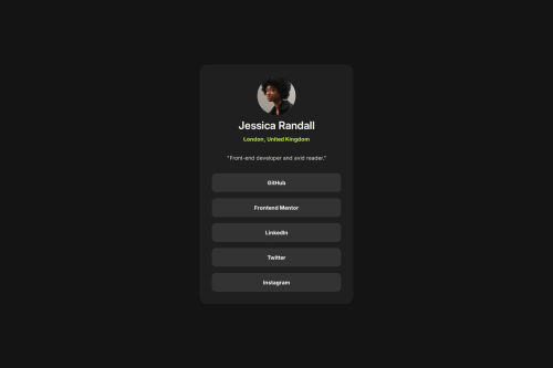
    <ul class="social__links"> <li><a href="#" class="network social__github">GitHub</a></li> <li><a href="#" class="network social__frontend">Frontend Mentor</a></li> <li><a href="#" class="network social__linkedIn">LinkedIn</a></li> <li><a href="#" class="network social__twitter">Twitter</a></li> <li><a href="#" class="network social__instagram">Instagram</a></li> </ul>

    Advantages:

    Improves accessibility (for screen readers and keyboard navigation).

    Improves interaction (real links can be clicked and opened).

    1. Semantic Organization of Content

    You could use tags like <header>, <main>, and <footer> to separate sections if the design were larger. For now, you might consider something like this:

    <main class="social"> <!-- Your content here --> </main>

    CSS Styles:

    You've done an excellent overall job. The design is well-structured, and you use variables, relative units, and consistent styles.

    THE GOOD Good use of :root to define reusable CSS variables.

    Good BEM structure.

    Clean and well-organized styles.

    Correct use of object-fit, border-radius, hover, transition, etc.

    Use of media queries for responsive design.

    Improvement and Optimization Suggestions

    1. True Vertical Centering on the Entire Screen

    You currently use align-content: center; on .body, but it doesn't work because it's not a grid or flex container.

    Solution: Change .body to display: grid or flex to achieve true vertical centering, like this:

    .body { display: grid; place-items: center; }

    This will center .social completely on the screen, vertically and horizontally.

  • P
    Eddie•140
    @WeatherheadOnline
    Posted about 2 months ago

    Nice solution!

  • Brittani Lovelace•60
    @blovelace84
    Posted about 2 months ago

    Hey, quick question: I notice you have a #react at the top in your solution. Was the entire code meant to be React or just basic HTML and CSS? Just wondering.

Join our Discord community

Join thousands of Frontend Mentor community members taking the challenges, sharing resources, helping each other, and chatting about all things front-end!

Join our Discord
Frontend Mentor logo

Stay up to datewith new challenges, featured solutions, selected articles, and our latest news

Frontend Mentor

  • Unlock Pro
  • Contact us
  • FAQs
  • Become a partner

Explore

  • Learning paths
  • Challenges
  • Solutions
  • Articles

Community

  • Discord
  • Guidelines

For companies

  • Hire developers
  • Train developers
© Frontend Mentor 2019 - 2025
  • Terms
  • Cookie Policy
  • Privacy Policy
  • License

Oops! 😬

You need to be logged in before you can do that.

Log in with GitHub

Oops! 😬

You need to be logged in before you can do that.

Log in with GitHub

How does the accessibility report work?

When a solution is submitted, we use axe-core to run an automated audit of your code.

This picks out common accessibility issues like not using semantic HTML and not having proper heading hierarchies, among others.

This automated audit is fairly surface level, so we encourage to you review the project and code in more detail with accessibility best practices in mind.

How does the CSS report work?

When a solution is submitted, we use stylelint to run an automated check on the CSS code.

We've added some of our own linting rules based on recommended best practices. These rules are prefixed with frontend-mentor/ which you'll see at the top of each issue in the report.

The report will audit all CSS, SCSS and Less files in your repository.

How does the HTML validation report work?

When a solution is submitted, we use html-validate to run an automated check on the HTML code.

The report picks out common HTML issues such as not using headings within section elements and incorrect nesting of elements, among others.

Note that the report can pick up “invalid” attributes, which some frameworks automatically add to the HTML. These attributes are crucial for how the frameworks function, although they’re technically not valid HTML. As such, some projects can show up with many HTML validation errors, which are benign and are a necessary part of the framework.

How does the JavaScript validation report work?

When a solution is submitted, we use eslint to run an automated check on the JavaScript code.

The report picks out common JavaScript issues such as not using semicolons and using var instead of let or const, among others.

The report will audit all JS and JSX files in your repository. We currently do not support Typescript or other frontend frameworks.

Oops! 😬

You need to be logged in before you can do that.

Log in with GitHub

Oops! 😬

You need to be logged in before you can do that.

Log in with GitHub

Oops! 😬

You need to be logged in before you can do that.

Log in with GitHub