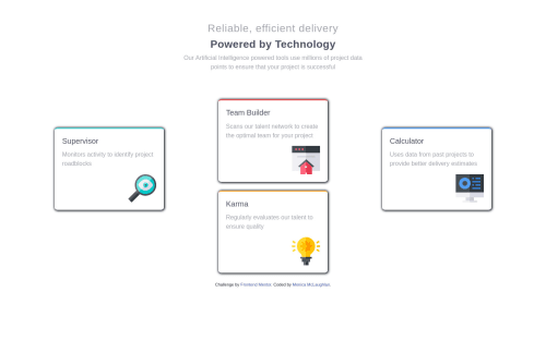
Four Card Feature Section using HTML CSS with flex-box/media-query

Solution retrospective
Trying to get more comfortable with flex-box and media queries. As always, all feedback welcome!
Please log in to post a comment
Log in with GitHubCommunity feedback
- @isimeri
Hello! You did a pretty good job on this project. I'd still change a few things, though:
- Remove all the
margin-bottomthat you set up for your cards. As the point of this project is to get you to know Flexbox better, rather set aheightormin-heightfor your.card-sectionand just let thealign-itemsandjustify-contentproperties do their job, instead of using the cards' margins to increase the.card-section's height by force. I'd suggest usingdisplay:flexwith aflex-direction: columnfor.middle-cardsas well, so you don't have to guess margins to position the cards. - Make the
<body>take up the full screen height. I'd actually use somediv.containerfor all the content, so i won't have any regrets if i decide to add some feature to the page some day(but it's no big deal for this specific project). - Remove the
max-width: 1440pxmedia query. The.card-sectionlooks very much wrong for screens wider than that. I know there was some mention in the project's instructions file, about the design being supposed to work for that width, but that shouldn't limit you from making it work for screens wider than 1440px. - The
<footer>is directly below the cards, but that is due to the<body>not taking the entire height of the screen. It really comes down to personal preference in this specific case, but i think it would look better if the<footer>was at the bottom of the screen.
Other than that, you did a great job. Keep it up!
- Remove all the
- @ApplePieGiraffe
Hey, there, Monica! 👋
Nice to see you complete another challenge, again! 😀 Good work on this one! 👍
I suggest,
- Using a single heading tag for the heading of the page (which could be a
<h1>, since it is the most important title on the page), because it is really a single heading, not two separate headings. You can easily use aspantag to style the two parts of the heading differently. - Decreasing the intensity of the box-shadow around the feature cards.
- Your design seems to break over 1440px (perhaps because of the way your media queries are set up). That'll be something worth looking into!
Keep learning and coding (and happy learning and coding, too)! 😁
- Using a single heading tag for the heading of the page (which could be a
- @AbbasSaad27
Hi Monica!! I've studied your work. You have done well in this challenge! Your solution looks good and it is responsive!! I've got a few things to suggest. For the header, I suggest using one h1 tag instead of using 2 h3 tags. Since it's only one header. You can use the span tag to style them differently :D There's quite a bit of space between the three columns of the card. Reduce that a bit :D Also, it breaks into the mobile layout too early. I think using CSS grid would be better for this solution (and also a lot easier!!) https://www.frontendmentor.io/solutions/four-card-feature-section-using-html-and-css-grid-lrZBdJgxN Here's my solution. Hope it helps!! :D Happy coding!! :D


Join our Discord community
Join thousands of Frontend Mentor community members taking the challenges, sharing resources, helping each other, and chatting about all things front-end!
Join our Discord