Latest solutions
Latest comments
- @main1479@AbbasSaad27
Hello Mainul Islam! Congratulations on completing your first Frontend Mentor challenge! :D It looks great and responds pretty nicely!! I just have a few things to suggest. The data from the Ip geolocation API is being logged to the console. Might wanna look into that. Also, I can't search using a domain name. You should add that since it says "Search for any IP address or domain" in the placeholder :D Overall it seems really nice. Keep coding and happy coding!! :D
- @Duhli@AbbasSaad27
Hi there! Glad to see that you completed another challenge. This one looks really great on the desktop! Good job on that! There are only a few things to improve. Adding a few media queries in between the desktop and mobile view would make the site fully responsive which is really needed! Also, there's a little white space at the bottom of the page in mobile view.. :") Overall it was it's nice! :D as always keep coding and happy coding :D
- @artistcoder-code@AbbasSaad27
Hi! Nice work! Glad to see that you completed another challenge! It looks great on the desktop! About the button, I would suggest that you should put "position: relative" on "email_form". Then try to position the button. It'll be a lot easier! Or maybe make the button an inline-block element. Then set a negative value to the margin-left property. That could work too I guess. Also, increase the font-size and font-weight to match the design. Overall it looks really good! Happy coding! :D
- @monicamclaughlan@AbbasSaad27
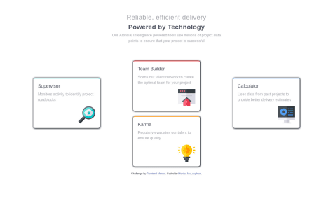
Hi Monica!! I've studied your work. You have done well in this challenge! Your solution looks good and it is responsive!! I've got a few things to suggest. For the header, I suggest using one h1 tag instead of using 2 h3 tags. Since it's only one header. You can use the span tag to style them differently :D There's quite a bit of space between the three columns of the card. Reduce that a bit :D Also, it breaks into the mobile layout too early. I think using CSS grid would be better for this solution (and also a lot easier!!) https://www.frontendmentor.io/solutions/four-card-feature-section-using-html-and-css-grid-lrZBdJgxN Here's my solution. Hope it helps!! :D Happy coding!! :D
- @sojol4242@AbbasSaad27
Hey sojol!
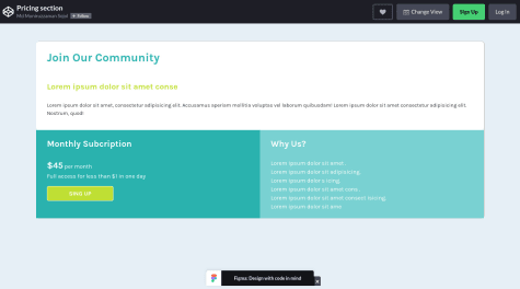
Congratulations on completing another challenge! It looks pretty good! I have some suggestions. You should use vs code, atom, or some other code editor with emmet and some font extensions (I also suggest adding live server extension) instead of using codepen. This way coding would be a lot easier and more fun for you! And also try to fix the issues from the report. This would be a great practice!!
For the design, I would suggest adding texts from the design instead of adding from lorem ipsum. You can find all the text in a file called "index.html" in the challenge folder. Copy and paste the text from there :D
Lastly, I would suggest that you should try to get it looking as close to design as possible. keep tweaking until you break it :D that's all.
Keep coding (and happy coding too!!).


