Not Found
Not Found
Not Found
Not Found
Not Found
Not Found
Not Found
Not Found
Not Found
Not Found
Not Found
Not Found
Not Found
Not Found
Not Found
Not Found
Not Found
Not Found
Not Found
Not Found

Submitted

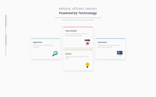
Four card feature section with HTML and CSS flexbox

Akshay Meshramβ€’ 390

@akshay63

Desktop design screenshot for the Four card feature section coding challenge

This is a solution for...

  • HTML
  • CSS
1newbie
View challenge

Design comparison


SolutionDesign

Solution retrospective


Hi, there. I have made a Responsive Four-card-section with HTML5 and CSS(Flexbox). I tried hard to make it responsive on all viewport widths. So check it out and please feel free to give any feedback. Thanks!

Community feedback

Karimβ€’ 590

@Galielo-App

Posted

Hi, Akshay πŸ‘‹

It's very hard to make it responsive when you're using flexbox in a two-dimensional layout. You should learn CSS grid, it will make your life way easier in layouts like this one. To start with CSS grid you should take a look at this guide.

happy coding and if I was helpful please upvote my comment :)

1

Akshay Meshramβ€’ 390

@akshay63

Posted

@Galielo-App I thought of using CSS grid as you mentioned cards are laying out in Two dimensional, but I thought using flexbox for this simple section was much easier than CSS grid. I will definitely try the CSS grid for this project. Thanks for the suggestion.πŸ‘

0
Karimβ€’ 590

@Galielo-App

Posted

@akshay63 grid is a little weird when you're first starting, that's completely normal. And I agree, sometimes is harder to use grid even in bi-dimensional layouts, but you need to think about the responsiveness of your app. If you want, take a look at my project Social Proof Section and look at what I've done with grid :)

0
Samuel Palaciosβ€’ 615

@samuelpalaciosdev

Posted

Hi, Akshay πŸ‘‹

Well done on this challenge! Your solution looks good and it scales pretty well.πŸ‘

I only suggest some things πŸ˜‰:

  • Maybe, you don't need height on the cards. I mean, setting an explicit height, could cause you some problems, when talking about responsivenes, you could try to get the same result using padding.

I hope this would help you, have a nice day, keep coding!πŸ’™

1

Akshay Meshramβ€’ 390

@akshay63

Posted

@samuelpalaciosdev Yes, you are right. The content should define the height and we could padding to increase the white space inside the component.

0

Please log in to post a comment

Log in with GitHub
Discord logo

Join our Discord community

Join thousands of Frontend Mentor community members taking the challenges, sharing resources, helping each other, and chatting about all things front-end!

Join our Discord