Latest solutions
Latest comments
- @sirriah@samuelpalaciosdev
Hello, Sirriah 👋
Well done on this challenge!. Your solution looks nice (almost pixel perfect) and it scales pretty well.
I only suggest some things😉:
-
Adding
outline: noneto the buttons with the icons. When I click on them, that outline doesn't look bad but I'd not display it. -
About your sass stylesheets. I suggest you to watch [this video] (https://www.youtube.com/watch?v=9Ld-aOKsEDk&ab_channel=KevinPowell)
I really like the way you approach this, keep coding ;).
-
- @wdluft@samuelpalaciosdev
Hello, William! 👋
Great job on this challenge!. Your solution looks nice (almost pixel perfect) and it scales pretty well.
I only suggest some things😉:
-
Adding
cursor: pointerto your button. So people would know that's clickable. -
Take care of those accesibility issues. I suggest you to use the [W3C Markup Validation Service] (https://validator.w3.org/).
I really like the way you approach this, keep coding ;)
-
- @spymon@samuelpalaciosdev
Hello, Spymom! 👋
Well done on this challenge!. Your solution looks great and it scales pretty well.
I only suggest a little thing😉:
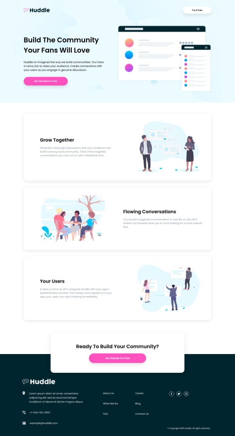
- I think that those images, don't need an alt text. In this instance, that's a good thing, as the alt text is currently repeating the same as the card headings, so if you take this tip, use
alt="" aria-hidden="true"on your HTML markup.
I really like the way you approach this, and that fancy animations you added are so cool, keep coding ;)
- I think that those images, don't need an alt text. In this instance, that's a good thing, as the alt text is currently repeating the same as the card headings, so if you take this tip, use
- @ApplePieGiraffe
Invoice App | React, Next.js, styled-components, Formik, Framer Motion
#framer-motion#react#styled-components#next@samuelpalaciosdevHi, ApplePieGiraffe👋
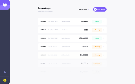
Congratulations, another amazing solution from you (as expected). I love the soft and cool animations you used. Your work impresses me, again, congratulations, mate ;).
Keep coding🧡
- @orandorisk@samuelpalaciosdev
Hi, Orlando👋
Well done on this challenge!👍
I only suggest some things 😉:
-
Be clear with your HTML classes. I don't understand what you're trying to say with example:
flavorindi. -
Using
min-widthsandmin-heightsinstead explicitwidthaheightproperties. Setting explicit widths and heights usually is not the best approach, As I'm seeing on your project, on the 900px viewport, one of the containers (the right one) lacks information, if you use min-widths, it will help you.
I hope this would help you, have a nice day, keep coding!💙
-
- @Sven72@samuelpalaciosdev
Hi, Sven👋
Good job on this challenge! Your solution looks good and it scales pretty well.👍
I only suggest some things 😉:
-
Changing the styles for the social media icons. As I see on you project, the twitter icon looks different from the others. That's because you set a
widthon them, I'd delete it, makes them look better. -
Setting a padding on the
mainelement. You only have padding for the left & right, but the "Social media dashboard" is too close to the top of the page, I'd addpadding: 2rem 3remon the 768px media query.
I hope this would help you, have a nice day, keep coding!💙
-


