Not Found
Not Found
Not Found
Not Found
Not Found
Not Found
Not Found
Not Found
Not Found
Not Found
Not Found
Not Found
Not Found
Not Found
Not Found
Not Found
Not Found
Not Found
Not Found
Not Found

All comments

  • Tereza 605

    @sirriah

    Submitted

    Hi, I finished next challenge. I downloaded the design files long time ago, but I didn't know, how to recreate the meter component. I know that HTML has meter tag but styling this component for all browsers is impossible, so I made it from div tags.

    I added some hover effect and title attribute on buttons for better accessibility.

    It would be great, if you can give me some feedback about accessibility or sass.

    Happy coding 👋👩‍🦰

    @samuelpalaciosdev

    Posted

    Hello, Sirriah 👋

    Well done on this challenge!. Your solution looks nice (almost pixel perfect) and it scales pretty well.

    I only suggest some things😉:

    • Adding outline: none to the buttons with the icons. When I click on them, that outline doesn't look bad but I'd not display it.

    • About your sass stylesheets. I suggest you to watch [this video] (https://www.youtube.com/watch?v=9Ld-aOKsEDk&ab_channel=KevinPowell)

    I really like the way you approach this, keep coding ;).

    0
  • @samuelpalaciosdev

    Posted

    Hello, William! 👋

    Great job on this challenge!. Your solution looks nice (almost pixel perfect) and it scales pretty well.

    I only suggest some things😉:

    • Adding cursor: pointer to your button. So people would know that's clickable.

    • Take care of those accesibility issues. I suggest you to use the [W3C Markup Validation Service] (https://validator.w3.org/).

    I really like the way you approach this, keep coding ;)

    0
  • spymon 90

    @spymon

    Submitted

    Hello, everyone! 👋

    I decided to try a CSS grid for this challenge and find out how easy it is to create and position elements in the layout. For all of you who haven't tried the CSS grid, I encourage you to try it out. 💪

    To get started with the CSS grid visit A Complete Guide to Grid. 😊

    And to spice things up I added a parallax tilt effect on the cards. (Tilt.js) 😉

    Feedback welcome and appreciated! 😊

    Happy coding! 😁

    @samuelpalaciosdev

    Posted

    Hello, Spymom! 👋

    Well done on this challenge!. Your solution looks great and it scales pretty well.

    I only suggest a little thing😉:

    • I think that those images, don't need an alt text. In this instance, that's a good thing, as the alt text is currently repeating the same as the card headings, so if you take this tip, use alt="" aria-hidden="true" on your HTML markup.

    I really like the way you approach this, and that fancy animations you added are so cool, keep coding ;)

    1
  • P
    ApplePieGiraffe 30,545

    @ApplePieGiraffe

    Submitted

    Hello, everybody! 👋

    This is my 30th solution on Frontend Mentor! 🎉 (And my first Guru level challenge submission.) 😎 This was definitely a tricky challenge, but I got to learn and try out many new things! 😀

    I used React and Next.js to build the site, styled-components to style it, Formik (and Yup) to handle the forms in this challenge, and Framer Motion to add some page transitions and animations. 😄

    There were quite a few things I had to learn in order to complete this challenge, and I'm not sure if I did them all correctly. 😥 Looking back, there are a few things I wish I would have differently, but it's a learning experience! 🙂

    If anyone could share some resources on how to manage and organize larger projects like this, I'd really appreciate it! 👍 Lots of resources that I find only focus on specific things (like creating a popup or using certain features of a tool) and not so much how to approach and think about an entire app. 🙃

    If you'd like to learn more about my project, see the README in my Git repo (where I also list a few quirks in my solution).

    Feedback welcome and appreciated! 😊

    Happy coding! 😁

    BTW, click on the sidebar avatar for the attribution.

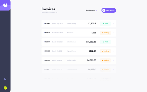
    Invoice App | React, Next.js, styled-components, Formik, Framer Motion

    #framer-motion#react#styled-components#next

    16

    @samuelpalaciosdev

    Posted

    Hi, ApplePieGiraffe👋

    Congratulations, another amazing solution from you (as expected). I love the soft and cool animations you used. Your work impresses me, again, congratulations, mate ;).

    Keep coding🧡

    1
  • @Chriseden83

    Submitted

    First attempt at a website without any tutorials, decided to go with a Flexbox mobile first approach. Had a little trouble with the social links on the desktop layouts and viewport height. Not overly happy with my final solution but I did learn from it.

    Would love some constructive criticism on this project.

    @samuelpalaciosdev

    Posted

    Hi, Chris👋

    Great job on this challenge. Your solution looks good and it scales pretty well👍

    I only suggest some things 😉:

    • Changing the button to an <a> (anchor link). If this would be an actual webpage, those buttons should redirect somewhere.

    • As Karim said, instead of using overflow:hidden you should use overflow-x:hidden. Because, if you left as it is right now, I can't scroll on mobile viewport.

    I hope this would help you, have a nice day, keep coding!

    1
  • @samuelpalaciosdev

    Posted

    Hi, Orlando👋

    Well done on this challenge!👍

    I only suggest some things 😉:

    • Be clear with your HTML classes. I don't understand what you're trying to say with example: flav or indi.

    • Using min-widths and min-heights instead explicit width a height properties. Setting explicit widths and heights usually is not the best approach, As I'm seeing on your project, on the 900px viewport, one of the containers (the right one) lacks information, if you use min-widths, it will help you.

    I hope this would help you, have a nice day, keep coding!💙

    0
  • Sven 295

    @Sven72

    Submitted

    Hi all, I am interested in:

    1. How to declutter my JS?
    2. How to prevent the content of the page from "jumping"? When in mobile (light) mode switching to darkmode, appears s a divider between "Dark Mode" and "Total Followers". This divider is only visible in darkmode. Due to the class ".visible_divider" which is append via JS.
    3. The switcher / Toggle Buttons after reload does not switch to the right but stays on the left. (Dark Mode side) Best and stay healthy

    @samuelpalaciosdev

    Posted

    Hi, Sven👋

    Good job on this challenge! Your solution looks good and it scales pretty well.👍

    I only suggest some things 😉:

    • Changing the styles for the social media icons. As I see on you project, the twitter icon looks different from the others. That's because you set a width on them, I'd delete it, makes them look better.

    • Setting a padding on the main element. You only have padding for the left & right, but the "Social media dashboard" is too close to the top of the page, I'd add padding: 2rem 3rem on the 768px media query.

    I hope this would help you, have a nice day, keep coding!💙

    1
  • @SarahHenriette

    Submitted

    Hey 🙂 !

    On this project I used gsap and I also tried to do unit tests but I am not yet familiar.

    all comments and suggestions are welcome

    @samuelpalaciosdev

    Posted

    Hello again, Elise👋

    Well done on this challenge! Your solution looks good and it scales pretty well.👍

    I only suggest a little thing 😉:

    • Decreasing the transition timing when opening the question. I'd change it to .3s, it makes it feels more smoother.

    I really like the way you approach this, have a nice day, keep coding!💙

    1
  • @samuelpalaciosdev

    Posted

    Hi, Akshay 👋

    Well done on this challenge! Your solution looks good and it scales pretty well.👍

    I only suggest some things 😉:

    • Maybe, you don't need height on the cards. I mean, setting an explicit height, could cause you some problems, when talking about responsivenes, you could try to get the same result using padding.

    I hope this would help you, have a nice day, keep coding!💙

    1
  • @samuelpalaciosdev

    Posted

    Hi, Nicole👋

    Well done on this challenge! Your solution looks good and it scales pretty well👍

    I only suggest some things 😉:

    • Adding a transition to the toggle. I'd add a transition: .5s; on the #toggle::after element, it make it feel more smooth.

    • You don't have a h1 on this project as it stands. Having your headings on order is not really a rule, but the h1 it's one of the most important tags on an webpage . For this project, it would be where you've got the h5 heading.

    I hope this would help you, have a nice day, keep coding!💙

    0
  • david 120

    @davidtrikic

    Submitted

    I had issues with background image positioning. Couldn't get it to match desktop and mobile designs (responsively). Any hint on that?

    @samuelpalaciosdev

    Posted

    Hi, David👋

    Great job on this challenge. Your solution looks good and it scales pretty well👍

    I only suggest some things 😉:

    • You don't have a h1 on this project as it stands. Headings provide valuable information by highlighting important topics and the structure of the document. For this project, I'd set it where is the person's name.

    • About the background image, I'd recommend you to use viewport units, especially vw in this case, I suggest you to watch this video

    I hope this would help you, have a nice day, keep coding!💙

    1
  • @Gabrieldev-web-coder

    Submitted

    I don't use SASS or other preprocesser, because for the "newbies" the most important is dominant the basics of lenguajes (and because i don't know use it yet xD)

    I try to do this responsive, and i said "try" because i think there are better methods than i use in this case, if you know how to better i'll thank give me feedback <3

    My bigest problem was the background with the position background and the porcents, that made me write a media querye for each misalignment, and repeat code for change a single value :/

    All other, if you see something you think can do better, please write it!

    Be severe, is the way to learn. Thanks!

    (Sorry if my english make you cry, i'm learning)

    @samuelpalaciosdev

    Posted

    Hi, ippo👋

    Well done on this challenge! Your solution looks good👍

    I only suggest some things 😉:

    • You don't have a h1 on this project as it stands. Headings provide valuable information by highlighting important topics and the structure of the document. For this project, I'd set it where is the person's name.

    • There're too many Media Queries on the background position. I'd think you should see others solutions to see how they approach that, because too many media queries are not the best approach I think.

    I hope this would help you, have a nice day, keep coding!💙

    1
  • @samuelpalaciosdev

    Posted

    Hi👋

    Great job on this challenge! Your solution looks good and it scales pretty well. 👍

    I only suggest one little thing 😉:

    • I think you should change the order of the headings tag. The h1 tag is usually used for the title of a page, in this case "Social media dashboard", actually is an h2, instead I'd set the followers number as an h2.

    I hope this would help you, have a nice day, keep coding!💙

    0
  • Xhoni 70

    @Xhoni43

    Submitted

    How i can be better in layout and animation ??

    @samuelpalaciosdev

    Posted

    Hi, Xhoni👋

    Great job on this challenge. Your solution looks good and it scales pretty well. 👍

    I only suggest some things 😉:

    • On mobile viewport the menu isn't centered. As I'm seeing on your project that's because you set a margin-left to the anchor links (.hero > .navbar > .nav-links > li a) , I'd delete the margin-left and add align-items: center; on the ul which in this case you selected as: .hero > .navbar > .nav-links.

    • Be careful with specificity. I mean, you have extra large selectors like the one I mentioned above, you could simplify that setting a class to those elements and just selecting the class. As an example, adding this class to the anchor link <a class= nav__link>, you could select it on CSS as .nav__link, and it is easier to read than the other selector

    I hope this would help you, have a nice day, keep coding!💙

    1
  • Xuan-Tam 40

    @xuantam-h

    Submitted

    Simple profile card challenge using Flexbox and Grid to design the card. Any feedback would be greatly appreciated ! I want to improve.

    @samuelpalaciosdev

    Posted

    Hi, Xuan-Tam👋

    Great job on this challenge. Your solution looks good and it scales pretty well👍

    I only suggest some things 😉:

    • You don't have a h1 on this project as it stands. Having your headings on order is not really a rule, but the h1 it's one of the most important tags on an webpage . For this project, it would be where you've got the h2 heading.

    I hope this would help you, have a nice day, keep coding!💙

    1
  • @analuzcervantes

    Submitted

    Hello everyone, 🖖

    Any comment is greatly appreciated. Let me know what you think. 👾

    Happy coding! ❤

    @samuelpalaciosdev

    Posted

    Hi, Anna👋

    Great job on this challenge. Your solution looks nice and the accordion works well ;)

    I really like the way you approach this, have a nice day, keep coding!🧡

    0
  • @richardconvery

    Submitted

    Hey guys!

    This is my first every Frontend Mentor challange and my first use of JavaScript within a page (just been learning JS on Codecademy up until now).

    In this challenge I used JS to switch between two different CSS files. It was nice and easy for this project, however if this was a production situation then I'd look for a different solution as it'd be difficult to keep two separate css files in sync.

    Any feedback on how to do that differently is more than welcome!

    Richard

    @samuelpalaciosdev

    Posted

    Hi, Richard👋

    Great job on this challenge. Your solution looks good and it scales pretty well👍

    I only suggest some things 😉:

    • Knows when to use paragraphs insteads ofheadings h1-h6. Headings provide valuable information by highlighting important topics and the structure of the document, you should know when to use and when not an heading tag. I'd not set the "followers" as an heading instead as a paragraph.

    • About the dark mode question. I suggest you to watch this video.

    I hope this would help you, have a nice day, keep coding!💙

    1
  • @Pedro-Vitor-SG

    Submitted

    Focused on understanding the basic structure of a project in react, its imports and etc. Always trying to improve responsiveness. The basics.

    @samuelpalaciosdev

    Posted

    Hi, Pedro👋

    Great job on this challenge👍

    I only suggest some things 😉:

    • Maybe, you don't need height on the cards. I mean, setting an explicit height, could cause you some problems, when talking about responsivenes, you could try to get the same result using padding. As I'm seeing on your project, the cards on desktop wiewport lacks content, that's because of the height you set.

    • On mobile view, there's some scrollbar. I'd set an overflow-x:hidden on the body. The content is too big to fit in the specified area on mobile view, setting an overflow-x:hidden would help.

    I hope this would help you, have a nice day, keep coding!💙

    0
  • Luis 270

    @luibernip

    Submitted

    Hello community, thankyou to anyone helping with my coding skills. This is my only question:

    1. Can I make each card position correctly in mobile mode without using the media query? Should I use min max values or is there another technique I'm ignorant about?

    If you see anything that can help me get better at coding I would greatly appreciate it.

    @samuelpalaciosdev

    Posted

    Hi, Luis👋

    Great job on this challenge. Your solution looks good and it scales pretty well👍

    I only suggest some things 😉:

    -Maybe checking the HTML Structure I'd set the content as an entire section, not two different. They share relation.

    I really like the way you approach this, have a nice day, keep coding!💙

    1
  • @samuelpalaciosdev

    Posted

    Hi, Ian👋

    Great job on this challenge. Your solution looks good and it scales pretty well👍

    I only suggest some things 😉:

    -Changing the buttons to <a>(anchor links). If this would be an actual webpage, those buttons should redirect somewhere.

    I really like the way you approach this, have a nice day, keep coding!💙

    0
  • @samuelpalaciosdev

    Posted

    Hello, again, MasterKrab👋

    Great job on this challenge. Your solution looks nice and it scales well.👍

    I only suggest you one thing😉:

    -Changing the href attribute of the buttons. They redirect to the root of the html, when redirecting you should use the #

    I don't have much to say, I really like the way you approach this. I hope you have a nice day, keep coding!💙

    1
  • @CamiloRodriguezG

    Submitted

    Please adjust the zoom to 80%, I made all the page with the zoom at 80% and I just noticed it :(

    @samuelpalaciosdev

    Posted

    Hi, Camilo👋

    Great job on this challenge👍

    I only suggest some things 😉:

    -Looking to that dropdown menu on mobile. On mobile viewport, I can open the dropdown menu but I can't close it.

    -Your attribution at the end of the website doesn't redirect anywhere.

    -Changing the buttons to an <a> (anchor link). If this would be an actual webpage, those buttons should redirect somewhere.

    I hope this would help you, have a nice day, keep coding!💙

    0
  • Luis Colina 1,043

    @Comet466

    Submitted

    hi, this one was a pretty straight forward layout, i put a few cute animation on hover on the anchors, if you could give me some feedback it will be appreciate

    @samuelpalaciosdev

    Posted

    By the way👀. I Just noticed that you don't have a placeholder on the input, could bring some problems for the users because they wouldn't know what to put on the input. You should add a placeholder on the <input> in this challenge the placeholder says: "Your email address...". Hope this helps you ;-)

    1
  • Luis Colina 1,043

    @Comet466

    Submitted

    hi, this one was a pretty straight forward layout, i put a few cute animation on hover on the anchors, if you could give me some feedback it will be appreciate

    @samuelpalaciosdev

    Posted

    Hello, again, Luis👋

    Great job on this challenge. Your solution looks good and it scales pretty well and I really like the animation you put on the social media buttons👍

    I only suggest some things 😉:

    -Checking the mobile viewport. On Mobile, the dashboard is too big to fit in the specified area that creates a "scrollbar" you should check that, that comes along with the overflow CSS property.

    -Taking care of accesibility issues. That input for the email should have the type of <input type="email"> yo have it as an <input type="text">. Litle details that makes the difference.

    -Again, changing the buttons to an <a> (anchor link). If this would be an actual webpage, those buttons should redirect somewhere.

    I hope you have a nice day, keep coding!💙

    1