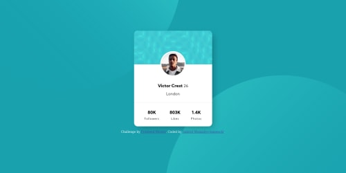
Mobile first, responsive with pure CSS

Solution retrospective
I don't use SASS or other preprocesser, because for the "newbies" the most important is dominant the basics of lenguajes (and because i don't know use it yet xD)
I try to do this responsive, and i said "try" because i think there are better methods than i use in this case, if you know how to better i'll thank give me feedback <3
My bigest problem was the background with the position background and the porcents, that made me write a media querye for each misalignment, and repeat code for change a single value :/
All other, if you see something you think can do better, please write it!
Be severe, is the way to learn. Thanks!
(Sorry if my english make you cry, i'm learning)
Please log in to post a comment
Log in with GitHubCommunity feedback
- @samuelpalaciosdev
Hi, ippo👋
Well done on this challenge! Your solution looks good👍
I only suggest some things 😉:
-
You don't have a h1 on this project as it stands. Headings provide valuable information by highlighting important topics and the structure of the document. For this project, I'd set it where is the person's name.
-
There're too many Media Queries on the background position. I'd think you should see others solutions to see how they approach that, because too many media queries are not the best approach I think.
I hope this would help you, have a nice day, keep coding!💙
-
- @MarwanT-dev
you can give the circles width and height with vh and vw instead of pixels to make it responsive or if you want to use media queries you can use these: @media(max-width:767px){} @media(min-width:768px){} @media(min-width:992px){} @media(min-width:1200px){} those will fit all screens
- @Drallas
Si, tu ingles me da los ojos lleno de lágrimas :) Pero si te querrás escribir mejor ingles, puedes considerar usar Grammarly.
There are too many Media Queries and the background is not scaling good and blanks out for me.
I have not done this challenge myself yet, but i recommend looking at other peoples solutions. You have submitted a solution so previous ones are unlocked for you!
- @Gabrieldev-web-coder
A lot media queries background position fixed.
Join our Discord community
Join thousands of Frontend Mentor community members taking the challenges, sharing resources, helping each other, and chatting about all things front-end!
Join our Discord