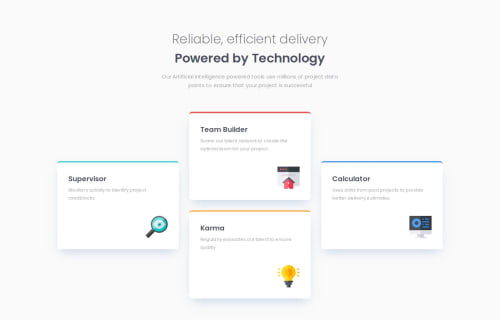
Skip to content
  • Unlock Pro
  • Log in with GitHub
Solution
Submitted 10 months ago

Four Card Feature w/Grid, Flex

P
Igor•290
@whiteriver-dev
A solution to the Four card feature section challenge
View live sitePreview (opens in new tab)View codeCode (opens in new tab)

Solution retrospective


What are you most proud of, and what would you do differently next time?

I made it look good in the end, but next time I'm going to start with the mobile layout first as it works better that way

What challenges did you encounter, and how did you overcome them?

Found it slightly challenging working with grid over flex. Realised I just had to make more rows to fit the cards properly

What specific areas of your project would you like help with?

Using rem units for more flexibility. If figma files are in px, how do I interpret them into rem units. Also, code efficiency tips are always appreciated

Code
Select a file

Please log in to post a comment

Log in with GitHub

Community feedback

  • P
    Huy Phan•3,430
    @huyphan2210
    Posted 10 months ago

    Hi, @whiteriver-dev

    I checked out your solution and I have some thoughts:

    • Try Mobile-First Design: Starting with the mobile layout first is a great approach, known as mobile-first design. It prioritizes smaller screens, ensuring that your design scales well to larger ones. I’d recommend doing a bit of research on it to understand the benefits better.
    • Improving Mobile Viewports: It seems the page layout doesn’t fully adapt to mobile viewports (a viewport is the visible area of a webpage on a screen). If you’re considering a code rewrite, try removing grid-template-column from .card-parent initially, as well as any grid-column and grid-row settings on the child elements. Then, apply these styles in a media query specifically for desktop viewports. This technique can help you implement mobile-first design more effectively.
    • Use Semantic HTML Tags: Try using semantic HTML tags instead of relying mainly on div elements. Semantic tags convey meaning to both the browser and developers, improving accessibility and readability. (For example, use <header>, <main>, <section>, etc., based on the content.)
    • Meaningful Class Names: Consider using more descriptive class names in your CSS, making it easier to understand and maintain. Although the challenge provides static data, it’s useful to plan for dynamic content. This practice becomes essential in professional environments. Researching CSS naming conventions, such as BEM (Block Element Modifier), can give you some inspiration for structuring your classes.

    Hope this helps!

    Marked as helpful

Join our Discord community

Join thousands of Frontend Mentor community members taking the challenges, sharing resources, helping each other, and chatting about all things front-end!

Join our Discord

Stay up to datewith new challenges, featured solutions, selected articles, and our latest news

Frontend Mentor

  • Unlock Pro
  • Contact us
  • FAQs
  • Become a partner

Explore

  • Learning paths
  • Challenges
  • Solutions
  • Articles

Community

  • Discord
  • Guidelines

For companies

  • Hire developers
  • Train developers
© Frontend Mentor 2019 - 2025
  • Terms
  • Cookie Policy
  • Privacy Policy
  • License

Oops! 😬

You need to be logged in before you can do that.

Log in with GitHub

Oops! 😬

You need to be logged in before you can do that.

Log in with GitHub

How does the accessibility report work?

When a solution is submitted, we use axe-core to run an automated audit of your code.

This picks out common accessibility issues like not using semantic HTML and not having proper heading hierarchies, among others.

This automated audit is fairly surface level, so we encourage to you review the project and code in more detail with accessibility best practices in mind.

How does the CSS report work?

When a solution is submitted, we use stylelint to run an automated check on the CSS code.

We've added some of our own linting rules based on recommended best practices. These rules are prefixed with frontend-mentor/ which you'll see at the top of each issue in the report.

The report will audit all CSS, SCSS and Less files in your repository.

How does the HTML validation report work?

When a solution is submitted, we use html-validate to run an automated check on the HTML code.

The report picks out common HTML issues such as not using headings within section elements and incorrect nesting of elements, among others.

Note that the report can pick up “invalid” attributes, which some frameworks automatically add to the HTML. These attributes are crucial for how the frameworks function, although they’re technically not valid HTML. As such, some projects can show up with many HTML validation errors, which are benign and are a necessary part of the framework.

How does the JavaScript validation report work?

When a solution is submitted, we use eslint to run an automated check on the JavaScript code.

The report picks out common JavaScript issues such as not using semicolons and using var instead of let or const, among others.

The report will audit all JS and JSX files in your repository. We currently do not support Typescript or other frontend frameworks.

Oops! 😬

You need to be logged in before you can do that.

Log in with GitHub