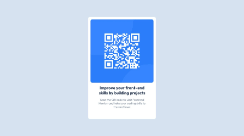
Frontend-Mentor-Chal.-1

Solution retrospective
I want to know more about responsive design for it for phone
Please log in to post a comment
Log in with GitHubCommunity feedback
- @funficient
Hey, nice work! Your solution looks great!
Responsive design essentially thinks about how the artifact will look like on different size devices. On a mobile screen your design will work very well, but if it is rendered on a large desktop screen the QR Code might be a bit large as you've set it to always be 75vh regardless of the screen size.
#main #qr-box{
    height: 75vh;
    width: 50vh;
    background-color: hsl(0, 0%, 100%);
    border: none;
    border-radius: 10px;
    padding: 1%;
}
To make it more responsive you can either make the QR code size fixed by using em, rem, of px. Alternatively you can add media queries that changes the layout when it reaches the criteria you specify, like the screen size.
For example, you might want to resize the qr-box when it is the desktop width is 1200px or larger.
 @media (min-width: 1200px) {
       #main #qr-box{
    height: 50em;
    width: 30em;
    padding: 2em;
}
It will read the CSS from top to bottom, thus, the main code will apply, until it hits 1200px, and then it will resize the qr-box component to a height of 50em, a width of 30em, and padding will change from 1% to 2em. (These measures are not exact, I'm just trying to explain how it works).
Hope that helps! Enjoy your next challange.
Join our Discord community
Join thousands of Frontend Mentor community members taking the challenges, sharing resources, helping each other, and chatting about all things front-end!
Join our Discord