Latest comments
- @hottamkumawat@funficient
Hey, nice work! Your solution looks great!
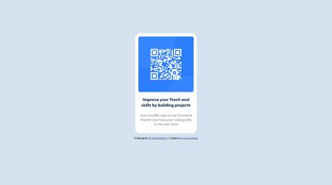
Responsive design essentially thinks about how the artifact will look like on different size devices. On a mobile screen your design will work very well, but if it is rendered on a large desktop screen the QR Code might be a bit large as you've set it to always be 75vh regardless of the screen size.
#main #qr-box{
    height: 75vh;
    width: 50vh;
    background-color: hsl(0, 0%, 100%);
    border: none;
    border-radius: 10px;
    padding: 1%;
}
To make it more responsive you can either make the QR code size fixed by using em, rem, of px. Alternatively you can add media queries that changes the layout when it reaches the criteria you specify, like the screen size.
For example, you might want to resize the qr-box when it is the desktop width is 1200px or larger.
 @media (min-width: 1200px) {
       #main #qr-box{
    height: 50em;
    width: 30em;
    padding: 2em;
}
It will read the CSS from top to bottom, thus, the main code will apply, until it hits 1200px, and then it will resize the qr-box component to a height of 50em, a width of 30em, and padding will change from 1% to 2em. (These measures are not exact, I'm just trying to explain how it works).
Hope that helps! Enjoy your next challange.
- @Ayyappanakkala@funficient
Hey, congratulations on submitting your first challenge! Well done!
Media queries are used to specify any changes in the layout between different media sizes to make it more responsive. For this challenge there is no difference between a mobile and desktop layout (looking at the design files), thus you don't need any media queries (even though they specify mobile and desktop sizes in the style guide).
If, however, the layout changed, you would want to use the media query to specify what is different between one layout and another. For example, let's say the font size changes to fit better on a mobile screen, then you might have main css like:
h1 {
  font-size: 3em;
}
And when the same code is displayed on a mobile device (size obtained from the stylesheet) it will look like this:
@media (max-width: 375px) {
   h1 {
     font-size: 2em;
   }
}
So, for a device with a screen size between 0 and 375px the header 1 text will be 2em in size, and as soon as it gets bigger than that, the code above it will be used, in this case 3em for header 1 text.
Here is a better explanation with more examples: https://developer.mozilla.org/en-US/docs/Learn/CSS/CSS_layout/Media_queries
Hope that helps! Good luck with your next challenge! Kate
Marked as helpful - @nikhil-131@funficient
Congratulations on completing the challenge! To add to what @Thodoris-Diamantidis already mentioned, here is an example of how you might create a media query for a mobile device:
 @media (max-width: 785px) {

    .grid-container {
      grid-template-columns: 1fr;
    }
    }
Use the breakpoints included in the style guide, and simply list all the changes from desktop view (in this case). Typical things that change for mobile view is padding or margins, font sizes, and stack order of components.
The way I approach it is to look at both the desktop and mobile designs carefully before I start anything to see what is different in the layout. This helps me decide whether to use grid or flex for example, or how to structure the page.
Good luck! Hope this answers your question. Happy coding! Kate
Marked as helpful - P@mickoymouse@funficient
Hey! Nice solution!
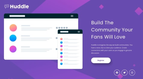
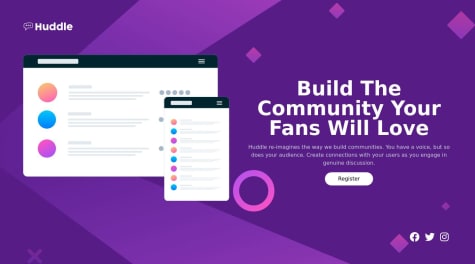
I'm not sure if it's best practice, but the way I handled the social icons is by sizing the body as 100vh:
body {
  background-color: var(--color-primary-voilet);
  background-image: url(assets/bg-desktop.svg);
  background-size: cover;
  background-repeat: no-repeat;
  width: auto;
  display: flex;
  flex-direction: column;
  min-height: 100vh;
}
The footer element which contains the social icons is then simply positioned at the end of the box which is 100vh.:
.footer {
  display: flex;
  justify-content:flex-end;
}
Hope that helps! Kate
Marked as helpful - @vgarmyWhat are you most proud of, and what would you do differently next time?
i like the spacing in my component. But would like to make shorter css code.
What challenges did you encounter, and how did you overcome them?No challanges at this porject, pretty straigh forward,
What specific areas of your project would you like help with?None
@funficientWell done on completing the challenge! I agree with @gfunk77, your CSS is pretty good!
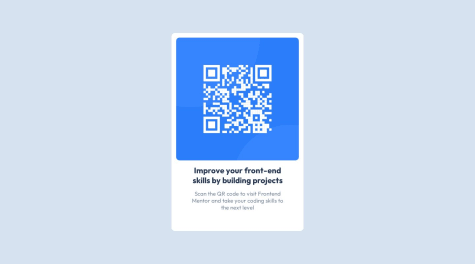
The only way I would shorten the CSS (if it were my code) is to remove the triplicate border-radius definitions. I only use the standard
border-radius: 0.75rem;without the webkit versions and it works fine.Also, I would move the width element to the container level rather than duplicating it for both the h1 and the p text. In other words, remove it from the h1 and p sections and handle the width for the parent container :
.container__card__body h1 {
    font-weight: 700;
    ***width: 265px;***
    font-size: 22px;
    color: var(--darkblue);
    margin: 2rem 0 1rem;
    text-align: center;
}
Another thing that I find useful is to define the h1, p, etc. as standalone and not as children of the container. This will not shorten your code for this challenge, but it would potentially shorten it if you had other containers re-using the same definitions. For example:
.container__card__body h1 {
}
becomes
h1 {
}
If you keep it the way you defined it as children of the container, you will have to redefine the h1 and p elements each time you use it on another container, which might get confusing.
Hope that helps! Enjoy your next challenge! Kate
Marked as helpful - @abhishek-baliyan-dev@funficient
Hey @abhishek-baliyan-dev! Great solution!
The breakpoint for desktop is included for reference to the designs that are included. The size of the designs are based on the breakpoint sizes as far as I understand. It is useful because some desktop screens are very big which would require using max-width, or minmax() rather than just padding and margins to position the items.
Regarding your other question, I suspect the space is because you handled the image and the text as sections rather than divs. A section, as far as I understand, is more like a fixed block on the page, while a div is an element on the page or in a block that can be positioned in any way, which gives it more flexibility. But disclaimer, I'm still learning too. :-)
Hope this is helpful! Enjoy your next challenge!
Kate
Marked as helpful
