


Eduardo D'Angelo• 70
@eduardodangelo
Posted
Hey Magda, really nice solution, keep up the great work!!!
1
Looking to hire developers?
Does the mobile design look well on your phones?
@eduardodangelo
Posted
Hey Magda, really nice solution, keep up the great work!!!
@mattstuddert
Posted
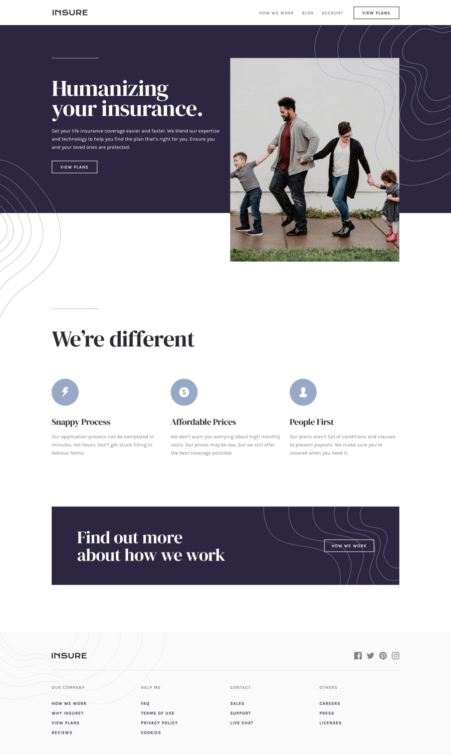
Hey Magda, nice work on this challenge and congrats on submitting your first solution! It looks great on mobile for me. There are a few small things like the pattern overlapping the View Plans call-to-action, but it's a small detail. You've done a really good job!
I noticed you're using max-width media queries. Have you ever tried using min-width instead of max-width? It's quite a common workflow with front-end developers to use them and work mobile-first. It can often lead to less CSS code and has the benefit of loading in fewer styles for mobile users, which can be a nice performance gain.
I hope you enjoyed the challenge. Keep up the great work!
@magdakok
Posted
@mattstuddert Hello! Thank you very much for the feedback :) I see the overlapping. Actually, I liked it, but I have to agree - it's too much going on there, will fix it soon :) I'll give a try to the mobile-first approach in my third project. Second is Easybank, and I'm hoping to finish today.
Thank you once again, also for the possibility to exercise on such cool and aesthetic projects!
@mattstuddert
Posted
@magdakok you're welcome! I'm really happy you're enjoying the challenges and I'm looking forward to seeing your next solution! :)
Join thousands of Frontend Mentor community members taking the challenges, sharing resources, helping each other, and chatting about all things front-end!
Join our Discord
