


@mattstuddert
Posted
Hey Fola, you've done an awesome job on this challenge! I like how well your project scales up and down. One small area that could do with a review on the responsive side is the footer layout in the tablet range. You'll see some of the lists get squashed or jump down to the next row at different times.
You've got some accessibility errors and HTML validations errors/warnings I'd recommend trying to resolve. For example, you've got two title elements in your `head. Your social links are also inaccessible to screen reader users at the moment. Have a go at Googling and fixing the errors. Once you think you've resolved them, push the new version of code and generate a new report to see if they've been fixed.
Your style-related files are all at the root level of the project at the moment. I'd recommend putting them in their own folder to clean up the file structure a bit.
Here are some other notes after looking at your code:
- The
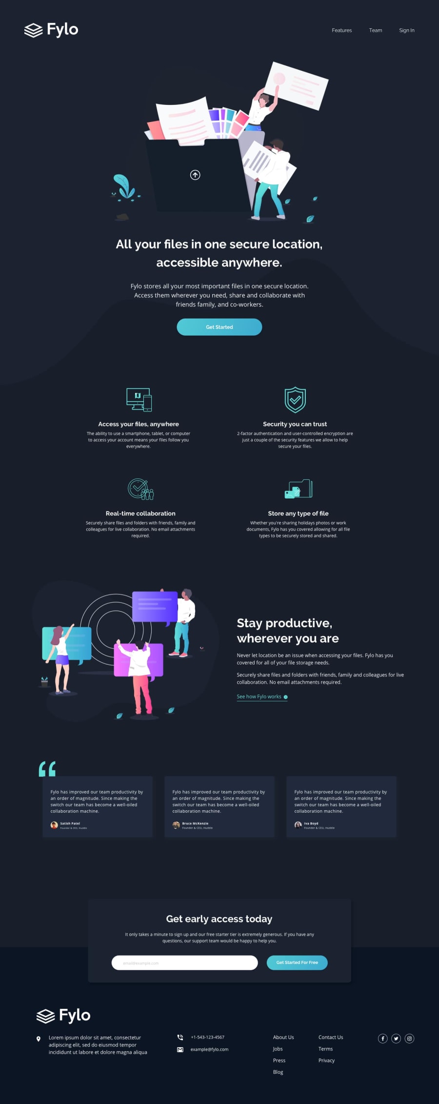
alttext for the logo says "fylo official logo" at the moment. For logos, you can add the company names by itself. So "Fylo" would be best here. - Your
headerstructure looks good overall, except you don't need the.logodivelement and you also don't needptags inside theatags for the navigation links. - On the first illustration, you've got this
alt="#"on theimgelement. If you want screen readers to skip an image, you should leave thealtvalue empty. Adding a hashtag in there would be confusing. - For the arrow
img, you've got thisalt="https://github.com/folathecoder/fylo.io"on theimgelement. Again, this would be confusing for screen reader users as it doesn't describe the image. In this instance, it's an arrow icon, so it doesn't add any context to the content, so an emptyaltwould be best to make screen readers skip that content. - You're using
max-widthmedia queries. I'd recommend usingmin-widthmedia and trying to work mobile-first. Many developers find it to be an easier workflow and usingmin-widthmedia queries has the benefit of loading in fewer lines of CSS, which can be a performance boost, especially if you're using different background images for different device sizes.
A big takeaway from this would be to read up on accessible images as much as possible. Creating accessible websites is a key part of being a front-end developer.
Your code overall though looks good, and you've done an excellent job of re-creating the design! 👍
I hope this helps. Let me know if you've got any questions 🙂
@folathecoder
Posted
@mattstuddert
Wow! Wow!! Wow!!!
I love detailed and critical feedback like this. Thank you, Matt! I will get to work immediately!
As regards min-width, I find it very very very very hard to design mobile-first! I have tried a million times. I will have to watch someone do it, probably on YouTube, to better understand the steps.
I have seen devs and companies go for desktop-first, while others do the opposite.
I will try my best to know mobile-first!
Thank you, Matt!
@mattstuddert
Posted
@folathecoder you're welcome! If you want to see a professional developer work mobile-first I'd recommend checking out this code along by Kevin Powell. He works through our Social proof section challenge and does it in a mobile-first workflow. Hopefully, that will help make it click for you!
@folathecoder
Posted
@mattstuddert Thank you matt!
