


Raymart Pamplona• 16,140
@pikapikamart
Posted
Hey, awesome work on this one. Layout in desktop looks great, it is responsive and the mobile layout looks great as well.
Some suggestions would be:
- Avoid using
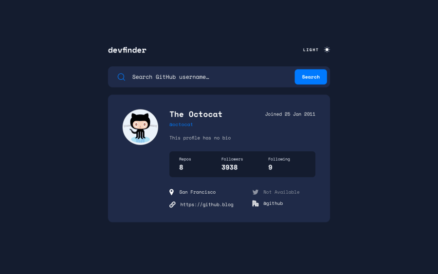
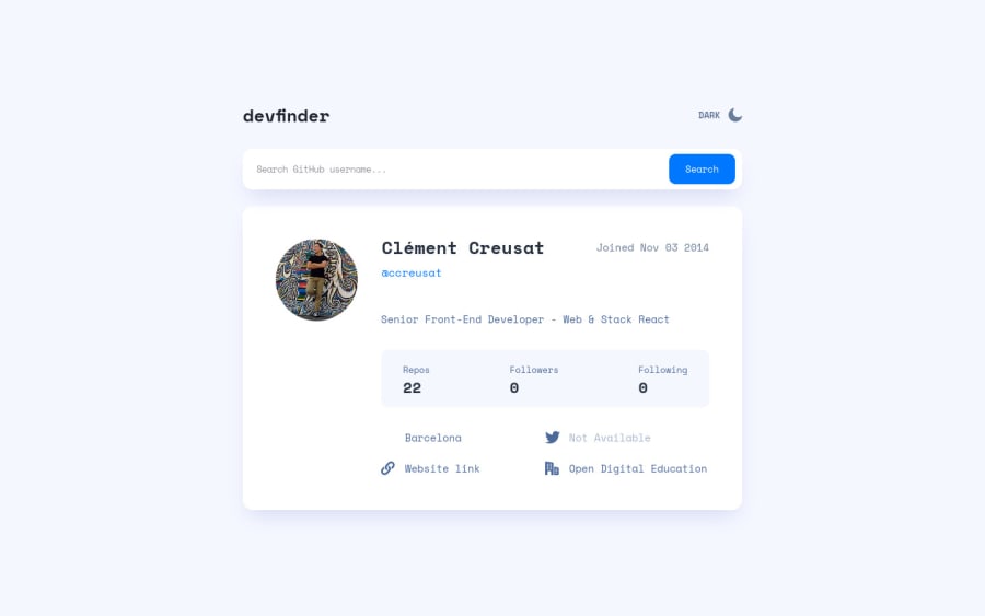
height: 100vhon a large container especially thebodytag, this makes the element's height limited to the current remaining screen. Try to inspect the layout in dev tools at the bottom, scroll down and hover on thebodytag, you will see that it doesn't captures the whole layout. Instead, usemin-height: 100vhthis takes full height and will expand if it needs to. - The theme-selection is not accessible at the moment since you are using
div, when creating an interactive component make use of interactive elements. On that one, you could have usedinput type="radio"since it is a selection of choice, theinputwill be inside afieldsetalong with ansr-onlylegendelement that describes what the set of radio buttons are for. This way, it will be more accessible for all users. It can quite a tricky to implement but you have to, I don't have solution for this one, [but take a look on how my theme-selection is structured(https://gallant-albattani-35cdfb.netlify.app/) that is my todo-app solution, inspect the color theme. - The
inputneeds to have anlabelassociated with it, thelabelwould havesr-onlyclass. Thelabel's text should describe what does theinputdoes. - It's great that there is an error message, but at the moment it is not associated internally with the
input. What you should do looks like this pseudocode:
const id = id of the error-message;
if ( input is wrong )
  input.setAttribute("aria-invalid", "true");
  input.setAttribute("aria-describedBy", id);
else
  input.removeAttribute("aria-invalid");
  input.removeAttribute("aria-describedBy");
This way, users will know that there is an error from their input because of the aria-invalid and they will know as well what kind of error they had made because of the aria-describedBy attribute. You can take a look at my simple snippet on how to use those method
buttonneeds to havetype="submit", always be explicit what yourbuttonshould be.- Also an addition, to make it even more accessible, you can make use of
aria-liveattribute to an element, maybe announce if theformsubmission is invalid, if there is a user or if there is no user. - Name of the person could use a heading tag since it is the primary text content of the app. Also avoid just wrapping a text inside a
strongspandiv, use a meaningful element like aptag. - I would use
ulon theuser__statssince those are "list" of information. - The
altfor each of the icon usage on the bottom part should be left emptyalt=""and added an extraaria-hidden="true"attribute on theimg. Since it is a decoration only, you want to hide it.
Aside from those, great work again on this one.
1

