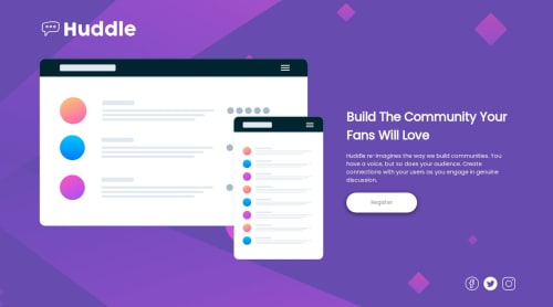
HTML and CSS Responsive Hunddle Landing Page with Queries.

Solution retrospective
Trying to keep my background responsive and similar when decreasing viewport.
The way a solved or approached this situation was with media queries and also setting my background to percetange to let it scale as needed.
What specific areas of your project would you like help with?For some reason I started losing track so probably my structure and some css is not the best, however if anyone knows about how to account for browser UI, in other words when you open this website in your phone and the bottom social icons are hidden or overflowing until the top UI for the browser is closed automatically, how do I adjust that?
Started reading some info about dvh and svh units, applied them but didn't work, maybe there are some inconsistencies in my code but I also read some browsers don't render it correctly. I was using google chrome in my phone, supposedly I should've tried with a different browser just not sure.
Please log in to post a comment
Log in with GitHubCommunity feedback
No feedback yet. Be the first to give feedback on Dangelo's solution.
Join our Discord community
Join thousands of Frontend Mentor community members taking the challenges, sharing resources, helping each other, and chatting about all things front-end!
Join our Discord