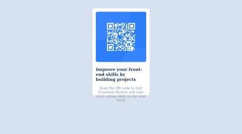
Solution retrospective
i had issues wrapping my head around the way github works
Please log in to post a comment
Log in with GitHubCommunity feedback
- @Hassiai
Replace <div class="container"> with the main tag, <p class="first"> with <h1> to fix the accessibility issues. click here for more on web-accessibility and semantic html
Every html must have <h1> to make it accessible. Always begin the heading of the html with <h1> tag wrap the sub-heading of <h1> in <h2> tag, wrap the sub-heading of <h2> in <h3> this continues until <h6>, never skip a level of a heading.
For a responsive content,
- Give .container a fixed max-width value and a padding value for all the sides
max-width: 320px which is 20rem/em padding:16px which is 1rem/em - Give the img a max-width of 100% and a border-radius value, the rest are not needed.
Give h1 and p the same font-size of 15px which is 0.9375rem, text-align: center, the same margin-left, margin-right and margin-top values. Give p a margin bottom value.
To center .container on the page using flexbox or grid instead of margin,
- USING FLEXBOX: add min-height:100vh; display: flex; align-items: center: justify-content: center; to the body
body{ min-height: 100vh; display: flex; align-items: center; justify-content: center; }- USING GRID: Add min-height:100vh; display: grid place-items: center to the body
body{
min-height: 100vh;
display: grid;
place-items: center;
}
Use relative units like rem or em as unit for the padding, margin, width values and preferably rem for the font-size values, instead of using px which is an absolute unit. For more on CSS units Click here
Hope am helpful.
Well done for completing this challenge. HAPPY CODING
- Give .container a fixed max-width value and a padding value for all the sides
- @sumanth-chandana
Hi ifeanyi!, congrats🎉 on completing the challenge. Better take care about following points.
- You could watch a crash course on youtube about Github
- Always check Frontendmentor Report Generator issues after submitting the project for removing errors and warnings.
- Use the
alt(alternate text) attribute as mentioned in your Accessibility Report.altattribute is used for Screen readers applications. - Why does alt attribute matter? Read here.
- To avoid accessibility issues "All page content should be contained by landmarks" use code as :
 <body>
    <main>
        ---your code here----
    </main>
  <footer>
  </footer>
</body>
(why does
<main>matter? Read here )- For proper centering the container(whole card) vertically and horizontally you can also use the following simple block of code use code:
body { min-height: 100vh; display: grid; place-content: center; }- When we open the GitHub repository link, you will find an About Section on the right side. There, also include a live preview link of your project. It is better for someone to check your live project while interacting with code.
I hope you will find this Feedback Helpful.
Join our Discord community
Join thousands of Frontend Mentor community members taking the challenges, sharing resources, helping each other, and chatting about all things front-end!
Join our Discord