HTML, CSS, Flex-box for responsive design

Solution retrospective
I've made the finally changes after some fantastic feedback from the community. Thank you everyone ❤️.
Please log in to post a comment
Log in with GitHubCommunity feedback
- @ApplePieGiraffe
Great job, Victor Bruce! 👍
Just one last thing in addition to the wonderful feedback you already have—setting a
max-widthon the main container or wrapper will ensure that the content of the page doesn't look too stretched on large screens (although this design still looks pretty good when the screen width increases). 😉Keep coding (and happy coding, too)! 😁
- @grace-snow
Hi Victor
Good job on this, it looks nice on all screen sizes!
A few larning points for next time:
-
Only include alt text on images that have meaning, otherwise leave the alt text blank. e.g. when I turn images off for your page, I get
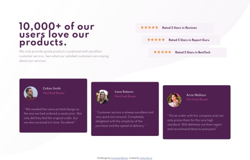
reviews rate star reviews rate star reviews rate star reviews rate star reviews rate star Rated 5 Stars in Reviews- as you can see, the alt text on the images adds no meaning there and should bealt=""to demonstrate it's intentionally blank -
Remember with CSS grid that it is for 2 dimensional layouts. With a minor adjustment to your html markup, your
.cardelements could easily be one grid rather than just the card header. -
I would advise against setting your html size to be small. There is little reason to do this and forces you to then change font sizes throughout a project. Not a big problem on a little challenge like this, but it could cause big issues on a large project where rems and ems are then used to size elements.
Hope all that's helpful :)
-
- @emestabillo
Hi Victor, congrats on finishing this challenge! Here are a few points:
- I'm looking at the mobile view and I'm not seeing all of your project because
bodyhasheight: 100vhon it. - The testimonial cards can also use
max-widthto control the stretch - they look really wide on medium-sized screens. - At 769px, the last ratings div is touching the gutter. Maybe it's better to keep them all in a straight line and indent them when you have more space
- The testimonial cards could use some margins or gaps in between them around 1025px to 1370px
Hope this helps :-)
- I'm looking at the mobile view and I'm not seeing all of your project because
- @jazy-bhai
https://www.w3schools.com/css/css3_backgrounds.asp
I was facing the same problem. This helped me. I hope this helps you too !


Join our Discord community
Join thousands of Frontend Mentor community members taking the challenges, sharing resources, helping each other, and chatting about all things front-end!
Join our Discord