Not Found
Not Found
Not Found
Not Found
Not Found
Not Found
Not Found
Not Found
Not Found
Not Found
Not Found
Not Found
Not Found
Not Found
Not Found
Not Found
Not Found
Not Found
Not Found
Not Found

Submitted

HTML, CSS, Flexbox, Media Query

@parmeet9891

Desktop design screenshot for the Interactive pricing component coding challenge

This is a solution for...

  • HTML
  • CSS
  • JS
2junior
View challenge

Design comparison


SolutionDesign

Solution retrospective


Behaving bit different in Mozilla, don't know why. Width looking strange, and fonts too. Need to figure out why this is happening. But just for reviewing, I suggest to review it in Chrome. I have used inbuilt range slider for now, but working on this to create my own. Suggestions, improvements always welcome :).

Community feedback

P
Patrick 14,325

@palgramming

Posted

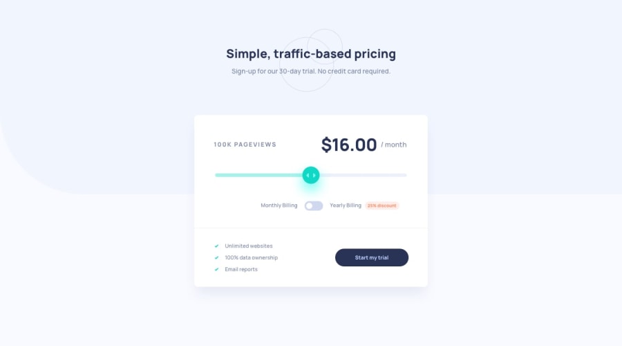
Part of your problem is are your "### Pageviews" changes number is changes widths and that is effecting the whole width of your layout. Put a fixed width on that element to fit the largest it grows and that should hold you design the same size

0

@parmeet9891

Posted

@palgramming ok, let me try.

0

@macluiggy

Posted

you probably need to add -webkit and -moz- prefixes in some css properties, that's becouse some css functionalities are not fully implement in all the browsers, so the prefixes are like a polyfill function in javascript

0

@parmeet9891

Posted

@macluiggy But this is something which is really weird. I haven't used anything which should relate to browser or something. Normal widths, flex, media queries which I used almost in every project I did here. That's why I am confuse, it looks fine in Chrome but not in firefox. And I do have used moz and webkit prefixes, where things behave differently.

0

Please log in to post a comment

Log in with GitHub
Discord logo

Join our Discord community

Join thousands of Frontend Mentor community members taking the challenges, sharing resources, helping each other, and chatting about all things front-end!

Join our Discord