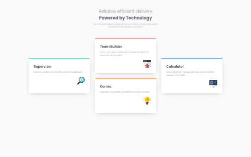
Submitted about 4 years agoA solution to the Four card feature section challenge
HTML, SCSS, grid, flexbox

@vlkradek
Solution retrospective
Any feedbacks are highly appreciated:))
Code
Please log in to post a comment
Log in with GitHubCommunity feedback
- @MojtabaMosavi
Hi!, The mobile and desktop view are look good but there is room for improvment when it comes to responsibility, if you don't wanna do the bit, I suggest you define your media-query at 1000px.
Keep coding :=)
- P@palgramming
You need to change your mobile to desktop transition point cause currently when the transition happens half your desktop layout end up out the side of the browser window


Join our Discord community
Join thousands of Frontend Mentor community members taking the challenges, sharing resources, helping each other, and chatting about all things front-end!
Join our Discord