


@artimys
Posted
Hi there Felipe, good job on completing the challenge.
I would recommend reducing the overall layout size and adjust the font-size accordingly to not make it so large. That way you can better fit the layout in a tablet/middle screen size with a media query.
Keep on coding!!
@felipeog
Posted
Hello, @artimys! Thanks for the feedback.
It really turned out too big, I agree. I plan on fixing it soon.
Thanks again for taking the time to take a look!
@felipeog
Posted
Hello again, @artimys!
I improved the layout a little bit and took care of the HTML issues, in case you want to take another look.
Cheers!
@artimys
Posted
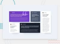
@felipeog I'm happy to see you're improvements. The cards look great.
I'll leave one last suggestion about the extra white space surrounding the mobile layout right before it switches to desktop (1440px). The extra space can be used to expand on the mobile layout design a bit before going desktop. Throw in another media query for a medium layout (you choose the px). Have fun with it since you are using grid-template-areas and it's easy to position elements around.
Think about those transitions for future challenges as well.
Keep it up!! 👍
