HTML5, SaSS

Solution retrospective
Please Rate my code. your feedbacks will help me improve in my journey.
Please log in to post a comment
Log in with GitHubCommunity feedback
- @mickyginger
Hey Nabil! 👋
You've done a great job here, so well done! 🎉
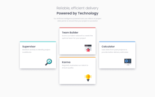
I think there may be a simpler way to position your cards. Generally I would avoid absolute positioning if you can possibly help it.
How about this for your tablet styles:
.cards {
  display: flex;
  flex-direction: row;
  max-width: 700px;
  flex-wrap: wrap;
  justify-content: space-evenly;
}

.cards .card {
  margin-bottom: 10px;
}
Then update them on desktop like so
.cards {
  max-width: 1120px;
}

.cards .card {
  margin-bottom: 25px;
}

.cards .card:nth-child(1), .cards .card:nth-child(4) {
  transform: translateY(-50%);
}
Using
transform: translateYis nice because you don't have to set explicit sizes, so the card will always move by half its own height, regardless of the content.Hope that helps! 🤓
Marked as helpful - @dewslyse
Nice work on the challenge Nabil. Everything seems clean. Well done 👏 👏 . My only suggestion would be to center content to the page. Happy coding and best of luck with subsequent challenges.
Marked as helpful


Join our Discord community
Join thousands of Frontend Mentor community members taking the challenges, sharing resources, helping each other, and chatting about all things front-end!
Join our Discord