HTML5, SCSS, Vanilla Js, Fluid Typography
Solution retrospective
Hello folks 😀
This challenge was awesome and taught me a lot of things on the way...!
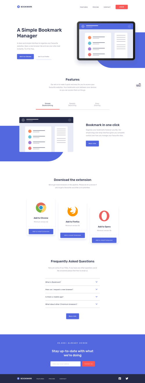
In this challenge I learned how you can apply fluid typography to width, height and font sizes to make things **fully responsive..! ** 😍 This web site is fully responsive without much use of media queries
There are a lot of things that I learned while being with this project, at the same time I believe I have missed some things and details😅 . But that's why we have each other, wouldn't you say? 🤗
Questions
- How can I make my Js simpler?
- Is there something that I missed while making HTML structure, like should have used this tag instead of that or you missed something?
- How can I make my sass code more scalable?
Any other feedbacks are very much welcome 😊
Let's learn together, grow together and Become the best Web developer..! 😎
Happy Coding..! 😴
Please log in to post a comment
Log in with GitHubCommunity feedback
- @ApplePieGiraffe
Greetings, Roc Tanweer! 👋
It's good to see you complete another challenge! 😀 Great job on this one! 👍 Overall, your solution looks good and is responsive and it's wonderful that you learned lots of new things (I always do when completing challenges, as well)! 😊 And I like the animation of the mobile menu icon and the custom attribution that you added to your solution! 😄
A few things I'd like to suggest are,
- Adding
overflow-x: hidden
to thebody
of the page (or something similar) to prevent a horizontal scroll bar from appearing along the bottom of the page when the image changes in the "Features" section. - Adding a
max-width
to the header of the page in the desktop layout to ensure that it isn't too wide on extra-large screens. - Using the
<button>
element (rather than a<div>
) for the hamburger menu icon (since it is button and that will improve the accessibility of your solution). - Perhaps taking another look at your class names. If you're trying to use BEM, I believe there should only be one element per classname (in other words, something like
block__element
instead ofblock__element__element
), so you might want to simplify some of your classnames a little. I don't think classnames have to reflect the actual structure of your HTML unless that makes things confusing, so you might be able to do things likeheader__link
instead ofheader__nav__links__link
. - Considering taking a look at this StackOverflow page (as it might help you clear up those few errors on your solution report).
- I noticed you created the accordion in this challenge with HTML and JS (and it works well, kudos!) but if you're interested, you can create accordions with just HTML by using the
<detail>
and<summary>
elements. It's pretty nice and easy, and you can learn more about it from this helpful MDN page.
I hope those tips help. 🙂
Of course—keep coding (and happy coding, too) my friend! 😁
- Adding
- @MasterKrab
Hello Roc Tanweer, great job on this challenge!
I think I can help you with a couple of suggestions.
- You can add an
aria-label
to links with descriptive text for screen reader users.
<a href="#" aria-label="Description"> <i class="icon" aria-hidden="true"></i> </a>
-
I think the "More info" button should be a link because it will probably send you to another page with more information.
-
The
download-box
should be anarticle
orsection
and not just adiv
. -
The hover effects should only be on desktop because on mobile is problematic and does not make sense to place it.
I hope you find it useful, let me know what you think.
Happy coding!
- You can add an
Join our Discord community
Join thousands of Frontend Mentor community members taking the challenges, sharing resources, helping each other, and chatting about all things front-end!
Join our Discord