Not Found
Not Found
Not Found
Not Found
Not Found
Not Found
Not Found
Not Found
Not Found
Not Found
Not Found
Not Found
Not Found
Not Found
Not Found
Not Found
Not Found
Not Found
Not Found
Not Found

Submitted

Hubble landing page

@ArtemPonomarenko


Design comparison


SolutionDesign

Solution retrospective


Good morning guys!

Rather straight forward challenge. No hidden stones. Have a great Monday!

Community feedback

Arturo Simon 1,785

@artimys

Posted

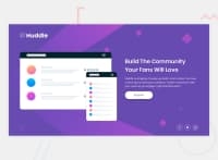
Amazing job Artem. Pretty much pixel perfect. Great to see you're thinking about aria-labels in your code.

  • I would add a bit of spacing to your main container when it hits 1100px in your media query.
  • Add a cursor: pointer to your button.
  • Your structure is well put together and I recommend adding some html semantics. Example div.container to main.container

Great job 👍👍

2

@ArtemPonomarenko

Posted

@artimys

Thanks! Semantics are eluding me at the moment. Will try to implement it more with my junior challenges.

0
P
ApplePieGiraffe 30,545

@ApplePieGiraffe

Posted

Hey, Artem Ponomarenko! 👋

You're completing so many challenges! You've done another great job on this one! 🙌

You've already received lots of great feedback, so I'll just say nice work, once again, and keep it up! 👍

Looking forward to your next solution, too! 😆

Happy coding! 😁

1

@ArtemPonomarenko

Posted

@ApplePieGiraffe

Thanks!

Happy coding back to you! =)

0
Anna Leigh 5,135

@brasspetals

Posted

Good job, Artem! I appreciate that you added hover states to the button and social links. Is this the last of your "newbie" challenges? If so, big congrats! 🎉

I have a few, small suggestions:

  • To make your mobile layout more responsive, you could change the container width: 300px to min-width and then play around with the max-width percentage a bit to see what you like (I think somwhere around 65% seems to work well).
  • After about 675px, the mobile background stops expanding. background-size: contain is definitely what fits the mobile design, but you might want to consider adding a small media query around that width to switch it to cover. If you keep it on cover, it will also fix a similar issue that happens with the desktop background when the height gets too large (ex: 1440 x 900).
1

@ArtemPonomarenko

Posted

@brasspetals Thanks! I did the changes you mentioned and it does look better, thank you very much! Before submitting the solution I tried using "background-size: cover" for the desktop version but it was slightly off, so I went with "contain", which massacred medium and extra-large screen size. To be honest I was being kind of lazy about the tablet size devices and extra large desktops. As long as 375px and 1440px corresponded to the design I was happy. But from now on will pay more attention to it. Yeah, tomorrow will be starting the next difficulty =) very excited =D

0
Anna Leigh 5,135

@brasspetals

Posted

@ArtemPonomarenko Oh yeah, that's right- cover doesn't quite match the desktop design. Had to go back to my code and check. I actually didn't intially set a background-position for the desktop image, but added a min-height: 801px media query to use cover. 😂 Only time I've ever used a min-height media query. The ridiculous things I do for pixel perfection. 🤦‍♀️

It can definitely be a pain to account for medium and extra large screens, but I think it's ultimately worth it. As you get more comfortable using flexbox and grid, it does get a bit easier. I heavily abuse max-width.

Anyway, congrats again! Looking forward to seeing your "junior" solutions!

1

Please log in to post a comment

Log in with GitHub
Discord logo

Join our Discord community

Join thousands of Frontend Mentor community members taking the challenges, sharing resources, helping each other, and chatting about all things front-end!

Join our Discord