


@Nishkarsh01
Posted
I saw your front-end challenge and the issue you were facing, and I created a pull request to help you understand.
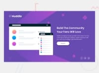
I updated the Html and CSS Code a bit in order to make the webpage responsive below 720px;
- I created a div with class
.centerto wrap & center the entire content. - Apart from that I made use of relative units of measurement using % and rem.
- When the viewport width hit 720px I changed the
flex-directionof the flex-container (.container) tocolumnand accordingly adjusted the width of the mockup image.
@Nishkarsh01
Posted
@Nishkarsh01 you could expand on the idea and make your code better.
Also, try and learn about:
- Using comments in HTML and CSS.
- Separation of Concerns in HTML and CSS.
- Learn more about relative units of measurement in CSS like rem, em, %, vh, vw, etc.
- Learn about utility classes and reusability of code.
- Also try and avoid repetition of code.
@pierre-pellegrino
Posted
@Nishkarsh01 Hey ! Thanks a lot for your answer !
I am reading what you changed on the pull request. As I am really a beginner I don't understand everything at first reading but I'll be working on it until I fully understand.
-
I didn't know about this
.centertechnique, as I understood it includes the whole page, so you can setup a responsive behaviour more easily ? It seems really nice, I will give it a try ASAP. -
I'm also surely giving it a look, I don't know how to use them properly, still need to practice !
-
Wow, I thought what I was setting up when viewport width was below 1250px automatically applied in my
@media screen and (max-width: 720px)media query !
Once again thanks a lot, it will really help me to improve !!
