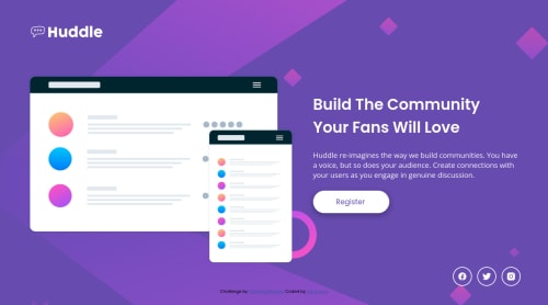
huddle landing page

Solution retrospective
Hello! 👋🏻
I'm still learning and discovering CSS features, any feedback will be appreciated!
If anyone has a suggestion on how to make that main picture looks better in mobile please let me know!😊
Please log in to post a comment
Log in with GitHubCommunity feedback
- @JesseOlisa
Hello @Isis,
Well Done completing this code. You did an amazing job on this challenge. Keep it up 👍
I went through your code and I will like to point out the main picture issue. There is no need to set the height of your image at every media query screen.
My suggestion to making the main picture responsive, and you can do this by adding a display: block and min-width: 100% to the illustration id; With this, the image will always adjust to the width of it's container no matter the screen size.
I hope this helps😊. Again, Well done.
Marked as helpful - @notFaceroll
Hey, awesome work on this one. Layout in general looks great!
On the image issue a suggestion would be:
- Try setting max-width (usually 100%) instead of max-height and control the actual size of the image by resizing its container. Making it so, in some cases, you won't even need to write more media queries for images :). Generally is easier to work with widths on images. Also, you could set display as 'block' for them;
and for other topics:
- You should always have a main element to wrap the main content of the site;
- Avoid using only (or mostly) IDs as a selector for css. IDs have a higher specificity and since classes can be reused, you would need more IDs or use '!important' to override some styles. This topic https://dev.to/clairecodes/reasons-not-to-use-ids-in-css-4ni4 can pretty much explain this better than me.
Aside from that, great job on this one!
Marked as helpful


Join our Discord community
Join thousands of Frontend Mentor community members taking the challenges, sharing resources, helping each other, and chatting about all things front-end!
Join our Discord